Posts
My thoughts and ideas
Welcome to the blog
My thoughts and ideas
This appendix is a continuation of the arrangingPlots, here we go over some advanced concepts in terms of aligning plot eements and manipulating grob objects. Some of the objects we’ll be working with come from the previously mentioned section so make sure you have that code run!
Our plot from the arrangingPlots section is looking pretty good, you might notice an unfortunate issue however in that the boxplots don’t align with their respective barcharts. Don’t worry it’s fairly easy to fix in this case, however before we start we need to go down a rabbit hole and obtain a basic understanding of grobs, tableGrobs and viewports.
First off a grob is just short for “grid graphical object” from the low-level graphics package grid; Think of it as a set of instructions for create a graphical object (i.e. a plot). The graphics library underneath all of ggplot2’s graphical elements are really composed of grob’s because ggplot2 uses grid underneath. A TableGrob is a class from the gtable package and provides an easier way to view and manipulate groups of grobs, it is actually the intermediary between ggplot2 and grid. A “viewport” is a graphics region for which describes where a grob or group of grobs is assigned on a graphics device. When we have been calling grid.arrange in our previous examples what we are really doing is arranging viewports which contain groups of grobs.
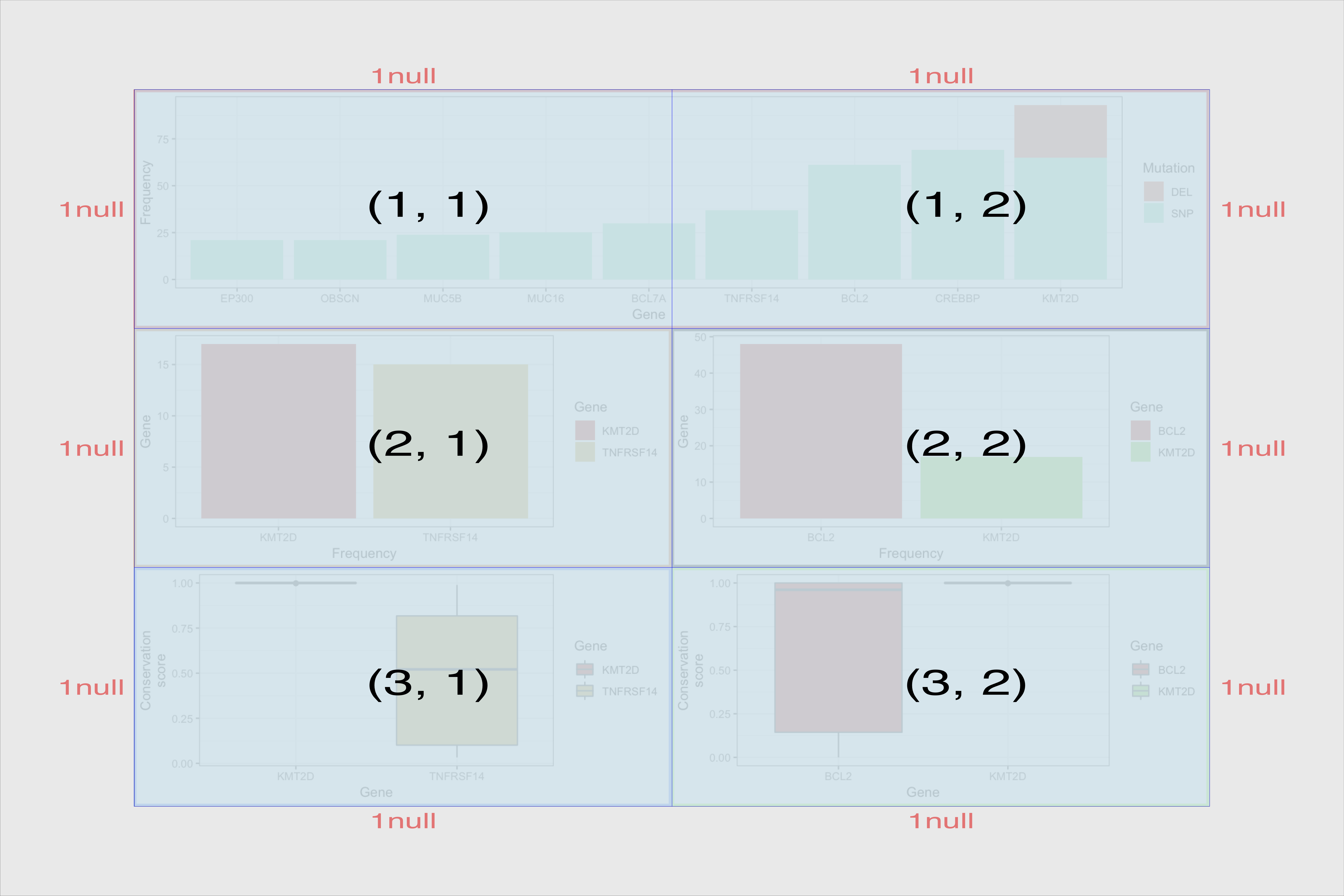
To Illustrate grobs and viewports a bit further let’s convert our arranged plot to a grob and take a look at it.
grob <- arrangeGrob(p1, p4, p5, p2, p3, layout_matrix=layout)
grob
you’ll notice a couple things right away, the table grob is composed of 5 individual grobs and are arranged in a 3 row, 2 column layout. The z column denotes the order in which grobs are plotted. the cells column is telling us where the grob is located within the viewport. For example the first element has a value of (1-1,1-2). This is telling us that that grob spans from from rows 1 to 1 (1-1) on the viewport and columns 1 to 2 (1-2) on the viewport. This is a bit easier to illustrate by viewing the actual layout with gtable_show_layout().
gtable_show_layout(grob)
After running the command above you should see something like the figure below, (note that i’ve taken the liberty of overalying the output ontop of the original plot). Notice how the first grob is spanning rows 1-1 and columns 1-2.
We can verify that this is correct by drawing just the first grob.
grid.draw(grob$grobs[[1]])
dev.off()
Okay our trip down the rabbit hole is coming to an end, I’ll just mention one last thing. As eluded to already the tableGrob we looked at is just a collection of viewports and those viewports contain grobs. In the grob we looked at we were at the top level and so by default the viewport takes up the entire page. Inside this top level we saw 5 grobs each of which have their own viewports. In the above command we go a layer deeper and draw one grob which itself has viewports it’s own associated viewports for the elements of the plot (legend, axis, etc.).
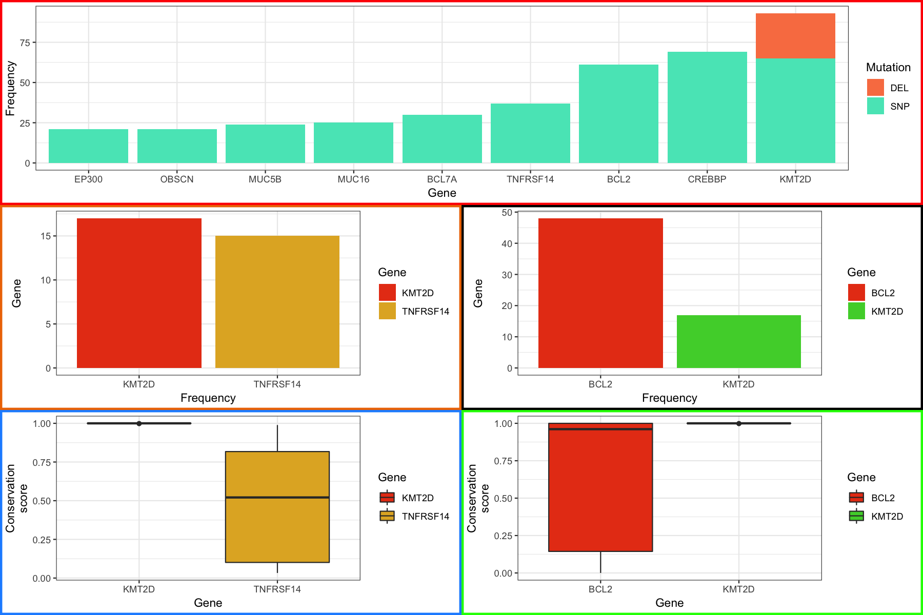
We glossed over quite a bit of detail in our discussion of grobs, tableGrobs and viewports however I think we know enough to get our plots to align. To start we need to convert all of the plots we made in ggplot to grobs, we can do this with the ggplotGrob() function. Next each viewport in the grob at this level has an associated width, for example the axis title has a width, the axis text etc. We can access these widths within the table grob using tableGrob$widths which will output a vector of these widths. We can then use the unit.pmax() function to find the maximum width for each viewport among all of our plots. From there it’s a simple matter of manually modifying and reassinging the widths for each grob and plotting the results as before.
# convert to grobs
p2_grob <- ggplotGrob(p2)
p3_grob <- ggplotGrob(p3)
p4_grob <- ggplotGrob(p4)
p5_grob <- ggplotGrob(p5)

# align plots
p4_grob_widths <- p4_grob$widths
p5_grob_widths <- p5_grob$widths
p2_grob_widths <- p2_grob$widths
p3_grob_widths <- p3_grob$widths

maxWidth <- unit.pmax(p4_grob_widths, p5_grob_widths, p2_grob_widths, p3_grob_widths)

p4_grob$widths <- maxWidth
p5_grob$widths <- maxWidth
p2_grob$widths <- maxWidth
p3_grob$widths <- maxWidth

layout <- rbind(c(1, 1),
                c(2, 3),
                c(4, 5))
grid.arrange(p1_grob, p4_grob, p5_grob, p2_grob, p3_grob, layout_matrix=layout)
At the end you should see something like the figure below.
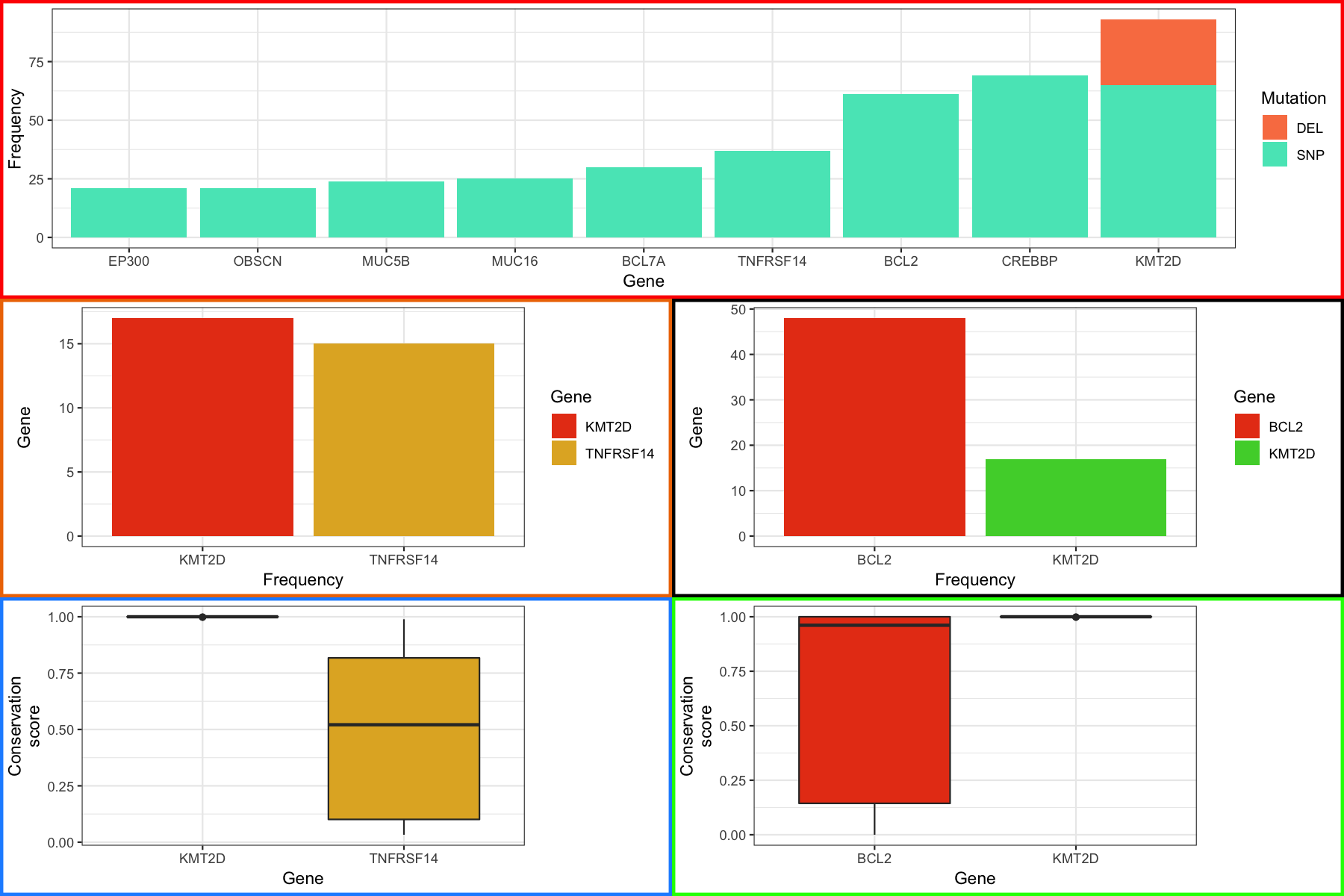
If you poked around the grob a bit you might have noticed that this only works because each plot has an equal number of viewports/grobs all of which have an associated width. What would you do then in a situation where your plots don’t have the same number of viewports. For example what if our boxplots didn’t have a legend. Fortunately there is a simple way around this, let’s start by first removing the legend from our boxplots and converting the resulting plots to grobs. If you take a look at the barchart (p4) and boxplot (p2) table grob you’ll notice that they are now different sizes as expected. The barchart is 12 x 11 and the boxplot is 12 x 9 further we see the boxplot is missing the grob named “guide-box” which corresponds to the legend. We don’t care that the grob is missing neccessarily, in fact it’s what we want, but we do need to add columns to the tableGrob for the boxplot to match the barchart. Examining the grobs we can see that the “guide-box” of the barchart spans columns 9-9 so we should add a place holder column before that at position 8. Further we can see we will actually need to add 2 placeholders, as the barchart has 11 columns and our boxplot has 9. This is because we need a placeholder not only for the legend but the whitespace between the legend and the main plot as well. Fortunately the gTable package has a function to add columns gtable_add_cols, it takes the gTable ojbect to modify, the width of the column to be added, and the position to add the column as arguments. For our purposes we need to specify a width but the actual width doesn’t matter, it just needs to be a valid width as we will be reassigning that width in a minute anyway.
# remove legend from the boxplots
p2 <- p2 + theme(legend.position="none")
p3 <- p3 + theme(legend.position="none")

# and then convert these to grob objects
p2_grob <- ggplotGrob(p2)
p3_grob <- ggplotGrob(p3)

# look at on of the boxplot/barchart grob sets
p2_grob
p4_grob

p2_grob <- gtable_add_cols(p2_grob, widths=unit(1, "null"), pos=8)
p2_grob <- gtable_add_cols(p2_grob, widths=unit(1, "null"), pos=8)

p3_grob <- gtable_add_cols(p3_grob, widths=unit(1, "null"), pos=8)
p3_grob <- gtable_add_cols(p3_grob, widths=unit(1, "null"), pos=8)
From here we can use the same methodology as we employed before to align the plots. You should see something like the figure below
# get the grob width for the new boxplots
p2_grob_widths <- p2_grob$widths
p3_grob_widths <- p3_grob$widths

# find the max width of all elements
maxWidth <- unit.pmax(p4_grob_widths, p5_grob_widths, p2_grob_widths, p3_grob_widths)

# assign this max width to all elements
p4_grob$widths <- maxWidth
p5_grob$widths <- maxWidth
p2_grob$widths <- maxWidth
p3_grob$widths <- maxWidth

# create a layout and plot the result
layout <- rbind(c(1, 1),
                c(2, 3),
                c(4, 5))
finalGrob <- grid.arrange(p1_grob, p4_grob, p5_grob, p2_grob, p3_grob, layout_matrix=layout)
grid.draw(finalGrob)
Were almost done with our final plot, there’s just one more thing we’re going to cover. It might have occurred to you that if we can view grobs we can manipulate them and you would be right. Let’s suppose that we want to color the labels in our final plot in a specific way, in particular we want to highlight the genes in the top most plot in red for which we have boxplots. The good new is that we can do this, the trick is to know which grobs and viewports to dig into. As a side note, it is hugely beneficial to use Rstudio when doing this sort of thing to take advantage of the autocompletion feature. To start digging in we need to look at the various grobs and their viewports. We first go into finalGrob$grobs which will print out all grobs at this level as a list. There are 5 one for each of our plots we used with grid.arrange and the first one in the list corresponds to the top plot which we can access with [[]] and draw with grid.draw() to verify. Digging in further through lists of grobs we can finally get to the x axis with grid.draw(finalGrob$grobs[[1]]$grobs[[7]]$children$axis$grobs[[2]]). Going just a bit further we can see that the x-axis has a color of “grey30” and we simply give it a new vector of colors to change the color for each label. At the end you should see something like the plot below:
# figure out the base grob we want to dig into
grid.draw(finalGrob$grobs[[1]])
dev.off()

# access x-axis
grid.draw(finalGrob$grobs[[1]]$grobs[[7]]$children$axis$grobs[[2]])
dev.off()

# access x-axis color
finalGrob$grobs[[1]]$grobs[[7]]$children$axis$grobs[[2]]$children$GRID.text.6880$gp$col

# change the color of the x-axis text
finalGrob$grobs[[1]]$grobs[[7]]$children$axis$grobs[[2]]$children$GRID.text.6880$gp$col <- c("blue", "blue", "blue", "blue", "blue", "red", "red", "blue", "red")

# plot the result
finalGrob <- grid.arrange(p1_grob, p4_grob, p5_grob, p2_grob, p3_grob, layout_matrix=layout)
grid.draw(finalGrob)

Most of the material in here, specifically the modification of gTable objects is advanced and in most cases will probably be uneccessary. But hopefully if you need to modify these types of objects you’ll have a basic understanding of how to go about doing it. We’ve really only scratched the surface of gTable objects as these are low level functions. The thing to remember is that you can modify these objects with some patience and trail and error.
Someone has decided they want a purple border around all the legends for our final plot (don’t ask me why). We could of course do this within ggplot but let’s imagine we’ve lost the code for creating the plot and only have the grob object to work with. Follow the instructions below and modify the grob to have this purple border.
finalGrob as exercise1 so we don’t overwrite anythingexercise1 and attempt to find where to change the legend border (hint your looking for something called col)col to purplegrid.draw() to plot the resultsolution
The solution is in solution.2.R