Posts
My thoughts and ideas
Welcome to the blog
My thoughts and ideas
Differential expression analysis is used to identify differences in the transcriptome (gene expression) across a cohort of samples. Often, it will be used to define the differences between multiple biological conditions (e.g. drug treated vs. untreated samples). There are many, many tools available to perform this type of analysis. In this course we will rely on a popular Bioconductor package DEseq2. We will then make various visualizations to help interpret our results.
For this analysis we will use the RNAseq data obtained from the EBI Expression Atlas (GXA). Specifically data set E-GEOD-50760 which corresponds to PMID: 25049118. This data consists of 54 samples from 18 individuals. Each individual has a primary colorectal cancer sample, a metastatic liver sample, and a normal sample of the surrounding colonic epithilium. The quantification data required to run differential expression analysis using DEseq2 are raw readcounts for either genes or transcripts. We will use the output from HTseq as a starting point.
The datafiles were originally downloaded from the GXA resource for use in this exercise (but we provide download commands below from within R):
A full description of the experimental design can be found at array express and the expression atlas.
DEseq2 is a popular differential expression analysis package available through Bioconductor. Its differential expression tests are based on a negative binomial generalized linear model. To get started we will first need to install the package and load the library.
# Install the latest version of DEseq2
if (!requireNamespace("BiocManager", quietly = TRUE))
    install.packages("BiocManager")
BiocManager::install("DESeq2", version = "3.8")

# load the library
library(DESeq2)
Input data for DEseq2 consists of non-normalized sequence read counts at either the gene or transcript level. No preliminary normalization of this data is needed. DEseq2 will internally corrects for differences in library size, using the raw counts. The tool HTseq can be used to obtain this information and is what was used for our example data.
Let’s go ahead and load the data and sample information into R from genomedata.org.
# Read in the raw read counts
rawCounts <- read.delim("http://genomedata.org/gen-viz-workshop/intro_to_deseq2/tutorial/E-GEOD-50760-raw-counts.tsv")
head(rawCounts)

# Read in the sample mappings
sampleData <- read.delim("http://genomedata.org/gen-viz-workshop/intro_to_deseq2/tutorial/E-GEOD-50760-experiment-design.tsv")
head(sampleData)

# Also save a copy for later
sampleData_v2 <- sampleData
The next step is to create an object of class DESeqDataSet, which will store the readcounts and intermediate calculations needed for the differential expression analysis. The object will also store the design formula used to estimate dispersion and log2 fold changes used within the model. “Dispersion” is a parameter of the Generalized Linear Model that relates to to the variance of the distribution. For more details refer to PMID: 24349066 and PMID: 22287627.
When specifying the formula it should take the form of a “~” followed by “+” separating factors. When using the default DEseq2 parameters the factor of interest (tissue type in this case) should be specified last and the control within that factor should be first when viewing the levels() for that variable.
There are 4 methods to create this object depending on the format the input data is in.
Because we already have our data loaded into R we will use DESeqDataSetFromMatrix().
# Convert count data to a matrix of appropriate form that DEseq2 can read
geneID <- rawCounts$Gene.ID
sampleIndex <- grepl("SRR\\d+", colnames(rawCounts))
rawCounts <- as.matrix(rawCounts[,sampleIndex])
rownames(rawCounts) <- geneID
head(rawCounts)

# Convert sample variable mappings to an appropriate form that DESeq2 can read
head(sampleData)
rownames(sampleData) <- sampleData$Run
keep <- c("Sample.Characteristic.biopsy.site.", "Sample.Characteristic.individual.")
sampleData <- sampleData[,keep]
colnames(sampleData) <- c("tissueType", "individualID")
sampleData$individualID <- factor(sampleData$individualID)
head(sampleData)

# Put the columns of the count data in the same order as rows names of the sample mapping, then make sure it worked
rawCounts <- rawCounts[,unique(rownames(sampleData))]
all(colnames(rawCounts) == rownames(sampleData))

# rename the tissue types
rename_tissues <- function(x){
  x <- switch(as.character(x), "normal"="normal-looking surrounding colonic epithelium", "primary tumor"="primary colorectal cancer",  "colorectal cancer metastatic in the liver"="metastatic colorectal cancer to the liver")
  return(x)
}
sampleData$tissueType <- unlist(lapply(sampleData$tissueType, rename_tissues))

# Order the tissue types so that it is sensible and make sure the control sample is first: normal sample -> primary tumor -> metastatic tumor
sampleData$tissueType <- factor(sampleData$tissueType, levels=c("normal-looking surrounding colonic epithelium", "primary colorectal cancer", "metastatic colorectal cancer to the liver"))

# Create the DEseq2DataSet object
deseq2Data <- DESeqDataSetFromMatrix(countData=rawCounts, colData=sampleData, design= ~ individualID + tissueType)
This was quite a bit of code, let’s go over whats going on here. The first thing we do is coerce the data frame containing the read counts into a format DESeq2 can accept. Specifically this must be a matrix with row names as genomic features (i.e. genes), and column names as samples. Next DESeq2 requires a data frame specifying the mapping of samples to variables, we load this in and clean it up some keeping only the variables we care about and making sure everything is a factor. For DEseq2 to work properly the column names of the count matrix must be in the same order as the row names of the sample mapping data, to ensure this we re-order the column names of the count data and run a check to ensure this has occurred correctly. To take advantage of the default settings of DEseq2 the control of the variable of interest, in our case the tissue type, should be the first element in the levels of that variable. Because we have more than 2 conditions for this variable we will not be taking advantage of the default settings however it’s good to get into the practice of doing this so we do it here. We then create a DEseq2DataSet object with this information and supply a formula where we use the individual id as a blocking factor and tissue type as the comparison variable.
While it is not strictly necessary, it is good to do some preliminary filtering of the data before running the differential expression analysis. This will reduce the size of the DEseq2DataSet object and speed up the runtime of the algorithm. Here we are performing relatively minor filtering, requiring genes to have more than a sum total of 5 reads of support in all samples.
First see what affect this filter will have.
dim(deseq2Data)
dim(deseq2Data[rowSums(counts(deseq2Data)) > 5, ])
Now actually apply the filter.
# Perform pre-filtering of the data
deseq2Data <- deseq2Data[rowSums(counts(deseq2Data)) > 5, ]
The next two steps can take some time to perform, we can offset this somewhat by enabling multiple cores using BiocParallel. To take advantage of this you will need to install the BiocParallel library and register the number of cores to use depending on your machine. Then when calling DESeq() and results() add parallel=TRUE as a parameter to these function calls.
# Install and load the library
if (!requireNamespace("BiocManager", quietly = TRUE))
    install.packages("BiocManager")
BiocManager::install("BiocParallel", version = "3.8")

# Register the number of cores to use
library(BiocParallel)
register(MulticoreParam(4))
The next step is to run the function DEseq() on our DESeq2 data set object. In this step the algorithm will perform the following:
This can take a few minutes to perform, for convenience a .RData object containing the resulting object is available to download here. You can load this into your R environment with load() either locally after downloading the file or directly through the web.
NOTE: You only need to do one of the following three options
# 1. Run pipeline for differential expression steps (if you set up parallel processing, set parallel = TRUE here)
deseq2Data <- DESeq(deseq2Data)

# 2. Load the R environment with this object from the web (optional)
# load(url("http://genomedata.org/gen-viz-workshop/intro_to_deseq2/tutorial/deseq2Data_v1.RData"))

# 3. Download the .Rdata file and load directly(optional)
# load("deseq2Data_v1.RData")
Finally we can extract the differential expression results with the results() function. When using this function we need to tell DESeq2 what comparison to make. This is only necessary if the design formula is multi-factorial or, as in our case, the variable in the design formula has more than 2 levels. This is done with the contrast parameter which takes a character vector of three elements giving the name of the factor of interest, the numerator (i.e. comparator), and the denominator (i.e. control).
Let’s get output for normal tissue vs primary tumor expression results and view a summary of results.
# Extract differential expression results
# For "tissueType" perform primary vs normal comparison
deseq2Results <- results(deseq2Data, contrast=c("tissueType", "primary colorectal cancer", "normal-looking surrounding colonic epithelium"))

# View summary of results
summary(deseq2Results)
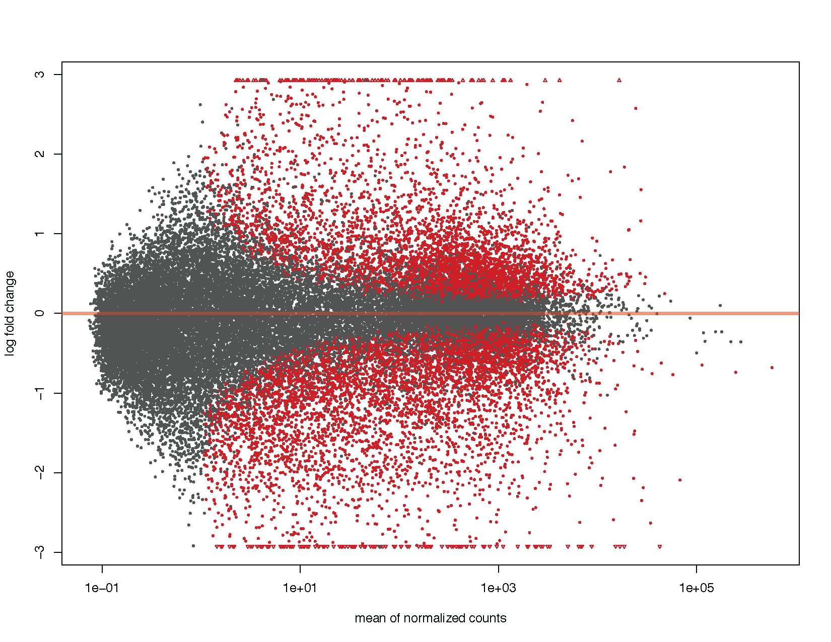
MA plots display a log ratio (M) vs an average (A) in order to visualize the differences between two groups. In general we would expect the expression of genes to remain consistent between conditions and so the MA plot should be similar to the shape of a trumpet with most points residing on a y intercept of 0. DESeq2 has a built in method for constructing an MA plot of our results however since this is a visualization course, let’s go ahead and use what we know of ggplot2 to construct our own MA plot as well.
# Using DEseq2 built in method
plotMA(deseq2Results)
# Load libraries
# install.packages(c("ggplot2", "scales", "viridis"))
library(ggplot2)
library(scales) # needed for oob parameter
library(viridis)

# Coerce to a data frame
deseq2ResDF <- as.data.frame(deseq2Results)

# Examine this data frame
head(deseq2ResDF)

# Set a boolean column for significance
deseq2ResDF$significant <- ifelse(deseq2ResDF$padj < .1, "Significant", NA)

# Plot the results similar to DEseq2
ggplot(deseq2ResDF, aes(baseMean, log2FoldChange, colour=significant)) + geom_point(size=1) + scale_y_continuous(limits=c(-3, 3), oob=squish) + scale_x_log10() + geom_hline(yintercept = 0, colour="tomato1", size=2) + labs(x="mean of normalized counts", y="log fold change") + scale_colour_manual(name="q-value", values=("Significant"="red"), na.value="grey50") + theme_bw()

# Let's add some more detail
ggplot(deseq2ResDF, aes(baseMean, log2FoldChange, colour=padj)) + geom_point(size=1) + scale_y_continuous(limits=c(-3, 3), oob=squish) + scale_x_log10() + geom_hline(yintercept = 0, colour="darkorchid4", size=1, linetype="longdash") + labs(x="mean of normalized counts", y="log fold change") + scale_colour_viridis(direction=-1, trans='sqrt') + theme_bw() + geom_density_2d(colour="black", size=2)
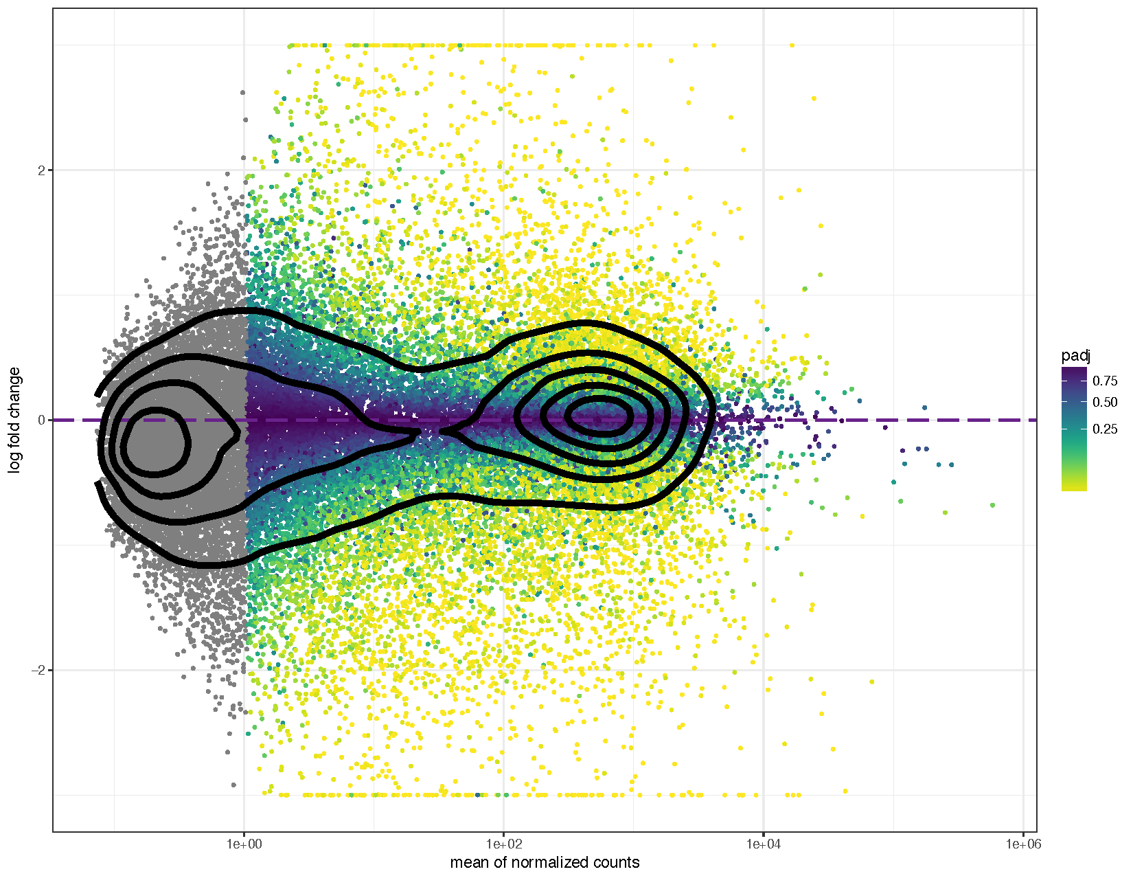
We can see from the above plots that they are in the characteristic trumpet shape of MA plots. Further we have overlayed density contours in the second plot and, as expected, these density contours are centered around a y-intercept of 0. We can further see that as the average counts increase there is more power to call a gene as differentially expressed based on the fold change. You’ll also notice that we have quite a few points without an adjusted p-value on the left side of the x-axis. This is occurring because the results() function automatically performs independent filtering using the mean of normalized counts. This is done to increase the power to detect an event by not testing those genes which are unlikely to be significant based on their high dispersion.
Often it will be useful to plot the normalized counts for a single gene in order to get an idea of what is occurring for that gene across the sample cohort. Fortunately the plotCounts() function from DEseq2 will extract the data we need for plotting this.
# Extract counts for the gene otop2
otop2Counts <- plotCounts(deseq2Data, gene="ENSG00000183034", intgroup=c("tissueType", "individualID"), returnData=TRUE)

# Plot the data using ggplot2
colourPallette <- c("#7145cd","#bbcfc4","#90de4a","#cd46c1","#77dd8e","#592b79","#d7c847","#6378c9","#619a3c","#d44473","#63cfb6","#dd5d36","#5db2ce","#8d3b28","#b1a4cb","#af8439","#c679c0","#4e703f","#753148","#cac88e","#352b48","#cd8d88","#463d25","#556f73")
ggplot(otop2Counts, aes(x=tissueType, y=count, colour=individualID, group=individualID)) + geom_point() + geom_line() + theme_bw() + theme(axis.text.x=element_text(angle=15, hjust=1)) + scale_colour_manual(values=colourPallette) + guides(colour=guide_legend(ncol=3)) + ggtitle("OTOP2")
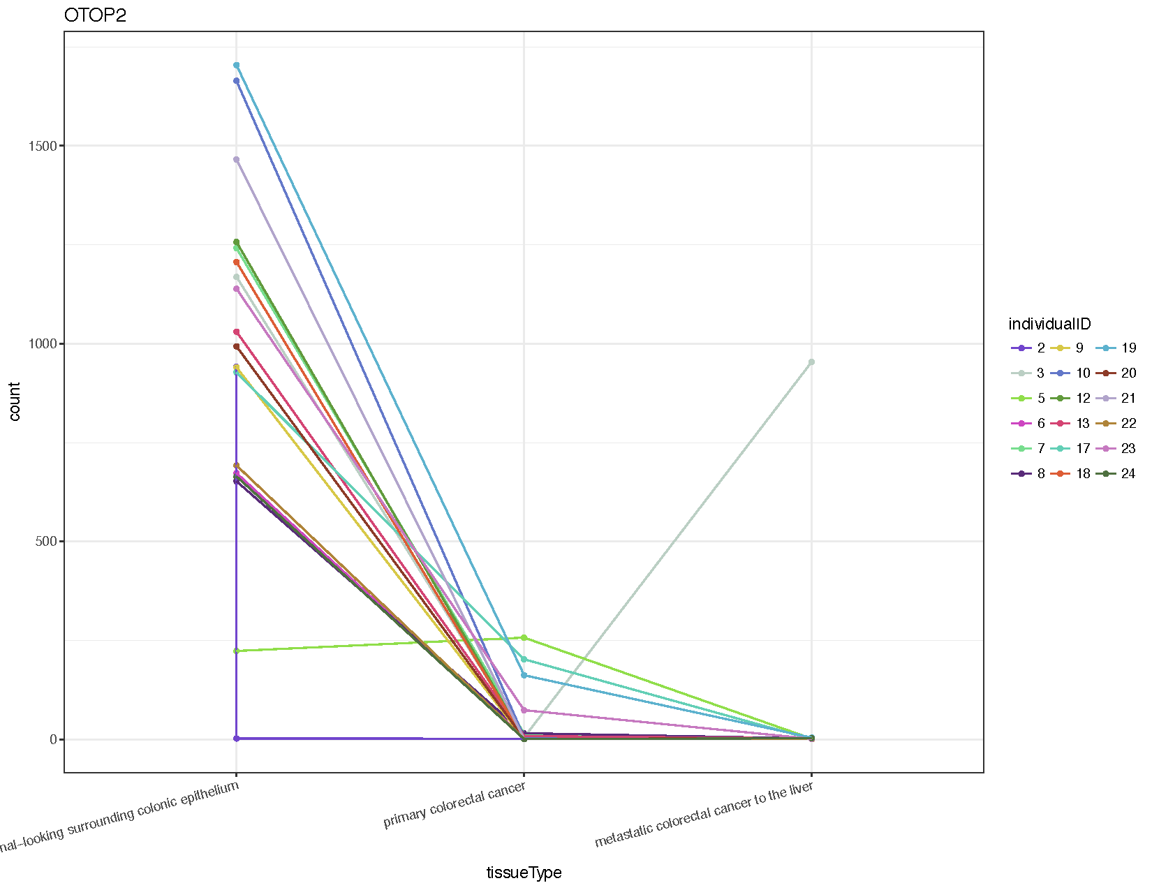
From the resulting plot (see above) we can see that almost all individuals show down-regulation of this gene in both the primary tumor and metastasis samples compared to the normal. We’ve also introduced a few new ggplot2 concepts, so let’s briefly go over them.
Examine the raw data for this gene. Is the p-value significant for this gene? Does this makes sense when we look back at the raw counts for primary tumors and normal samples?
deseq2ResDF["ENSG00000183034",]
rawCounts["ENSG00000183034",]
normals=row.names(sampleData[sampleData[,"tissueType"]=="normal-looking surrounding colonic epithelium",])
primaries=row.names(sampleData[sampleData[,"tissueType"]=="primary colorectal cancer",])
rawCounts["ENSG00000183034",normals]
rawCounts["ENSG00000183034",primaries]
It is often informative to plot a heatmap of differentially expressed genes and to perform unsupervised clustering based on the underlying data to determine sub categories within the experiment. In this case we can attempt to remedy the error we observed in individual 2. We can use ggplot and ggdendro for this task, but first we must obtain transformed values from the RNAseq counts. The differential expression analysis started from raw counts and normalized using discrete distributions however when performing clustering we must remove the dependence of the variance on the mean. In other words we must remove the experiment wide trend in the data before clustering. There are two functions within DEseq2 to transform the data in such a manner, the first is to use a regularized logarithm rlog() and the second is the variance stablizing transform vst(). There are pros and cons to each method, we will use vst() here simply because it is much faster. By default both rlog() and vst() are blind to the sample design formula given to DEseq2 in DESeqDataSetFromMatrix(). However this is not appropriate if one expects large differences in counts, which can be explained by the differences in the experimental design. In such cases the blind parameter should be set to FALSE.
# Transform count data using the variance stablilizing transform
deseq2VST <- vst(deseq2Data)
# Convert the DESeq transformed object to a data frame
deseq2VST <- assay(deseq2VST)
deseq2VST <- as.data.frame(deseq2VST)
deseq2VST$Gene <- rownames(deseq2VST)
head(deseq2VST)
# Keep only the significantly differentiated genes where the fold-change was at least 3
sigGenes <- rownames(deseq2ResDF[deseq2ResDF$padj <= .05 & abs(deseq2ResDF$log2FoldChange) > 3,])
deseq2VST <- deseq2VST[deseq2VST$Gene %in% sigGenes,]
# Convert the VST counts to long format for ggplot2
library(reshape2)
# First compare wide vs long version
deseq2VST_wide <- deseq2VST
deseq2VST_long <- melt(deseq2VST, id.vars=c("Gene"))
head(deseq2VST_wide)
head(deseq2VST_long)
# Now overwrite our original data frame with the long format
deseq2VST <- melt(deseq2VST, id.vars=c("Gene"))
# Make a heatmap
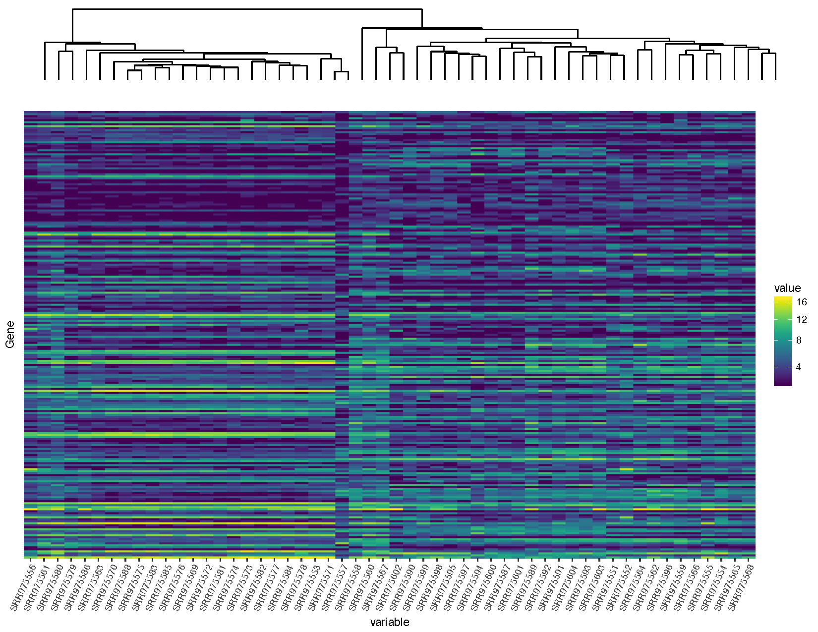
heatmap <- ggplot(deseq2VST, aes(x=variable, y=Gene, fill=value)) + geom_raster() + scale_fill_viridis(trans="sqrt") + theme(axis.text.x=element_text(angle=65, hjust=1), axis.text.y=element_blank(), axis.ticks.y=element_blank())
heatmap
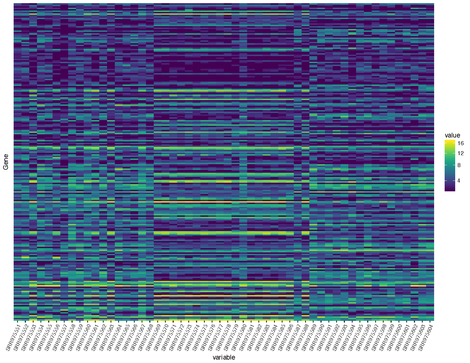
Let’s briefly talk about the steps we took to obtain the heatmap we plotted above.
Now that we have a heatmap let’s start clustering using the functions available with base R.
# Convert the significant genes back to a matrix for clustering
deseq2VSTMatrix <- dcast(deseq2VST, Gene ~ variable)
rownames(deseq2VSTMatrix) <- deseq2VSTMatrix$Gene
deseq2VSTMatrix$Gene <- NULL
# Compute a distance calculation on both dimensions of the matrix
distanceGene <- dist(deseq2VSTMatrix)
distanceSample <- dist(t(deseq2VSTMatrix))
# Cluster based on the distance calculations
clusterGene <- hclust(distanceGene, method="average")
clusterSample <- hclust(distanceSample, method="average")
# Construct a dendogram for samples
install.packages("ggdendro")
library(ggdendro)
sampleModel <- as.dendrogram(clusterSample)
sampleDendrogramData <- segment(dendro_data(sampleModel, type = "rectangle"))
sampleDendrogram <- ggplot(sampleDendrogramData) + geom_segment(aes(x = x, y = y, xend = xend, yend = yend)) + theme_dendro()
# Re-factor samples for ggplot2
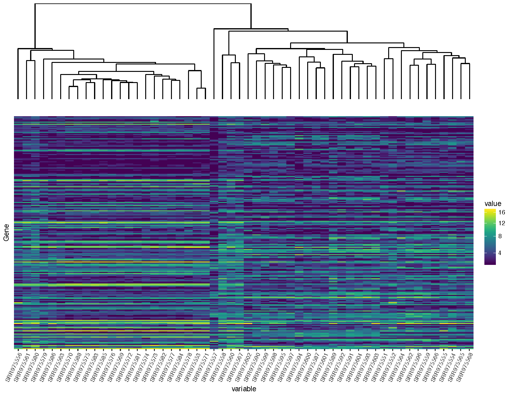
deseq2VST$variable <- factor(deseq2VST$variable, levels=clusterSample$labels[clusterSample$order])
# Construct the heatmap. note that at this point we have only clustered the samples NOT the genes
heatmap <- ggplot(deseq2VST, aes(x=variable, y=Gene, fill=value)) + geom_raster() + scale_fill_viridis(trans="sqrt") + theme(axis.text.x=element_text(angle=65, hjust=1), axis.text.y=element_blank(), axis.ticks.y=element_blank())
heatmap
# Combine the dendrogram and the heatmap
install.packages("gridExtra")
library(gridExtra)
grid.arrange(sampleDendrogram, heatmap, ncol=1, heights=c(1,5))
Our graph is looking pretty good, but you’ll notice that the dendrogram plot doesn’t line up well with the heatmap plot. This is because the plot widths from our two plots don’t quite match up. This can occur for a variety of reasons. In this case it is because we have a legend in one plot but not in the other. Fortunately this sort of problem is generally easy to fix.
# Load in libraries necessary for modifying plots
#install.packages("gtable")
library(gtable)
library(grid)

# Modify the ggplot objects
sampleDendrogram_1 <- sampleDendrogram + scale_x_continuous(expand=c(.0085, .0085)) + scale_y_continuous(expand=c(0, 0))
heatmap_1 <- heatmap + scale_x_discrete(expand=c(0, 0)) + scale_y_discrete(expand=c(0, 0))

# Convert both grid based objects to grobs
sampleDendrogramGrob <- ggplotGrob(sampleDendrogram_1)
heatmapGrob <- ggplotGrob(heatmap_1)

# Check the widths of each grob
sampleDendrogramGrob$widths
heatmapGrob$widths

# Add in the missing columns
sampleDendrogramGrob <- gtable_add_cols(sampleDendrogramGrob, heatmapGrob$widths[7], 6)
sampleDendrogramGrob <- gtable_add_cols(sampleDendrogramGrob, heatmapGrob$widths[8], 7)

# Make sure every width between the two grobs is the same
maxWidth <- unit.pmax(sampleDendrogramGrob$widths, heatmapGrob$widths)
sampleDendrogramGrob$widths <- as.list(maxWidth)
heatmapGrob$widths <- as.list(maxWidth)

# Arrange the grobs into a plot
finalGrob <- arrangeGrob(sampleDendrogramGrob, heatmapGrob, ncol=1, heights=c(2,5))

# Draw the plot
grid.draw(finalGrob)
You will notice that we are loading in a few additional packages to help solve this problem. All plots within ggplot are at the lowest level graphical objects (grobs) from the grid package. The gtable allows us to view and manipulate these grobs as tables making them easier to work with.
expand parameter within ggplot’s scale layers. To get things just right you will need to alter these parameters so data within the plots line up, approximate alterations are provided above so let’s move on the the next step.Now that we’ve completed that let’s add a plot between the dendrogram and the heatmap showing the tissue type to try and discern which normal sample in individual 2 should be the metastasis sample as per the experimental design described.
# Re-order the sample data to match the clustering we did
sampleData_v2$Run <- factor(sampleData_v2$Run, levels=clusterSample$labels[clusterSample$order])

# Construct a plot to show the clinical data
colours <- c("#743B8B", "#8B743B", "#8B3B52")
sampleClinical <- ggplot(sampleData_v2, aes(x=Run, y=1, fill=Sample.Characteristic.biopsy.site.)) + geom_tile() + scale_x_discrete(expand=c(0, 0)) + scale_y_discrete(expand=c(0, 0)) + scale_fill_manual(name="Tissue", values=colours) + theme_void()

# Convert the clinical plot to a grob
sampleClinicalGrob <- ggplotGrob(sampleClinical)

# Make sure every width between all grobs is the same
maxWidth <- unit.pmax(sampleDendrogramGrob$widths, heatmapGrob$widths, sampleClinicalGrob$widths)
sampleDendrogramGrob$widths <- as.list(maxWidth)
heatmapGrob$widths <- as.list(maxWidth)
sampleClinicalGrob$widths <- as.list(maxWidth)

# Arrange and output the final plot
finalGrob <- arrangeGrob(sampleDendrogramGrob, sampleClinicalGrob, heatmapGrob, ncol=1, heights=c(2,1,5))
grid.draw(finalGrob)
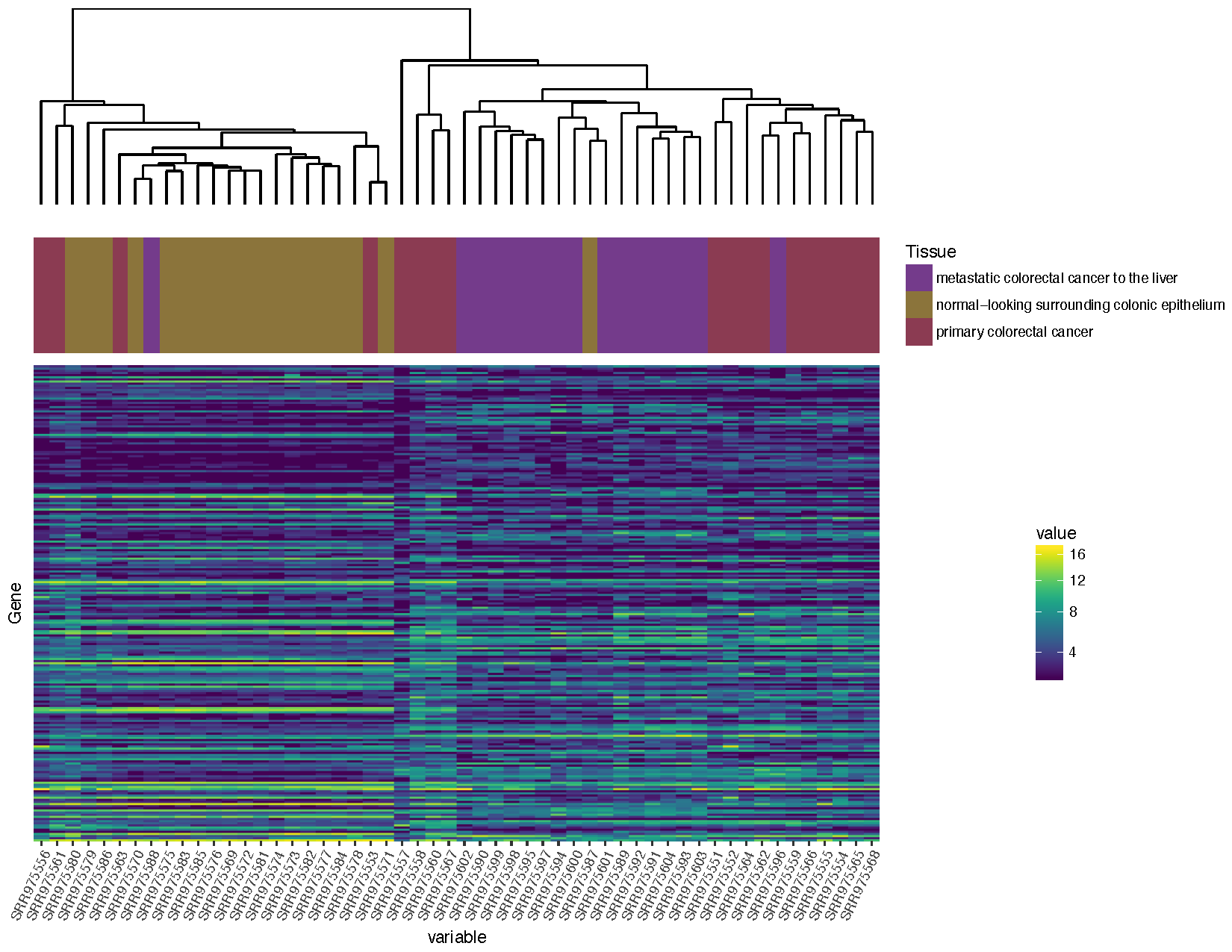
Based on the plot you produced above, which normal sample for individual 2 is likely the metastasis sample
Based on the clustering, sample SRR975587
In the tutorial above we have completed the steps necessary to produce a dendrogram for samples, we could also do this for genes. Try to reproduce the plot below, if you get stuck you’ll find an rscript that below which will produce the correct answer! Your steps should look something like this:
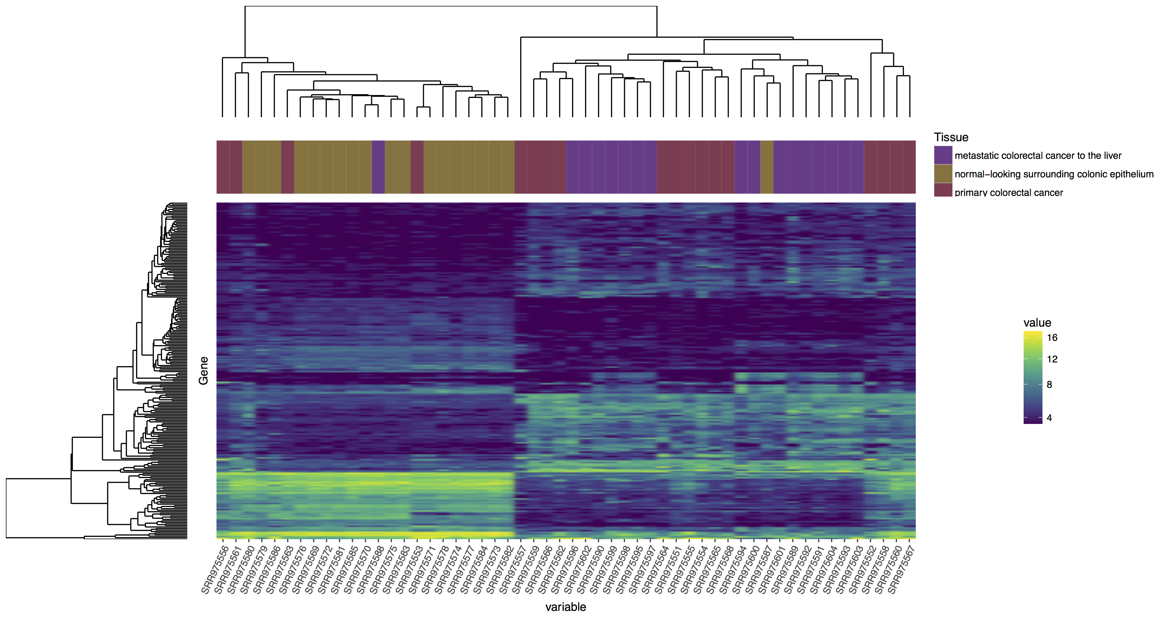
blankPanel<-grid.rect(gp=gpar(col="white"))
Reproduce the plot above, follow the steps outlined.
This Rscript file contains the correct answer.