Welcome to the blog

Posts

My thoughts and ideas

Introduction to sequencing coverage plots | Griffith Lab

Genomic Visualization and Interpretations

Introduction to sequencing coverage plots

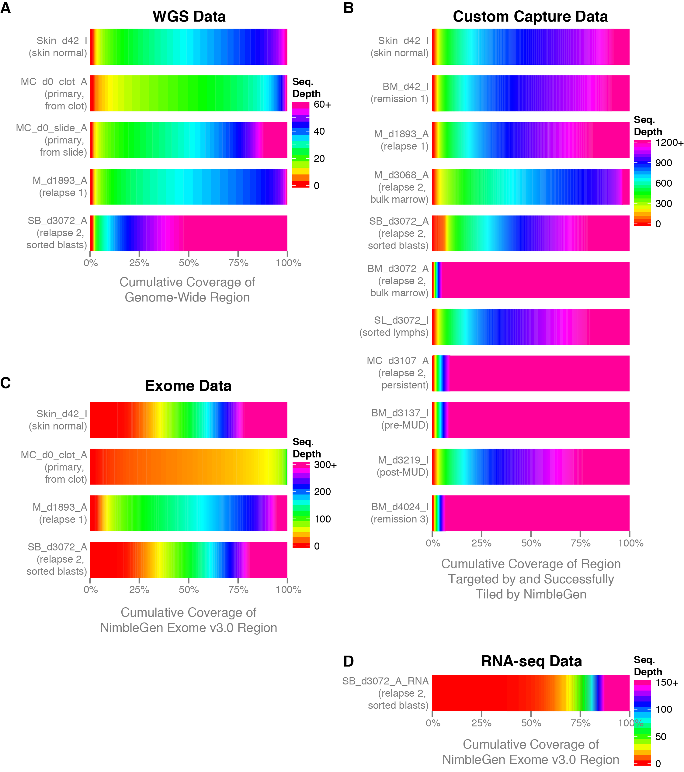
Commonly when a sample has undergone sequencing you will want to know the sequencing depth achieved in order to get an idea of the data quality. The covBars() function from the GenVisR package is designed to help in visualizing this sort of data by constructing a color ramp of cumulative coverage. In this section we will be reconstructing the capture coverage plots for 4 samples from the paper “Comprehensive genomic analysis reveals FLT3 activation and a therapeutic strategy for a patient with relapsed adult B-lymphoblastic leukemia” shown in Supplemental Figure S3.

Sequence Coverage by Griffith et al. with permission under CC BY-NC-ND

Data Preparation

The covBars() function takes as input a matrix with rows representing the sequencing depth, columns representing samples, and matrix values representing the number of reads meeting that criteria for a given cell. The best way to begin constructing this data is with the command line tool samtools depth for anything other than whole genome sequencing data in which case picards CollectWgsMetrics program might be a better choice. The output from samtools depth for 4 capture samples from the adult B-lymphoblastic leukemia manuscript linked above is available on genomedata.org. The command used to create this file was samtools depth -q 20 -Q 20 -b roi.bed -d 12000 sample1.bam sample2.bam sample3.bam sample4.bam, let’s briefly go over the parameters used to create this file and load it into R. Within the samtools depth command we used the parameters -q 20 and -Q 20 to set a minimum base and mapping quality respectively. Essentially this means that a read will not be counted if these criteria are not met. We used -b roi.bed to tell samtools depth to only create pileups for those regions encompassed by each line of the bed file. We used -d 12000 to ensure pileups are not stopped until 12,000 reads are reached for that coordinate. Finally we specified the four bam files for which we want to create pileups for, each bam file has been indexed with samtools index.

# load the ouput of samtools depth into R
seqData <- read.delim("http://genomedata.org/gen-viz-workshop/GenVisR/ALL1_CaptureDepth.tsv", header=F)
colnames(seqData) <- c("chr", "position", "samp1", "samp2", "samp3", "samp4")
seqData <- seqData[,c(3:6)]

Manipulating data

After reading in the data you’ll notice that the format is not quite what covBars() will accept; Instead of having read pileup counts for each coverage value (1X 2X 3X etc.) we have read pileups for each coordinate position in the bed file. Let’s go step by step how to manipulate the data into the proper format for covBars(). The first thing we need to do loop over all columns of seqData and obtain a tally of read pileups for each coverage value, this can be done with a call to apply() using the plyr function count(). Strictly for readability we then create our own function called renameCol with the purpose of renaming the columns names to a more human readable format and use lapply() to apply the function to each data frame in our list. You might notice that each data frame in seqCovList has a differing number of rows. This has occurred because not every sample will have pileups for the same coverage values, this is especially true when getting into higher coverage depths owing to outliers. We will fix this by creating a framework data frame containing all possible coverage values, from the min to the max observed from each data frame in the list seqCovList. For this we use lapply() to apply max() to each coverage column within the data frames in seqCovList using an anonymous function within the lapply(). This will return a list of the maximum coverage value for each data frame so we use unlist() to coerce the list to a vector and use max() again to find the overall maximum coverage observed. A similar procedure is perormed to obtain the minimum coverage and we create are framework data frame using these maximum and minimum values with data.frame(). Now that we have our framework data frame we can use merge() and lapply() to perform a natural join between the the framework data frame covFramework and each data frame containg the acutal read pileups for each coverage in seqCovList. From there we can use Reduce to recursively apply merge() to our previous list of data frames seqCovList, which effectively merges all data frames in this list. Our data is now in a format covBars() can accept but we have to do some minor cleanup. The merges we performed introduce NA values for those cells which had no coverage pileups, we convert these cell values from NA to 0. We then remove the coverage column from the data frame as that information is defined in the row names, convert the data frame to a matrix, and add in column names.

# Count the occurrences of each coverage value
# install.packages("plyr")
library(plyr)
seqCovList <- apply(seqData, 2, count)

# rename the columns for each dataframe
renameCol <- function(x){
    colnames(x) <- c("coverage", "freq")
    return(x)
}
seqCovList <- lapply(seqCovList, renameCol)

# create framework data frame with entries for the min to the max coverage
maximum <- max(unlist(lapply(seqCovList, function(x) max(x$coverage))))
minimum <- min(unlist(lapply(seqCovList, function(x) min(x$coverage))))
covFramework <- data.frame("coverage"=minimum:maximum)

# Merge the framework data frame with the coverage
# seqCovList <- lapply(seqCovList, function(x, y) merge(x, y, by="coverage", all=TRUE), covFramework)
seqCovList <- lapply(seqCovList, merge, covFramework, by="coverage", all=TRUE)

# merge all data frames together
seqCovDataframe <- Reduce(function(...) merge(..., by="coverage", all=T), seqCovList)

# set all NA values to 0
seqCovDataframe[is.na(seqCovDataframe)] <- 0

# set the rownames, remove the extra column, and convert to a matrix
rownames(seqCovDataframe) <- seqCovDataframe$coverage
seqCovDataframe$coverage <- NULL
seqCovMatrix <- as.matrix(seqCovDataframe)

# rename columns
colnames(seqCovMatrix) <- c("sample1", "sample2", "sample3", "sample4")

Running the covBars function

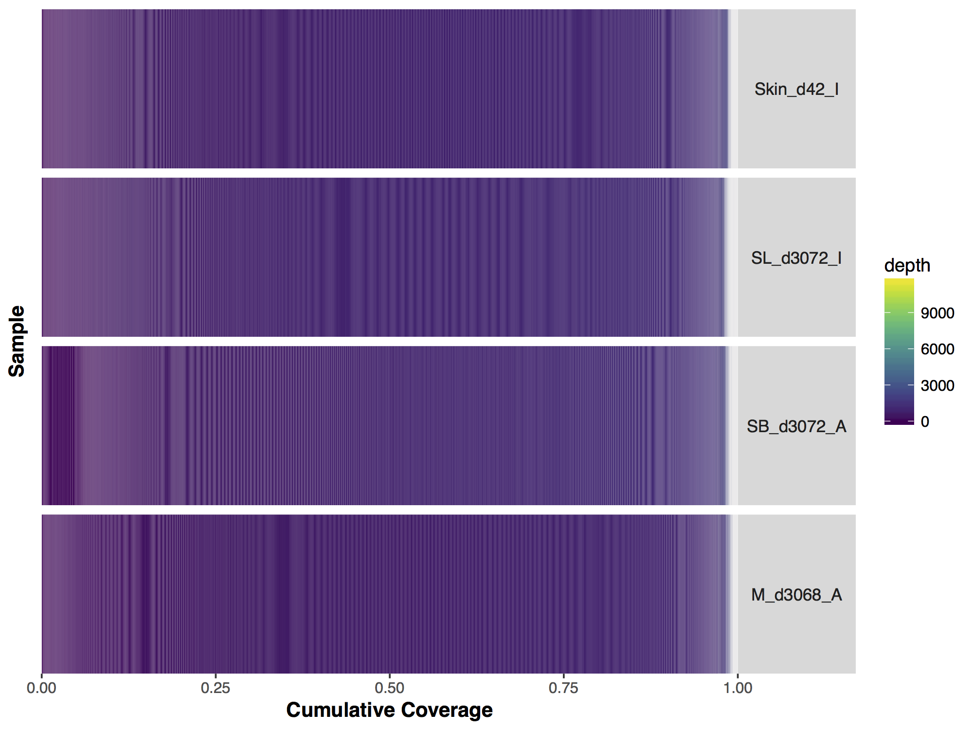
Now that we have our matrix we can simply call covBars() on the resulting object. The output looks significantly different from the manuscript version though so what exactly is going on? The problem is with the coverage outliers in the data, the graph shows that 99% of the genome is covered up to a depth of 2000X however are scale is linear and so the outliers are forcing are scale to cover a range from 0 to 11,802, obviously this is problematic.

# run covBars
covBars(seqCovMatrix)

ceiling coverage output

If we look closely at the manuscript figure we can see that the scale is actually limited to a coverage depth of 1,200. This ceilings the outliers in the data and puts everything on an easily interpretable scale. Let’s go ahead and do this to our data; First we need to calculate the column sums for every coverage value (i.e. row in our data) beyond 1,200X, for this we use the function colSums(). The previous function returns a vector, we convert this to a matrix with the appropriate row name 1200. From there we subset our original matrix up to a coverage of 1,199X and use rbind() to add in the final row corresponding to a coverage of 1,200X.

# ceiling pileups to 1200
column_sums <- colSums(seqCovMatrix[1200:nrow(seqCovMatrix),])
column_sums <- t(as.matrix(column_sums))
rownames(column_sums) <- 1200
seqCovMatrix2 <- seqCovMatrix[1:1199,]
seqCovMatrix2 <- rbind(seqCovMatrix2, column_sums)

# run covBars
covBars(seqCovMatrix2)

Interpreting the results

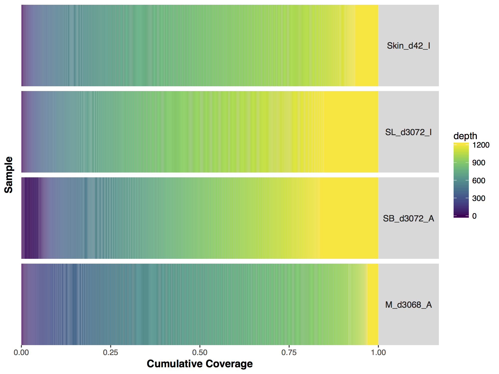
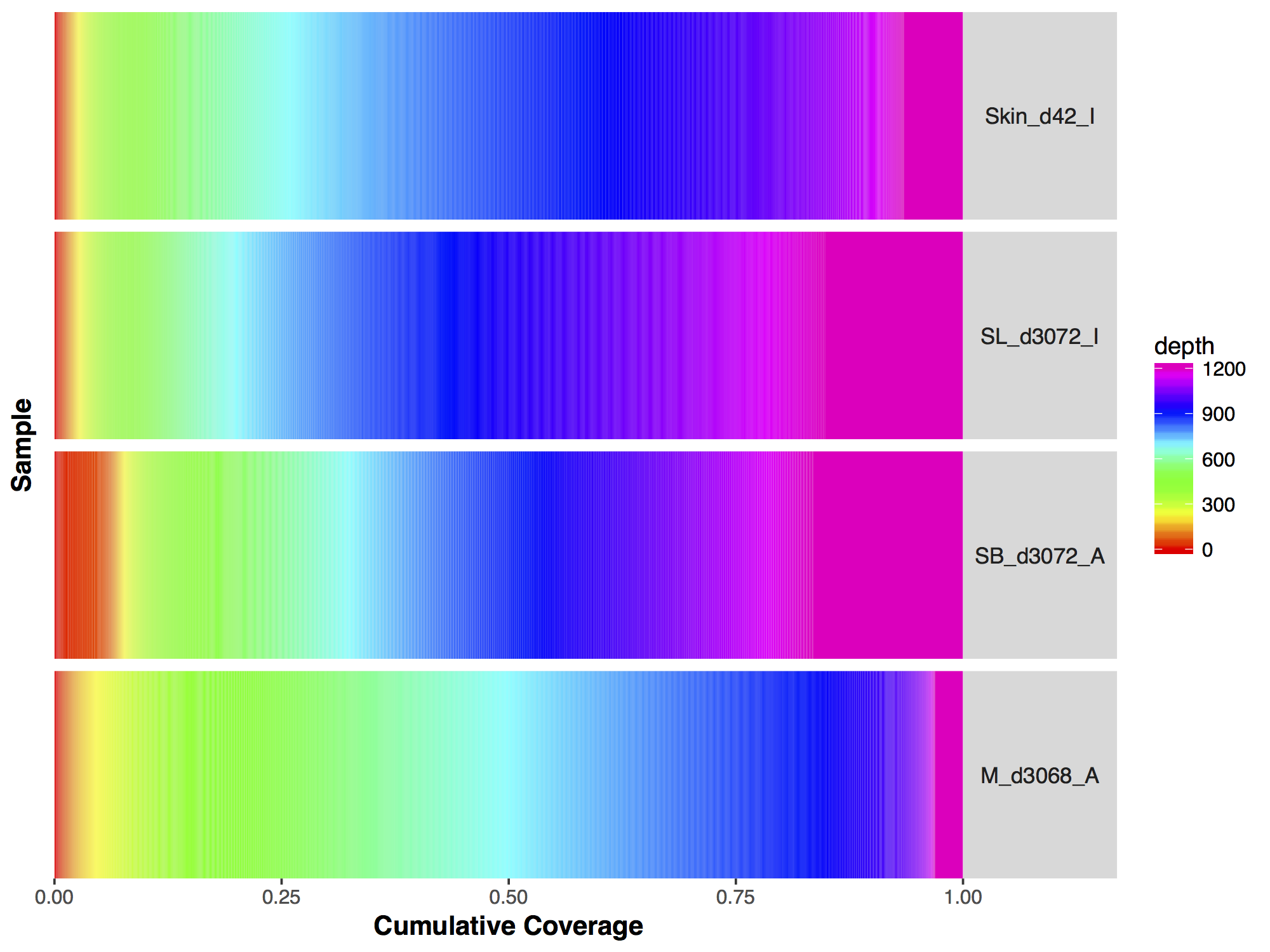
Now that we have a descent scale let’s change the colours within the scale to more closely match that of the figure. Adding more colours in our colour ramp will also provide more resolution for our interpretation of the data. For this we can use the function rainbow() and subset the vector at the end to avoid repeating red hues at both ends of the palette. From the resulting plot we can see that sample SL_d3072_I achieved the best coverage with 25% of the targeted genome achieving at least 1000X coverage and 75% of the genome acheiving greater than 800X coverage. Sample M_d3068_A appears to have the worst coverage overall with around 50% of the targeted genome covered up to 700X. Sample SB_d3072_A while achieving good coverage over all, has poor coverage for a greater proportion of the genome with 6% of the targeted space covered only up to 200-250X.

# change the colours in our Plots
colorRamp <- rainbow(1200)[1:1050]
covBars(seqCovMatrix2, colour=colorRamp)

Exercises

As with the majority of ggplot2 functions covBars() can accept additional ggplot2 layers to alter the plot as long as they are passed as a list. Try using what you know to alter the plot we created above to more closely resemble that of the manuscript. Specifically this will entail the following:

  1. change the y-axis facet labels, change the underlying data in seqCovMatrix2 for this
  2. remove the grey facet boxes (keeping the labels) and position them on the right side
  3. Add the title “Custom Capture Data”
  4. Change the x-axis title
  5. alter the legend to add 1200+ and change the legend title. You’ll need to overwrite scale_fill_gradientn()

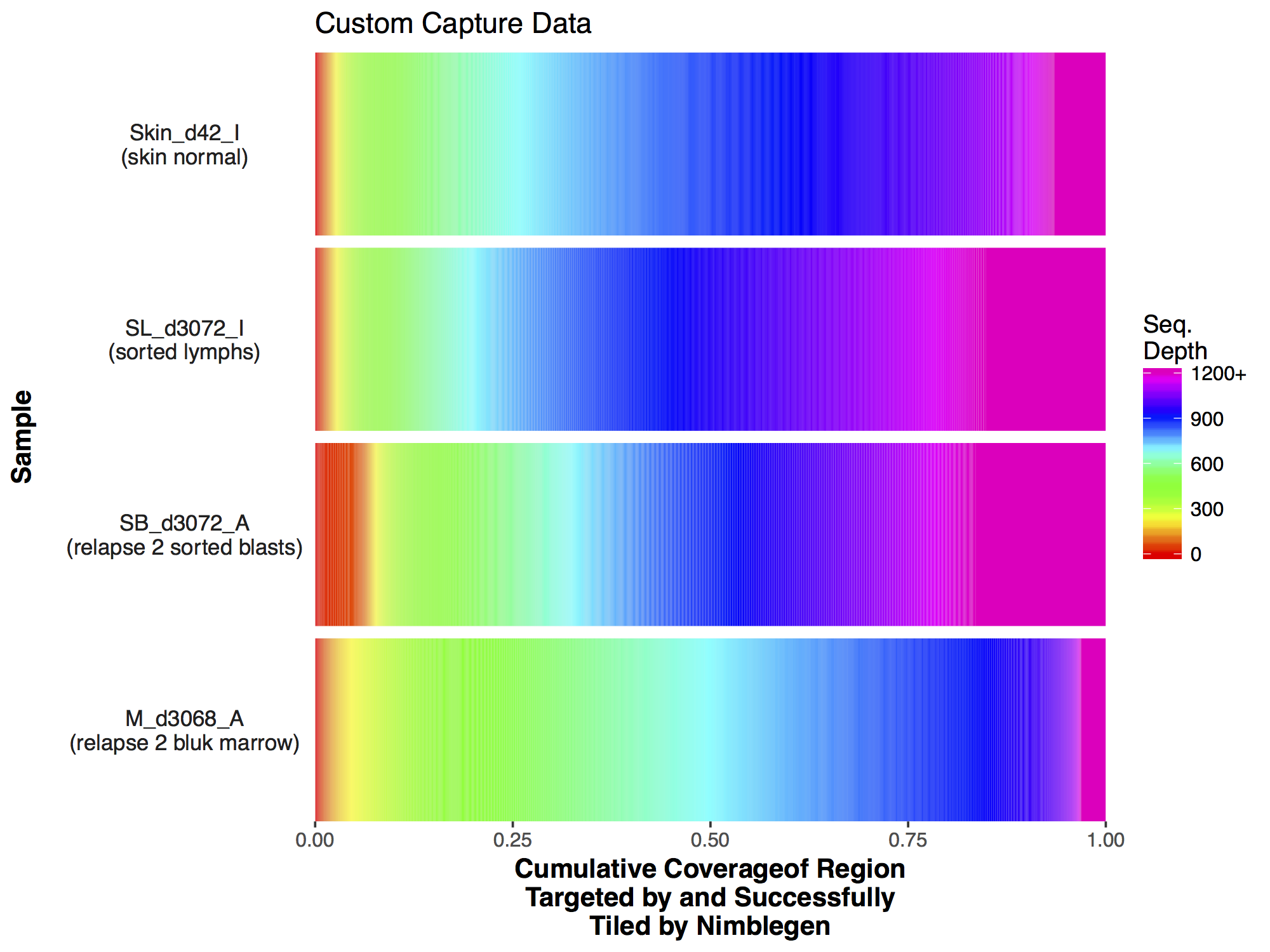
Make the changes listed above to the GenVisR plot, the final output should look like the plot below.

This Rscript file contains the correct answer.

Introduction to loss of heterozygosity plots | Griffith Lab

Genomic Visualization and Interpretations

Introduction to loss of heterozygosity plots

We’ve gone through visualizations of point mutations and copy number changes using GenVisR, another type of genomic alteration that is often usefull to visualize are “Loss of Heterozygosity” events. In a diploid cell there are pairs of chromosomes each containing a single copy of the genome. These pairs each come from haploid gametes and are slightly different from each other leading to heterozygosity throughout much of the genome. Situations can arise however where this inherit heterozygosity of the genome is loss, commonly this is through deletions of a parental copy within a chromosome region also known as hemizygosity. Viewing deletions however will not give a complete picture of LOH as events can arise that will lead to copy-neutral LOH, for example if a parental copy was deleted but the then remaining copy underwent an amplification. In this section we will use the GenVisR function lohSpec() created specifically for viewing loh events.

How lohSpec works

The function lohSpec() works by using a sliding window approach to calculate the difference in the variant allele fractions (VAF) between heterozygous variants in matched tumor normal samples. Essentially, a window of a specified size (defined by the parameter window_size) will obtain the absolute difference between the tumor VAF and the normal VAF, which is assumed to be .5, for each genomic position within the window’s position. All of these points are then averaged to obtain a measure of LOH within the window. This window will then move forward by a length specified by the parameter step, and again cauclate this absolute mean tumor-normal VAF difference metric. This LOH value across all overlapping windows is averaged.

Introduction to demonstration dataset

For this section we will be starting from a file of variants generated from the variant calling algorithm varscan. These variants originate from the breast cancer cell line HCC1395 aligned to “hg19” and were lightly processed to limit to only events called as “Germline” or “LOH” by varscan. Once we read this file in from the url we’ll need to do some minor reformatting as described below to make it compatiable with lohSpec().

# read in the varscan data
lohData <- read.delim("http://genomedata.org/gen-viz-workshop/GenVisR/HCC1395.varscan.tsv", header=FALSE)

# grab only those columns which are required and name them
lohData <- lohData[,c("V1", "V2", "V7", "V11")]
colnames(lohData) <- c("chromosome", "position", "n_vaf", "t_vaf")

# add a sample column
lohData$sample <- "HCC1395"

# convert the normal and tumor vaf columns to fractions
lohData$n_vaf <- as.numeric(gsub("%", "", lohData$n_vaf))/100
lohData$t_vaf <- as.numeric(gsub("%", "", lohData$t_vaf))/100

# limit to just the genome of interest
lohData <- lohData[grepl("^\\d|X|Y", lohData$chromosome),]

The function lohSpec() requires a data frame of heterozygous variant calls with column names “chromosome”, “position”, “n_vaf”, “t_vaf”, and “sample” as it’s primary input. Above we read in our germline variant calls from varscan and subset the data to just the required columns renaming them with colnames() and addin in a “sample” column. If we look at the the documentation we can see that lohSpec() expects proportions for the VAF columns and not percentages. We coerce these columns into this format by using gsub() to remove the “%” symbol and dividing the resultant numeric value from the call as.numeric() by 100. We also subset our data using grepl() to remove anything that is not a canonical chromosome as the chromosomes in the primary data must match those specified in the genome parameter we will use later.

Creating an initial plot

Like it’s counterpart cnSpec(), lohSpec() needs genomic boundaries to be specified in addition to the primary data in order to ensure that the entire genome is plotted when creating the graphic. This can be done via the parameter genome which expects a character string specifying one of “hg19”, “hg38”, “mm9”, “mm10”, or “rn5”. Alternatively a custom genome can be supplied with the y parameter. These parameters are both identical to their cnSpec() counterparts, please refer to the cnSpec tutorial for a more detailed explanation. Now that we have all of the required data let’s go ahead and make a standard lohSpec() plot.

# Create an inital plot
lohSpec(lohData, genome="hg19")

We have our first plot however you might have noticed a warning message along the lines of “Detected values with a variant allele fraction either above .6 or below .4 in the normal. Please ensure variants supplied are heterozygous in the normal!”. Admittedly this warning message is accurate, let’s take a minute to consider why biologically lohSpec() is producing this warning message.

Get a hint!

Refer to the "How lohSpec works" section above

Answer

A heterozygous call in a diploid genome should have a VAF of .5, any deviation from this is either noise due to insufficient coverage, or more problematically indicative that the site is not completely heterozygous. A reasonable explanation could be a focal amplification at that site on one allele. In any case it is inadvisable to use such sites when constructing this type of plot

Now let’s fix the issue and reproduce our plot, note that as expected the warning message has disappeared.

# Obtain variants with a VAF greater than 0.4 and below 0.6.
lohData <- lohData[lohData$n_vaf > 0.4 & lohData$n_vaf < 0.6,]

# run lohSpec
lohSpec(x=lohData)

Now that we have a plot let’s go over what it is showing. First off what is a high LOH value. Remember the formula used to calculate LOH for a single variant is |normal vaf - tumor vaf| and that these values are averaged for a given window. Consider this example of LOH then |.5 - 1 | = .5 and |.5 - 0| = .5. Conversely consider this example of non LOH, | .5 - .5 | = 0. So we can see that the closer we get to the value .5 the more evidence there is that an LOH event exists. We have to take noise into account but we can see that the majority of this genome has some sort of LOH, probably not surprising as this data is derived from an imortalized cell line.

Altering the step and window size

At this point it is appropriate to talk about the trade off between speed and accuracy from setting the parameters step and window_size. We have already briefly discussed these parameters and what they do. What has so far gone unsaid is that these parameters really control the amount of smoothing the data undergoes and as such altering one will alter the trade off between the algorithms speed and an accurate representation of the data, this is especially true for the step parameter. We can view the effect of this using the microbenchmark package, increasing the step by a factor of 2/3 will decrease the computation time by almost half. Reasonable defaults have been chosen for the human genome however one should keep these parameters in mind when using a custom genome or when attempting to plot many samples.

# install and load a benchmarking package
# install.packages("microbenchmark")
library(microbenchmark)

# run benchmark tests
microbenchmark(lohSpec(x=lohData, window_size = 2500000, step = 1000000), lohSpec(x=lohData, window_size = 2500000, step = 1500000), times = 5L)

Exercises

There may be situations in which you would want to view only specific regions within the genome instead of the whole genome itself. This can be achieved by supplying a custom genome to the parameter y and making sure your input data is limited to only that region. The gene PTEN is commonly lost in breast cancer, take a look to see if it’s lost in this cell line. Limit your data to only chromosome 10 and use plotLayer to highlight the q23.31 cytogenetic band on which PTEN resides (chr10:89500000-92900000). Your plot should look something like the one below.

Get a hint!

You'll need to create a custom genome that is only chromosome 10, and you'll need to subset your input data as well.

Get a hint!

Look at the messages lohSpec() outputs, it automatically prepends chr to the input to x so your custom genome will need chr prepended as well

Get a hint!

Try using geom_vline() to highlight q23.1

Answer

The solution is supplied in this file.

At times it may be desireable to alter how the plot looks, lohSpec() has a few helpfull parameters to aid in this but it may also be necessary to add additional plot layers as well via the parameter plotLayer. try to recreate the plot below using a combination of parameters in the lohSpec() documentation and adding additional layers via plotLayer. You will need to alter the plot colours, add a title, and change the facets to take up an equal share of the plot.

Get a hint!

look at the parameter "colourScheme"

Get a hint!

you will need to add layers for facet_grid() and ggtitle()

Get a hint!

Remember from earlier that when multiple layers are supplied they must be as a list!

Answer

lohSpec(lohData, colourScheme = "viridis", plotLayer=list(facet_grid(.~chromosome, scales="free"), ggtitle("Loss of Heterozygosity")))

When plotting these types of plots, particular care must be taken when dealing with allosomes. The parameter gender is usefull in this regard however try and think why it is necessary to consider for these plots and why lohSpec() does not plot allosomes by default.

Answer

Depending on the gender, the allosomes of a sample could be diploid or haploid, if the later is true LOH could be deceptively displayed when there is not any.