Introduction to waterfall plots
After sequencing a set of samples, a common question to ask is what mutations are present in the sample/patient cohort. This type of data is often displayed in a heatmap-like structure with rows and columns denotating genes and samples with these variables ordered in a hierarchical pattern based on recurrence. Such plots make viewing mutually exclusive and co-occurring mutational events a trivial task. The waterfall() function from the GenVisR package makes it easy to create these types of charts while also allowing additional data in the context of sample and gene data to be added to the plot. In this tutorial we will use the waterfall() function to re-create panel C of figure 2 from the paper “A Phase I Trial of BKM120 (Buparlisib) in Combination with Fulvestrant in Postmenopausal Women with Estrogen Receptor-Positive Metastatic Breast Cancer.”.
Installing GenVisR and loading Data
To begin let’s install and load the GenVisR library from bioconductor. We will also need to load the mutation data from Supplemental Table 3, a version that has been converted to a tab delimited format which we can load directly from genomedata.org. We also need some supplemental information regarding the clinical data and mutation burden data available both of which we’ll load from genomedata.org as well.
# Install and load GenVisR
if (!requireNamespace("BiocManager", quietly = TRUE))
    install.packages("BiocManager")
BiocManager::install("GenVisR")

library(GenVisR)

# Load relevant data from the manuscript
mutationData <- read.delim("http://genomedata.org/gen-viz-workshop/GenVisR/BKM120_Mutation_Data.tsv")
clinicalData <- read.delim("http://genomedata.org/gen-viz-workshop/GenVisR/BKM120_Clinical.tsv")
mutationBurden <- read.delim("http://genomedata.org/gen-viz-workshop/GenVisR/BKM120_MutationBurden.tsv")
Creating the initial plot
The waterfall() function is designed to work with specific file types read in as data frames, the default being MAF files, however the option exists to use custom file types as long as the column names “sample”, “gene”, and “variant_class” are present. This is done by setting fileType="Custom". Let’s go ahead and re-format our mutation data and create an initial plot using this parameter. Note that when using a custom file type the priority of mutation types must be specified with the variant_class_order parameter which accepts a character vector. We’ll explain what this does in the next section, for now just give it a character vector containing all mutation types present in mutationData.
# Reformat the mutation data for waterfall()
mutationData <- mutationData[,c("patient", "gene.name", "trv.type", "amino.acid.change")]
colnames(mutationData) <- c("sample", "gene", "variant_class", "amino.acid.change")

# Create a vector to save mutation priority order for plotting
mutation_priority <- as.character(unique(mutationData$variant_class))

# Create an initial plot
waterfall(mutationData, fileType = "Custom", variant_class_order=mutation_priority)
Setting the mutation hierarchy
As you can see from the previous plot, waterfall() plots mutations in a method similar to a heatmap, however the astute user may be asking what happens in cases where there are two different mutations types for the same cell in the heatmap. The answer is waterfall() picks one based on a mutation hierarchy. For a known file format such as MAF this hierarchy is pre set such that the more deleterious mutations are higher on the hierarchy. However, for a “custom” file type there is no apriori knowledge of what this order should be and thus must be set by the user. As mentioned, this is done with the variant_class_order parameter which accepts a character vector of all mutation types within the mutation data input in order of most to least deleterious. The effect this parameter has is best exemplified in the example below.
# Make sure seed is set to 426 to reproduce!
set.seed(426)

# Install and load the gridExtra package
#install.packages("gridExtra")
library(gridExtra)

# Create a data frame of random elements to plot
inputData <- data.frame(sample = sample(1:5, 20, replace = TRUE), gene = sample(letters[1:5], 20, replace = TRUE), variant_class = sample(c("silent", "frameshift", "missense"), 20, replace = TRUE))

# Choose the most deleterious to plot with y being defined as the most
# deleterious
most_deleterious <- c("frameshift", "missense", "silent")

# Plot the data with waterfall using the 'Custom' parameter
p1 <- waterfall(inputData, fileType = "Custom", variant_class_order = most_deleterious, mainXlabel = TRUE, out="grob")

# Change the most deleterious order
p2 <- waterfall(inputData, fileType = "Custom", variant_class_order = rev(most_deleterious), mainXlabel = TRUE, out="grob")

# Arrange the two plots side by side
grid.arrange(p1, p2, ncol=2)

# Summarize the mutation types for a given sample/gene
inputData[inputData$sample=="5" & inputData$gene=="a",]
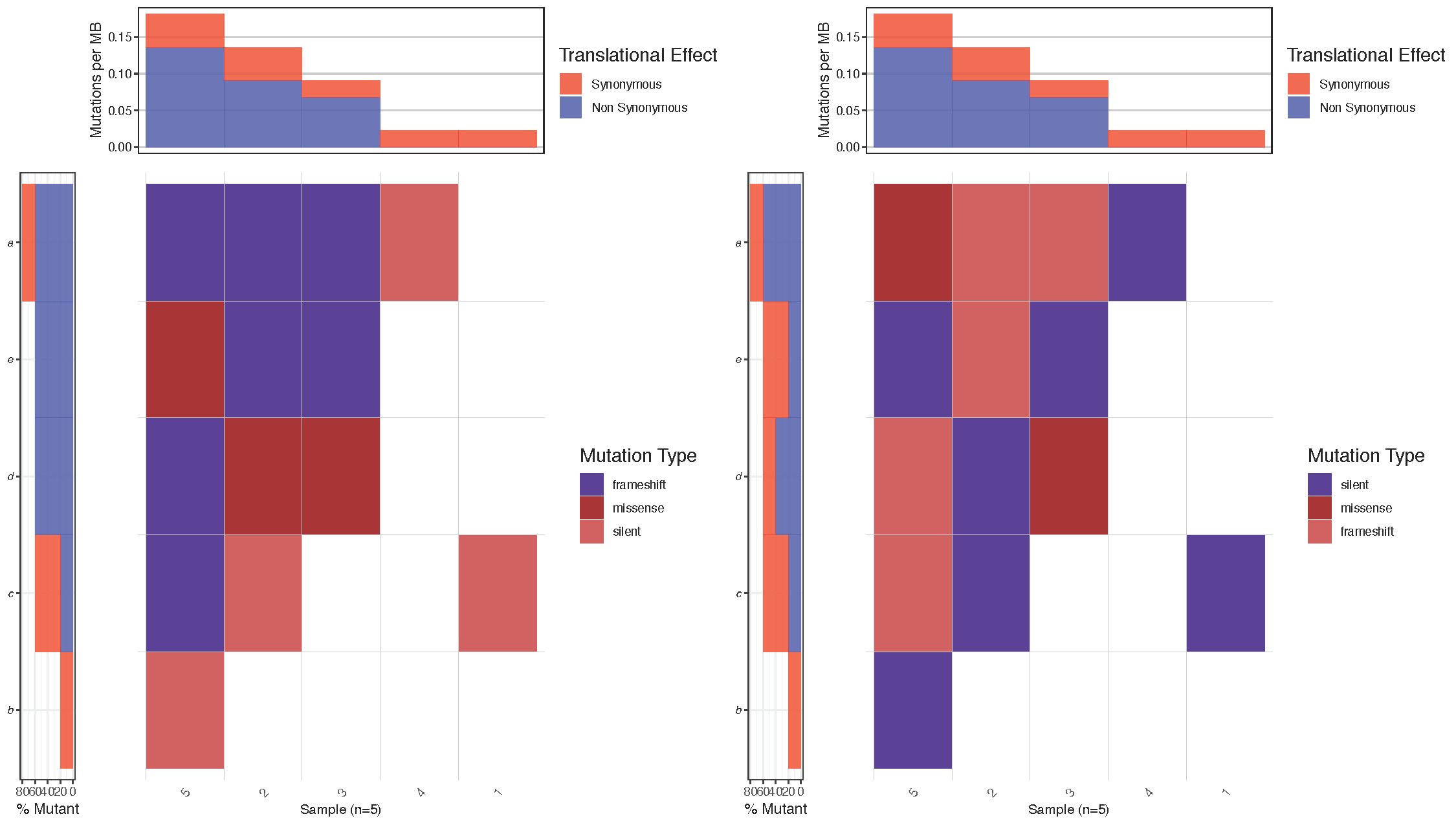
Notice that in the figure above, the top left cell (sample: 5, gene: a) has mutations of two types (frameshift and missense). Between the two plots we reversed the hierarchy of the mutations specified in variant_class_order causing mutation of type “missense” to have a higher precedence in the right most plot. As we would expect waterfall() then displays the color for mutation type “missense” instead of “frameshift” in this cell. Let’s go ahead and set a variant_class_order that makes sense for the breast cancer plot we’re working on. Remember this must be a character vector and contain all mutation types in the data frame mutationData.
# Define a mutation hierarchy
mutationHierarchy <- c("nonsense", "frame_shift_del", "frame_shift_ins", "in_frame_del", "splice_site_del", "splice_site", "missense", "splice_region", "rna")
# Create waterfall plot
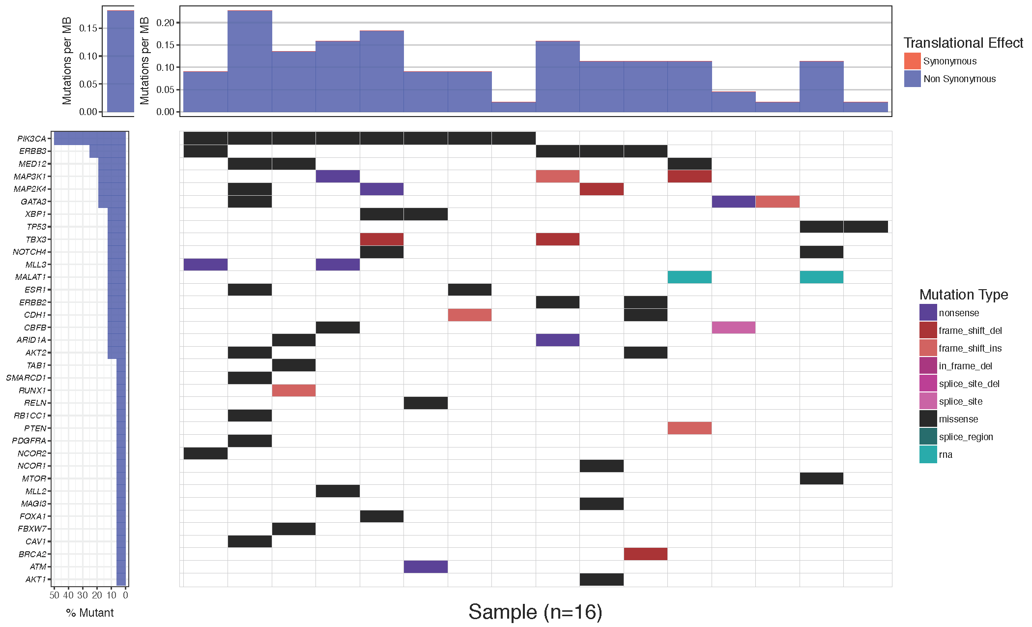
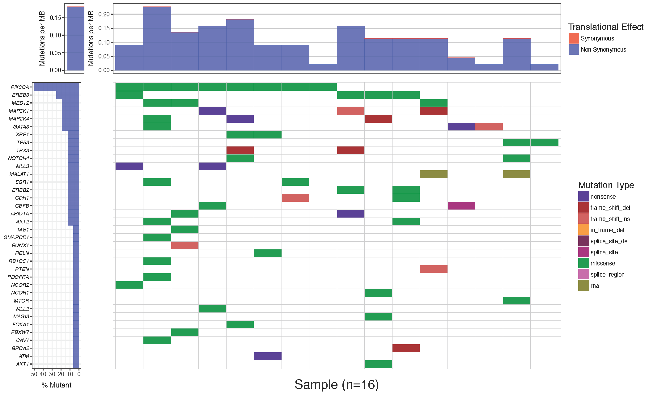
waterfall(mutationData, fileType = "Custom", variant_class_order=mutationHierarchy)
Changing the color of tiles
Often it is desirable to change the colors of the plotted cells, either for purely aesthetic reasons, or to group similar mutation types. The waterfall() parameter which allows this is mainPalette which expects a character vector mapping mutation types to acceptable R colors. Let’s go ahead and match the colors in our plot to the one in the paper.
# define colours for all mutations
mutationColours <- c("nonsense"='#4f00A8', "frame_shift_del"='#A80100', "frame_shift_ins"='#CF5A59', "in_frame_del"='#ff9b34', "splice_site_del"='#750054', "splice_site"='#A80079', "missense"='#009933', "splice_region"='#ca66ae', "rna"='#888811')

# create waterfall plot
waterfall(mutationData, fileType = "Custom", variant_class_order=mutationHierarchy, mainPalette=mutationColours)
Adding a custom mutation burden
You might notice that while the mutation burden between the manuscript plot and our plot are very similar they are not exactly the same. The waterfall() function aproximates the mutation burden via the formula (# of mutations)/(coverage space) * 1,000,000 where the coverage space is controlled by the coverageSpace parameter and takes an integer giving the number of base pairs adequately covered in the experiment. This is only an aproximation as the coverage per sample can fluctuate, in situations such as this the user has the option of providing user defined mutation burden calculation for each sample for which to plot. This is done with the mutBurden parameter which takes a data frame with two columns, “sample” (which should match the samples in mutationData) and “mut_burden” (giving the actual value to plot). We’ve downloaded what the actual values are and stored them in the mutationBurden data frame we created above. You’ll notice the samples between mutationBurden and mutationData don’t quite match. Specifically it looks like an identifier “WU0” or “W00” has been added to each sample in the mutationBurden data frame. Let’s fix this using a regular expression with gsub and use these mutation burden values for our plot.
# Find which samples are not in the mutationBurden data frame
# First, let's look at the sample names in the mutationData and mutationBurden
mutationData$sample
mutationBurden$sample

# Now, determine the non-overlap between these values
sampleVec <- unique(mutationData$sample)
sampleVec[!sampleVec %in% mutationBurden$sample]

# Fix mutationBurden to match mutationData
mutationBurden$sample <- gsub("^WU(0)+", "", mutationBurden$sample)

# Check for non-overlap again
sampleVec[!sampleVec %in% mutationBurden$sample]

# Create the waterfall plot
waterfall(mutationData, fileType = "Custom", variant_class_order=mutationHierarchy, mainPalette=mutationColours, mutBurden=mutationBurden)
At this stage it is appropriate to talk about the subsetting functions within waterfall(). We could subset mutationData to include, for example, just some specific genes that we wish to plot. However, doing so would reduce the accuracy of the mutation burden top sub-plot if not using custom values. The waterfall() function contains a number of parameters for limiting the genes and mutations plotted without affecting the mutation burden calculation. These parameters are mainRecurCutoff, plotGenes, maxGenes and rmvSilent.
How would you create a waterfall plot showing only genes which are mutated in 15% of samples?
set the mainRecurCutoff parameter to .15
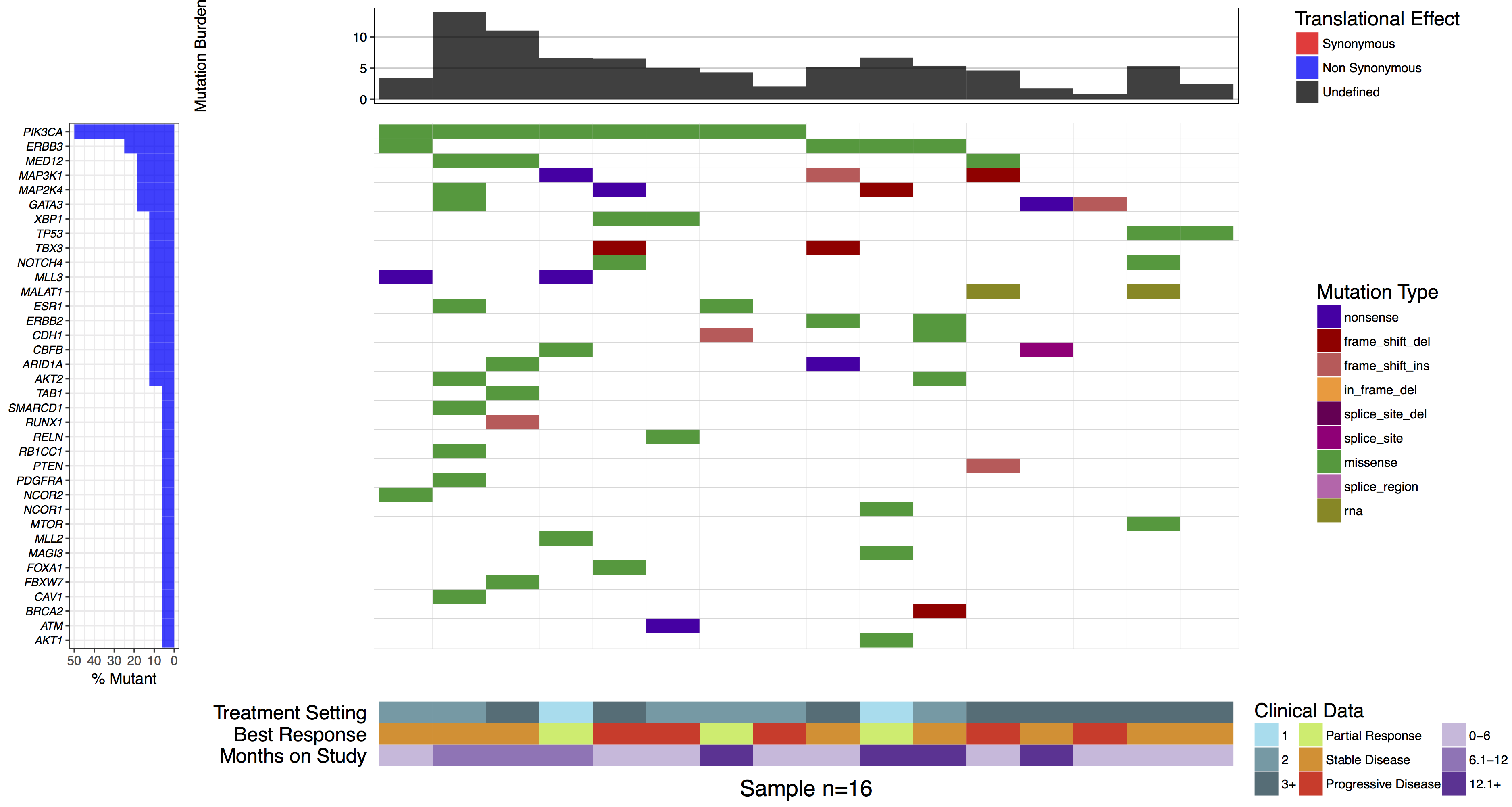
Adding clinical data
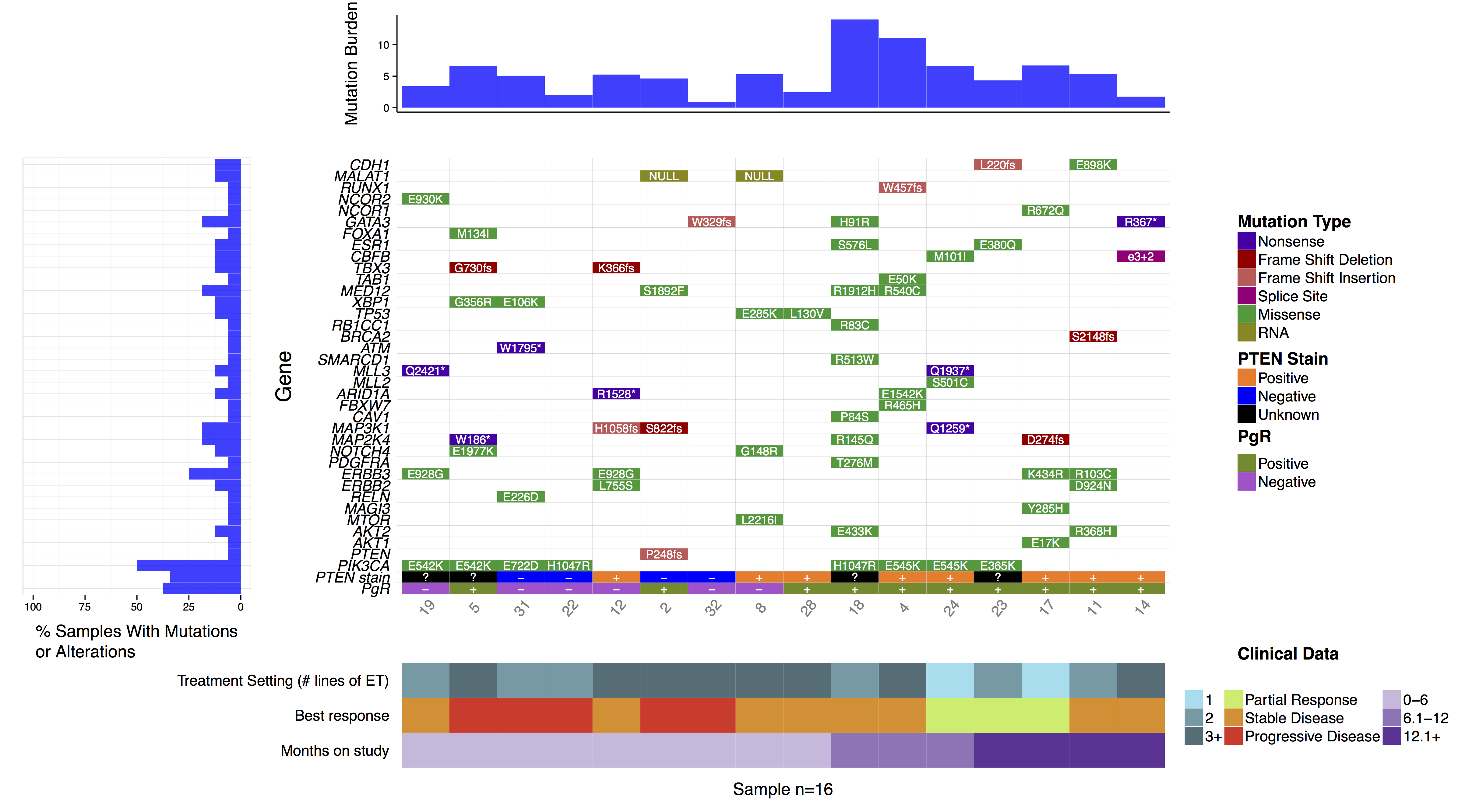
As stated previously waterfall() can display additional data in the bottom sub-plot. In order to do this a data frame in long format with column names “sample”, “variable”, “value” must be given to the parameter clinData. As with the mutBurden parameter, the samples in both data frames must match. Let’s go ahead and reproduce the clinical sub-plot from the manuscript figure. We will also use the clinLegCol, clinVarCol and clinVarOrder parameters to specify the number of columns, the colours, and the order of variables for the legend respectively. We also apply the section_heights parameter which takes a numeric vector providing the ratio of each verticle plot. In this situation we have a total of three verticle plots, the mutation burden, main, and clinical plot so we need a numeric vector of length 3.
# reformat clinical data to long format
library(reshape2)
clinicalData_2 <- clinicalData[,c(1,2,3,5)]
colnames(clinicalData_2) <- c("sample", "Months on Study", "Best Response", "Treatment Setting")
clinicalData_2 <- melt(data=clinicalData_2, id.vars=c("sample"))
# find which samples are not in the mutationBurden data frame
sampleVec <- unique(mutationData$sample)
sampleVec[!sampleVec %in% clinicalData$sample]
# fix clinical data to match mutationData
clinicalData_2$sample <- gsub("^WU(0)+", "", clinicalData_2$sample)
# create the waterfall plot
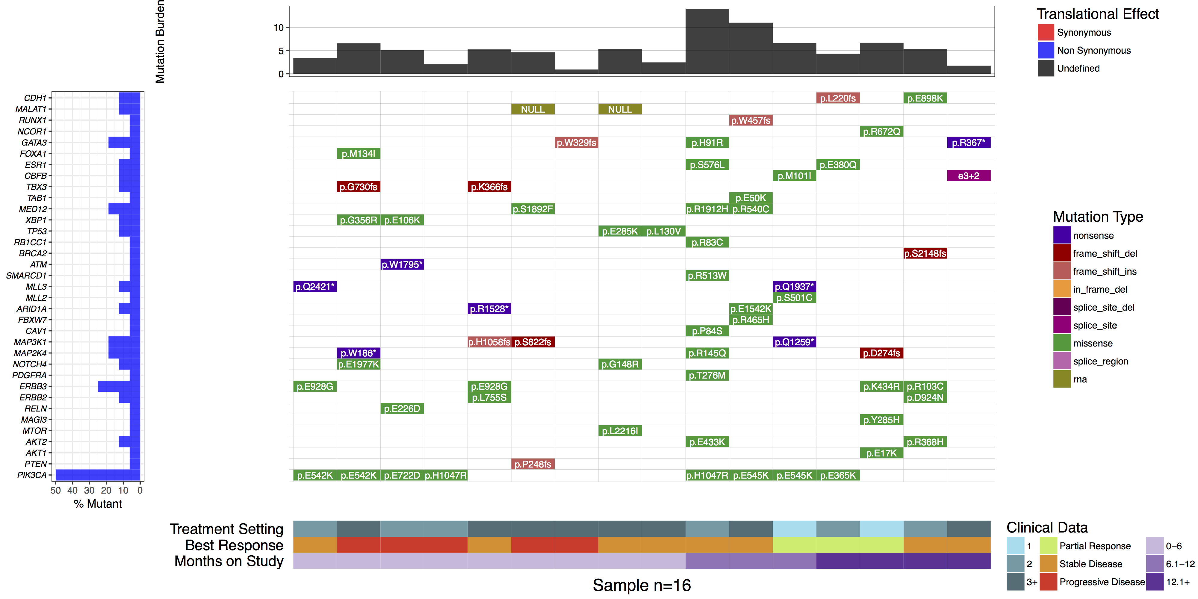
waterfall(mutationData, fileType = "Custom", variant_class_order=mutationHierarchy, mainPalette=mutationColours, mutBurden=mutationBurden, clinData=clinicalData_2, clinLegCol=3, clinVarCol=c('0-6'='#ccbadc', '6.1-12'='#9975b9', '12.1+'='#663096', 'Partial Response'='#c2ed67', 'Progressive Disease'='#E63A27', 'Stable Disease'='#e69127', '1'='#90ddee', '2'='#649aa6', '3+'='#486e77'), clinVarOrder=c('1', '2', '3+', 'Partial Response', 'Stable Disease', 'Progressive Disease', '0-6', '6.1-12', '12.1+'), section_heights=c(1, 5, 1))
Adding cell labels
You might have noticed when we subsetted our data frame at the begining of this tutorial we kept an extra column named “amino.acid.change”. This was done so that we could use this column to add cell labels to our plot as the authors of the manuscript figure did. In order to do this we only need specify the column in mutationData from which to pull labels from, we do this with mainLabelCol="amino.acid.change". Further we adjust the size of the labels so that they fit in the cells with mainLabelSize = 3. You can also change the angle of labels with the parameter mainLabelAngle which may be useful if the the cells on a plot are not perfectly square.
# create the waterfall plot
waterfall(mutationData, fileType = "Custom", variant_class_order=mutationHierarchy, mainPalette=mutationColours, mutBurden=mutationBurden, clinData=clinicalData_2, clinLegCol=3, clinVarCol=c('0-6'='#ccbadc', '6.1-12'='#9975b9', '12.1+'='#663096', 'Partial Response'='#c2ed67', 'Progressive Disease'='#E63A27', 'Stable Disease'='#e69127', '1'='#90ddee', '2'='#649aa6', '3+'='#486e77'), clinVarOrder=c('1', '2', '3+', 'Partial Response', 'Stable Disease', 'Progressive Disease', '0-6', '6.1-12', '12.1+'), section_heights=c(1, 5, 1), mainLabelCol="amino.acid.change", mainLabelSize = 3)
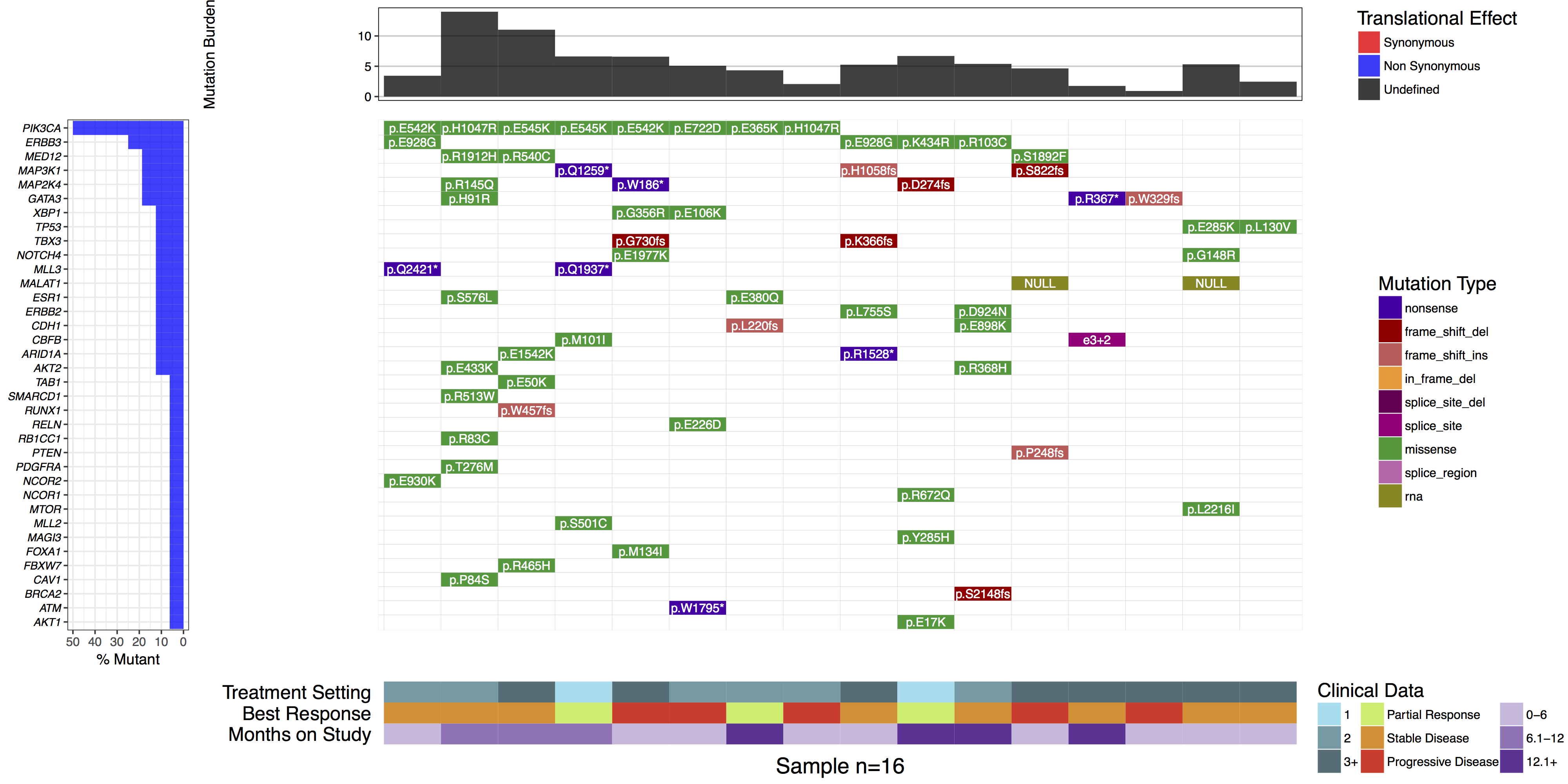
What is the most commonly mutated gene in this cohort?
PIK3CA is the most commonly mutated, in 50% (8/16) samples.
Are there any recurrently mutated amino acid positions in this gene?
Yes. E542K, H1047R, and E545K are each mutated twice.
If yes, are they known mutation hotspots? How would you determine this?
Yes. E542K, E545K and H1047R are all well known hotspots of mutation in PIK3CA, especially in human breast cancer. You could determine this by exploring PIK3CA mutation frequencies in COSMIC or ProteinPaint.
Re-arranging genes and samples
In some cases it may be desireable to forgo the default hierarchical ordering of cells in favor of a more custom approach. We can see in the authors original figure they elected to do this such that samples were grouped by months on study and gene were grouped by pathway. We can achieve this with the parameters geneOrder and sampOrder both of which take a character vector giving the order in which to plot row and column cells respectively.
# Create a sample ordering
sample_ordering <- c("19", "5", "31", "22", "12", "2", "32", "8", "28", "18", "4", "24", "23", "17", "11", "14")

# Create a gene ordering
gene_ordering <- c("CDH1", "MALAT1", "RUNX1", "NCOR1", "GATA3", "FOXA1", "ESR1", "CBFB", "TBX3", "TAB1", "MED12", "XBP1", "TP53", "RB1CC1", "BRCA2", "ATM", "SMARCD1", "MLL3", "MLL2", "ARID1A", "FBXW7", "CAV1", "MAP3K1", "MAP2K4", "NOTCH4", "PDGFRA", "ERBB3", "ERBB2", "RELN", "MAGI3", "MTOR", "AKT2", "AKT1", "PTEN", "PIK3CA")

# Create a gene ordering
waterfall(mutationData, fileType = "Custom", variant_class_order=mutationHierarchy, mainPalette=mutationColours, mutBurden=mutationBurden, clinData=clinicalData_2, clinLegCol=3, clinVarCol=c('0-6'='#ccbadc', '6.1-12'='#9975b9', '12.1+'='#663096', 'Partial Response'='#c2ed67', 'Progressive Disease'='#E63A27', 'Stable Disease'='#e69127', '1'='#90ddee', '2'='#649aa6', '3+'='#486e77'), clinVarOrder=c('1', '2', '3+', 'Partial Response', 'Stable Disease', 'Progressive Disease', '0-6', '6.1-12', '12.1+'), section_heights=c(1, 5, 1), mainLabelCol="amino.acid.change", mainLabelSize=3, sampOrder=sample_ordering, geneOrder=gene_ordering)