Posts
My thoughts and ideas
Welcome to the blog
My thoughts and ideas
We have previously covered the core aspects of ggplot2. In this section we provide some exercises to reinforce concepts.
To start things off let’s go ahead and load in a transcripts annotation database to work with. Bioconductor maintains many of these databases for different species/assemblies, here we load in one from Bioconductor for the human reference genome (build HG38). You can view the many different transcript annotation databases bioconductor offers by looking for the TxDb BiocView on bioconductor.
# install if not already installed
# if (!requireNamespace("BiocManager", quietly = TRUE))
#    install.packages("BiocManager")
# BiocManager::install("TxDb.Hsapiens.UCSC.hg38.knownGene")

# load the library
library(ggplot2)
library(TxDb.Hsapiens.UCSC.hg38.knownGene)
TxDb <- TxDb.Hsapiens.UCSC.hg38.knownGene
It is beyond the purpose of this workshop to explain everything a TxDb object stores. In the code below we are just extracting gene related data from chromosome 1-22,X,Y to plot. Note that in the dataframe we produce below the Gene ID is an Entrez ID.
# obtain gene locations from the TxDb object as a data frame
genes <- genes(TxDb, columns=c("gene_id"), single.strand.genes.only=FALSE)
genes <- as.data.frame(genes)
chromosomes <- paste0("chr", c(1:22,"X","Y"))
genes <- genes[genes$seqnames %in% chromosomes,]
genes <- unique(genes[,c("group_name", "seqnames", "start", "end", "width", "strand")])
colnames(genes) <- c("gene_id", "seqnames", "start", "end", "width", "strand")
Let’s also grab a list of immune genes and annotate our data with these as well. The immune genes here come from a pancancer immune profiling panel.
# read in the immune gene list
immuneGenes <- read.delim("http://genomedata.org/gen-viz-workshop/intro_to_ggplot2/immuneGenes.tsv")

# merge the immune gene annotations onto the gene object
genes <- merge(genes, immuneGenes, by.x=c("gene_id"), by.y=c("entrez"), all.x=TRUE)
genesOnChr6 <- genes[genes$seqnames %in% "chr6",]
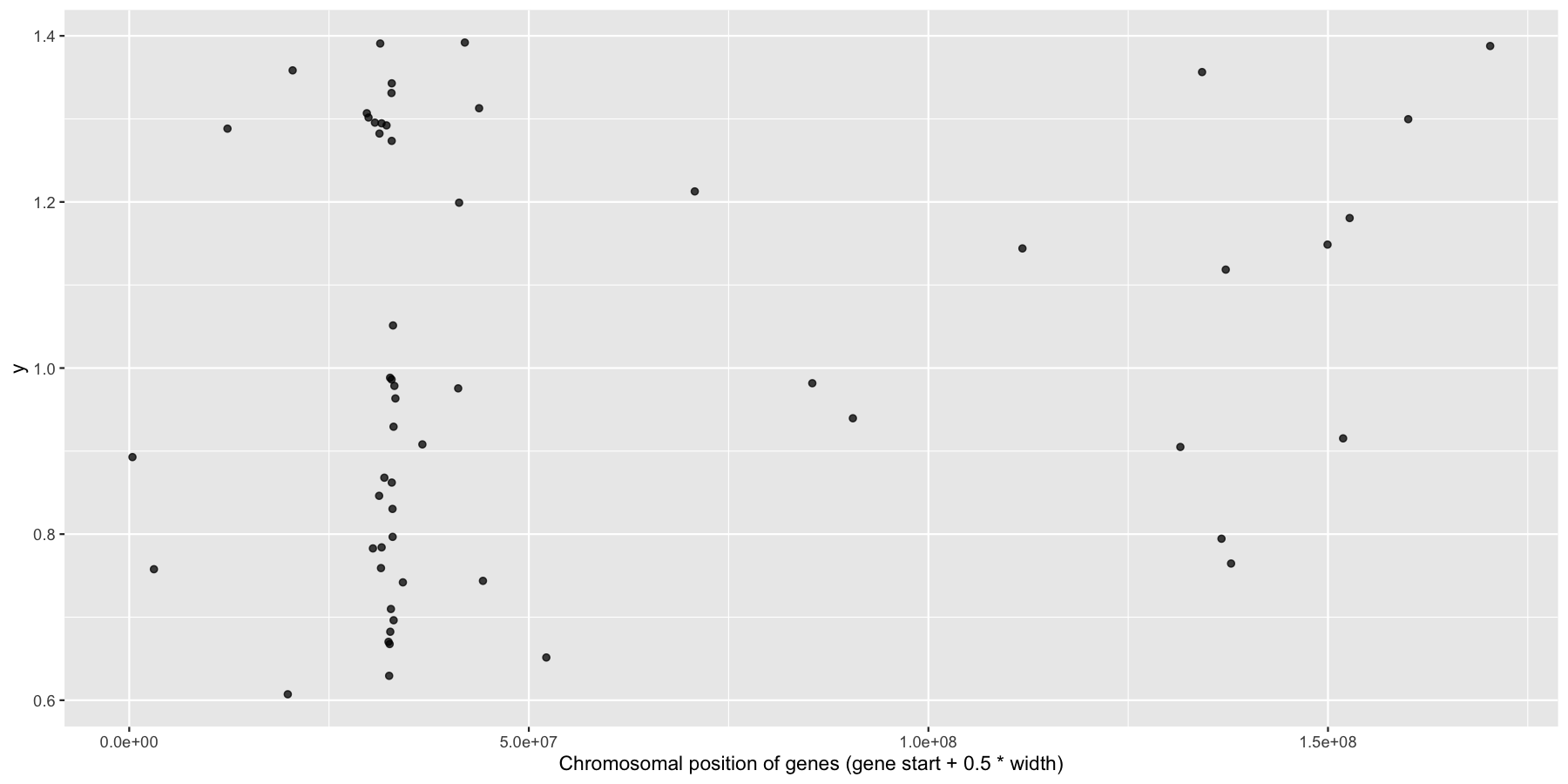
Okay, we have the core data we’ll be using for this section, let’s go ahead and use what we learned in the last section to answer a couple biologically relevant questions adding layers as we go to create more complex plots. Let’s first start with a relatively easy plot. Try plotting the genomic center of all immune genes on chromosome 6 with geom_jitter(), making sure to only jitter the height. You should use the genesOnChr6 object we created above, at the end you should see something like the plot below. Hint, we only annotated immune genes, you can use na.omit() to remove any rows with NA values.
Get a hint!
you can calculate the center of the gene with the start and width columns in the DF, this can be done inside or outside of ggplot2
Get a hint!
There is a parameter in geom_jitter() to control the ammount of jitter in both the x and y directions
Get a hint!
What is passed to the Y axis does not matter numerically as long as it is consistent!
What is the code to produce the plot below?
ggplot(na.omit(genesOnChr6), aes(x=start + .5*width, y=1)) + geom_jitter(width=0, alpha=.75) + xlab("Chromosomal position of genes (gene start + 0.5 * width)")
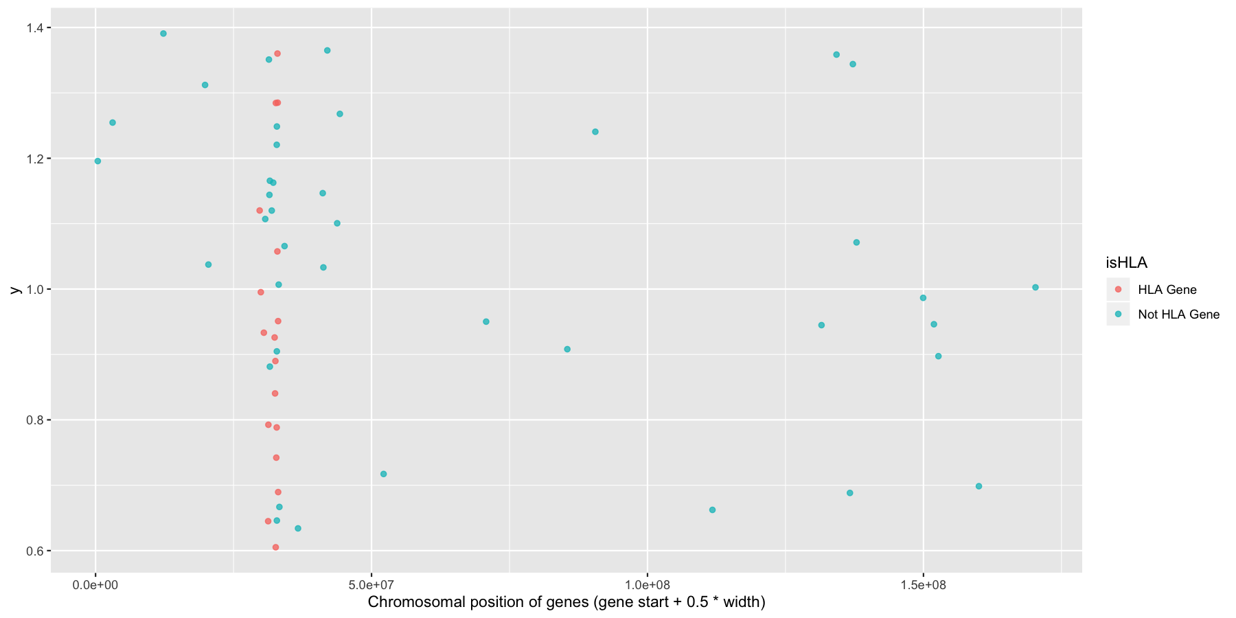
Okay now let’s try and highlight all HLA genes on the plot we just created, to do this we’ll need a column specifying which genes are HLA related, the code below will do that for you.
# make column specifying what genes are HLA or not
genesOnChr6$isHLA <- ifelse(grepl("^HLA", genesOnChr6$Name), "HLA Gene", "Not HLA Gene")
Try to mimic the plot displayed below.
Get a hint!
You only need to change one thing here in the aes() call
What is the code to produce the plot below?
ggplot(na.omit(genesOnChr6), aes(x=start + .5*width, y=1, color=isHLA)) + geom_jitter(width=0, alpha=.75) + xlab("Chromosomal position of genes (gene start + 0.5 * width)")
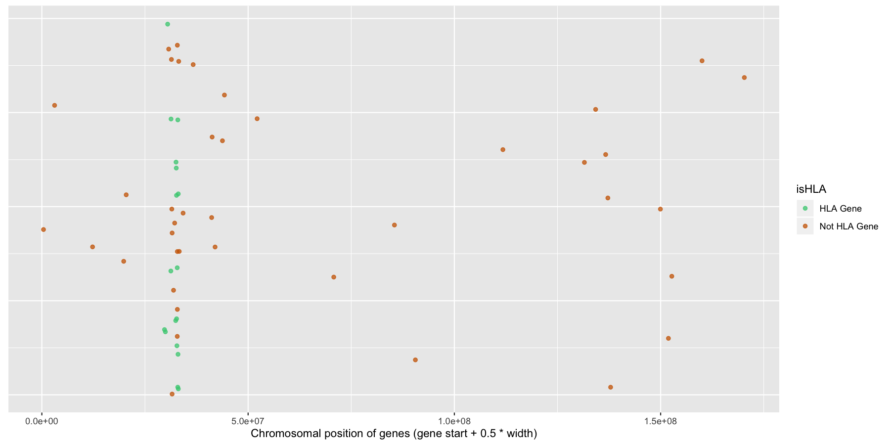
Finally let’s make some stylistic changes and clean the plot up a bit. Use theme() to remove the y-axis elements and add some custom colors to the points as is done in the plot below.
Get a hint!
to change the color you need to add one of the scale_*_manual(), i.e. scale_shape_manual, scale_linetype_manual() etc.
What is the code to produce the plot below?
ggplot(na.omit(genesOnChr6), aes(x=start + .5*width, y=1, color=isHLA)) + geom_jitter(width=0, alpha=.75) + scale_color_manual(values=c("seagreen3", "darkorange3")) + theme(axis.text.y=element_blank(), axis.title.y=element_blank(), axis.ticks.y=element_blank()) + xlab("Chromosomal position of genes (gene start + 0.5 * width)")
Okay let’s try another example, lets look at the density of genes across all genomic coordinates. We’ll start simple and keep adding layers to work our way up to a final plot. Try to recreate the plot below by plotting the density of the genes acorss the genome. Use the gene center coordinate of the gene for this.
Get a hint!
Reminder, to plot the center coordinate of the gene you will need to make another columns in the data frame, you can do this within ggplot or just add another column.
What is the code to produce the plot below?
ggplot(data=genes, aes(x=start + .5*width,)) + geom_density() + xlab("Chromosomal position of genes (gene start + 0.5 * width)")
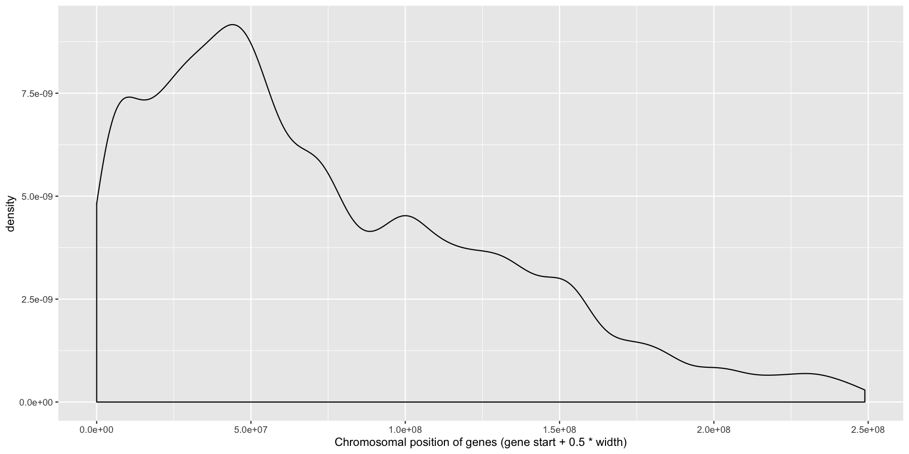
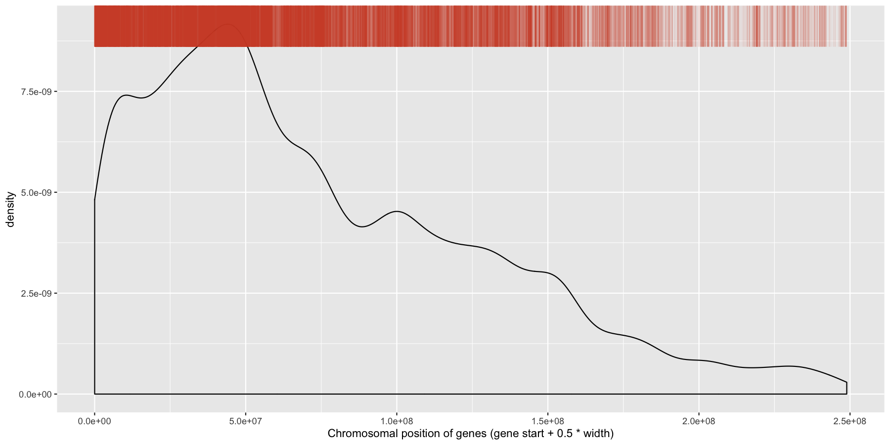
Pretty easy right? As you would expect gene density is higher toward the beginning of chromosomes simply because there is more overlap of genomic coordinates between chromosomes at the start (i.e. all chromosomes start at 1, but are of different lengths). Now let’s add to our plot by creating a rug layer for genes on the anti-sense strand. Place this rug on the top of the plot, alter the transparency, color, and size of the rug. when your done your plot should look similar to the one below.
Get a Hint!
Look at the ggplot2 documentation for geom_rug()
Get a Hint!
You will need to pass a subsetted data frame directly to geom_rug() with the data parameter
Get a Hint!
within geom_rug() you want to pay attention to the sides and length parameters, again see ggplot2 documentation
What is the code to produce the plot below
ggplot(data=genes, aes(x=start + .5*width,)) + geom_density() + geom_rug(data=genes[genes$strand == "-",], aes(x=start + .5*width), color="tomato3", sides="t", alpha=.1, length=unit(0.1, "npc")) + xlab("Chromosomal position of genes (gene start + 0.5 * width)")
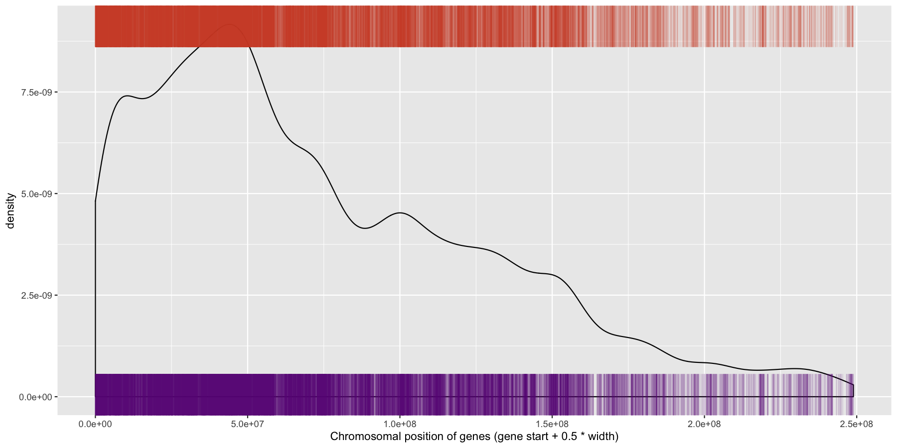
While were at it, let’s go ahead and add a layer for the sense strand as well, this will go on the bottom of the plot instead of the plot. Go ahead and try and mimic the plot below.
Get a Hint!
Same concept as above, you should have 2 geom_rug() layers for this plot
What is the code to produce the plot below
ggplot(data=genes, aes(x=start + .5*width,)) + geom_density() + geom_rug(data=genes[genes$strand == "-",], aes(x=start + .5*width), color="tomato3", sides="t", alpha=.1, length=unit(0.1, "npc")) + geom_rug(data=genes[genes$strand == "+",], aes(x=start + .5*width), color="darkorchid4", sides="b", alpha=.1, length=unit(0.1, "npc")) + xlab("Chromosomal position of genes (gene start + 0.5 * width)")
We have are basic plot now, but it’s still not very informative as all the data from the different chromosomes are colliding with each other. Let’s go ahead and fix this by making multiple plots from the same data split out by chromosome. Recall from the previous section that there is a very easy way to do this. Also pay particular attention to how the axis are set for each individual plot and produce the result below.
Get a Hint!
look at the ggplot2 documentation for facet_wrap(), particularly the scales parameter in facet_wrap()
What is the code to produce the plot below
ggplot(data=genes, aes(x=start + .5*width)) + geom_density() + geom_rug(data=genes[genes$strand == "-",], aes(x=start + .5*width), color="tomato3", sides="t", alpha=.1, length=unit(0.1, "npc")) + geom_rug(data=genes[genes$strand == "+",], aes(x=start + .5*width), color="darkorchid4", sides="b", alpha=.1, length=unit(0.1, "npc")) + facet_wrap(~seqnames, scales="free") + xlab("Chromosomal position of genes (gene start + 0.5 * width)")
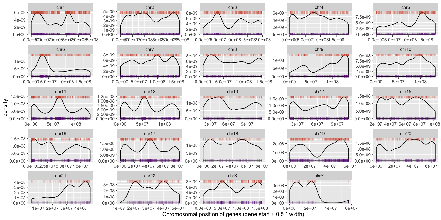
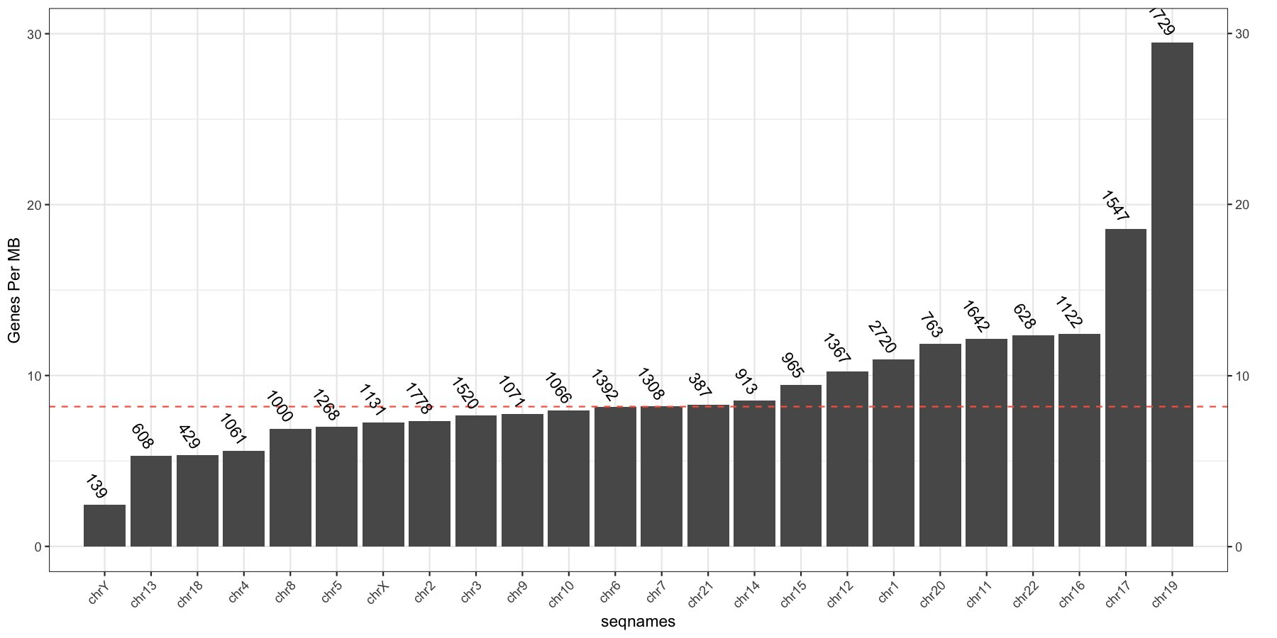
We can start to see some interesting trends now, specifically chr6 appeears to have many genes on the p-arm of the chromosome compared to the q-arm. We can also see a couple regions where strand bias might be present, such as in the beginning of chromosome 15. Let’s go ahead and finish things up by altering some of the theme aspects of the plot. Reproduce the plot below using theme()
What is the code to produce the plot below
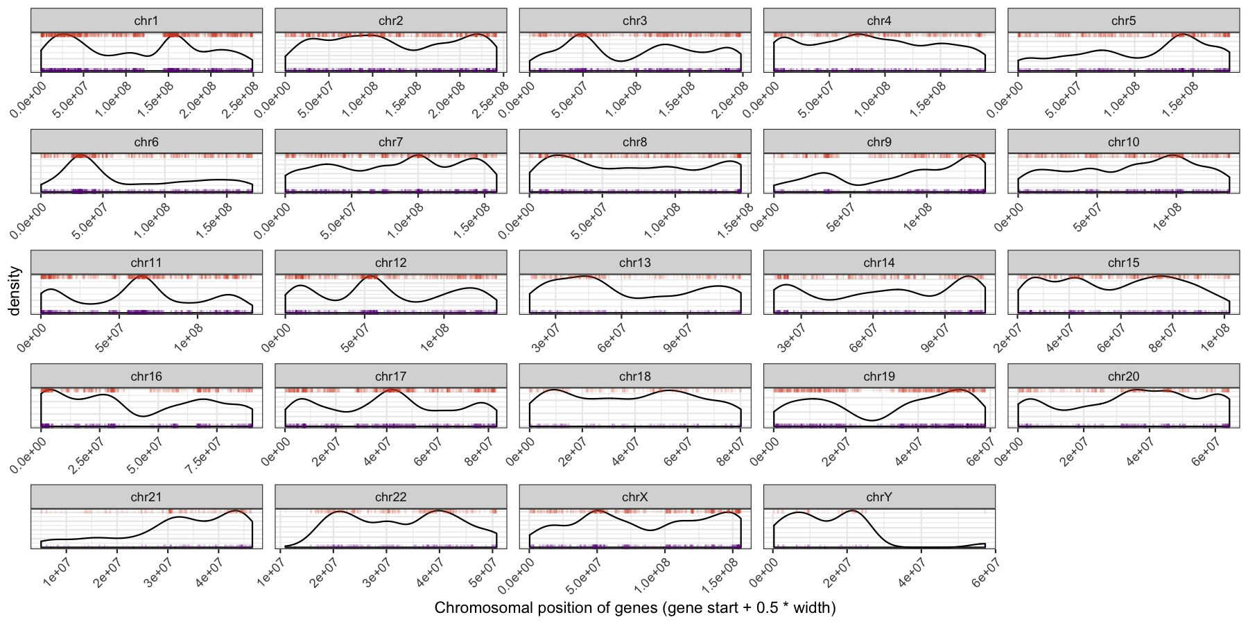
ggplot(data=genes, aes(x=start + .5*width,)) + geom_density() + geom_rug(data=genes[genes$strand == "-",], aes(x=start + .5*width), color="tomato3", sides="t", alpha=.1, length=unit(0.1, "npc")) + geom_rug(data=genes[genes$strand == "+",], aes(x=start + .5*width), color="darkorchid4", sides="b", alpha=.1, length=unit(0.1, "npc")) + facet_wrap(~seqnames, scales="free") + theme_bw() + theme(axis.text.y = element_blank(), axis.ticks.y=element_blank(), axis.text.x=element_text(angle=45, hjust=1)) + xlab("Chromosomal position of genes (gene start + 0.5 * width)")
Let’s try another exercise, what if we don’t care about the density of genes across chromosomes, but instead just want to know which chromosome has the highest gene burden. The code below will produce the data ggplot2 will need to plot this information
geneFreq <- plyr::count(genes$seqnames)
names(geneFreq) <- c("seqnames", "freq")
chrLength <- as.data.frame(seqlengths(TxDb))
chrLength$seqnames <- rownames(chrLength)
colnames(chrLength) <- c("length","seqnames")
chrGeneBurden <- merge(geneFreq, chrLength, all.x=TRUE, by="seqnames")
chrGeneBurden$gene_per_mb <- chrGeneBurden$freq/chrGeneBurden$length * 1000000
Go ahead and try and reproduce the plot below, remember to keep adding layers to get closer to the final product and refer to the ggplot2 documention for help.
Get a Hint!
We dont go step by step for this one, you will need geom_bar(), geom_hline(), geom_text() as the core elements
Get a Hint!
you can make a secondary axis with the scale_y_continuous() layer, you only need one scale_y_continuous()
What is the code to produce the plot below
myChrOrder <- as.character(chrGeneBurden[order(chrGeneBurden$gene_per_mb),]$seqnames)
chrGeneBurden$seqnames <- factor(chrGeneBurden$seqnames, levels=myChrOrder)
ggplot(chrGeneBurden, aes(seqnames, gene_per_mb)) +
geom_bar(stat="identity") +
geom_hline(yintercept = median(chrGeneBurden$gene_per_mb), linetype=2, color="tomato1") +
geom_text(aes(label=freq), angle=-55, hjust=1, nudge_y=.5) +
scale_x_discrete(expand=c(.05, .05)) +
scale_y_continuous(sec.axis = dup_axis(name="")) +
geom_point(aes(y=30, x=1), alpha=0) +
theme_bw() + theme(axis.text.x=element_text(angle=45,hjust=1)) +
ylab("Genes Per MB")
Often it is useful to compare tumor variant allele frequencies among samples to get a sense of the tumor purity, heterogeneity, aneuploidy and to determine the existence of sub-clonal cell populations within the tumor. Let’s use the ggplot2ExampleData.tsv dataset we used in the introduction to ggplot2 section to explore this.Run the R code below to make sure you have the data loaded, then try re-creating the plots below. You’ll find hints and answers below each plot.
# load the dataset
variantData <- read.delim("http://genomedata.org/gen-viz-workshop/intro_to_ggplot2/ggplot2ExampleData.tsv")
variantData <- variantData[variantData$dataset == "discovery",]
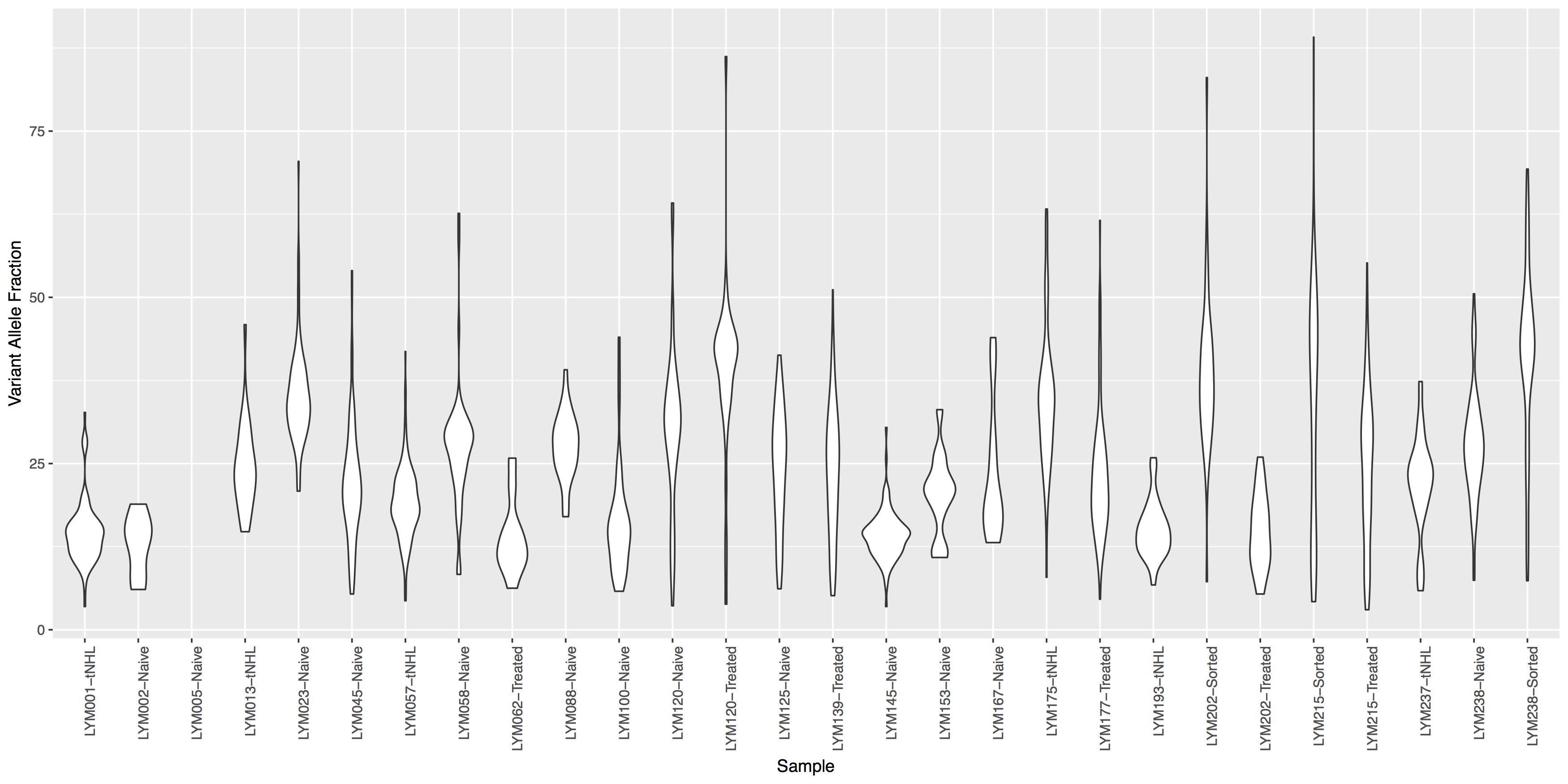
Get a hint!
look at geom_violin(), change labels with xlab() and ylab()
What is the code to create the violin plot above?
ggplot() + geom_violin(data=variantData, aes(x=Simple_name, y=tumor_VAF)) + theme(axis.text.x=element_text(angle=90, hjust=1)) + xlab("Sample") + ylab("Variant Allele Fraction")
Looking good, but the plot looks dull, try adding some color to the violin plots and let’s see where the points for the underlying data actually reside.
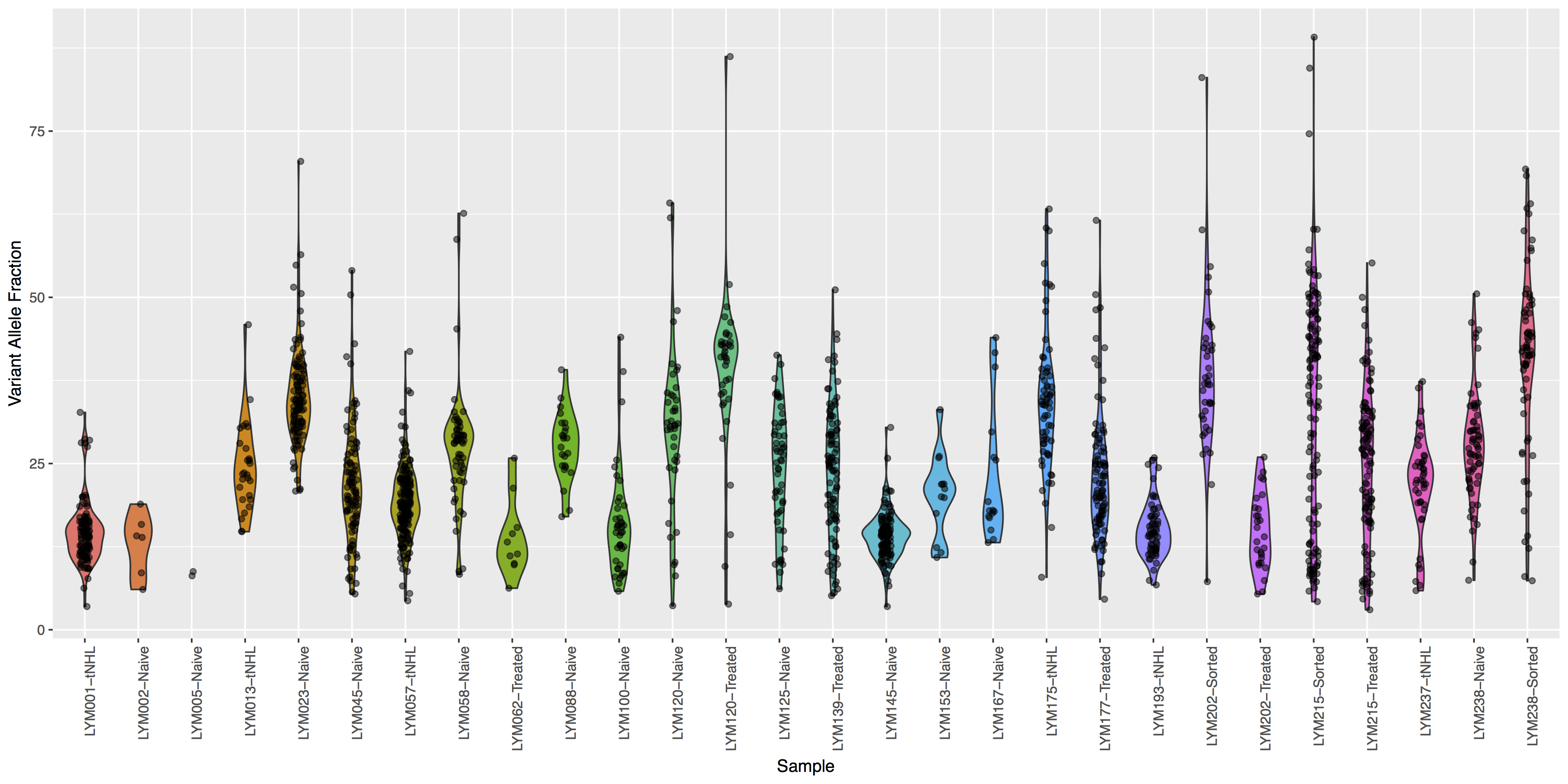
Get a hint!
Try using geom_jitter() to offset points
What is the code to create the violin plot above?
ggplot(data=variantData, aes(x=Simple_name, y=tumor_VAF)) + geom_violin(aes(fill=Simple_name)) + geom_jitter(width=.1, alpha=.5) + theme(axis.text.x=element_text(angle=90, hjust=1), legend.position="none") + xlab("Sample") + ylab("Variant Allele Fraction")
Finally let’s add some more detail, specifically let’s annotate how many points actually make up each violin. The code below will construct the extra data you’ll need to make the final plot.
# library(plyr)
variantDataCount <- plyr::count(variantData, "Simple_name")
variantDataMax <- aggregate(data=variantData, tumor_VAF ~ Simple_name, max)
variantDataMerge <- merge(variantDataMax, variantDataCount)
head(variantDataMerge)
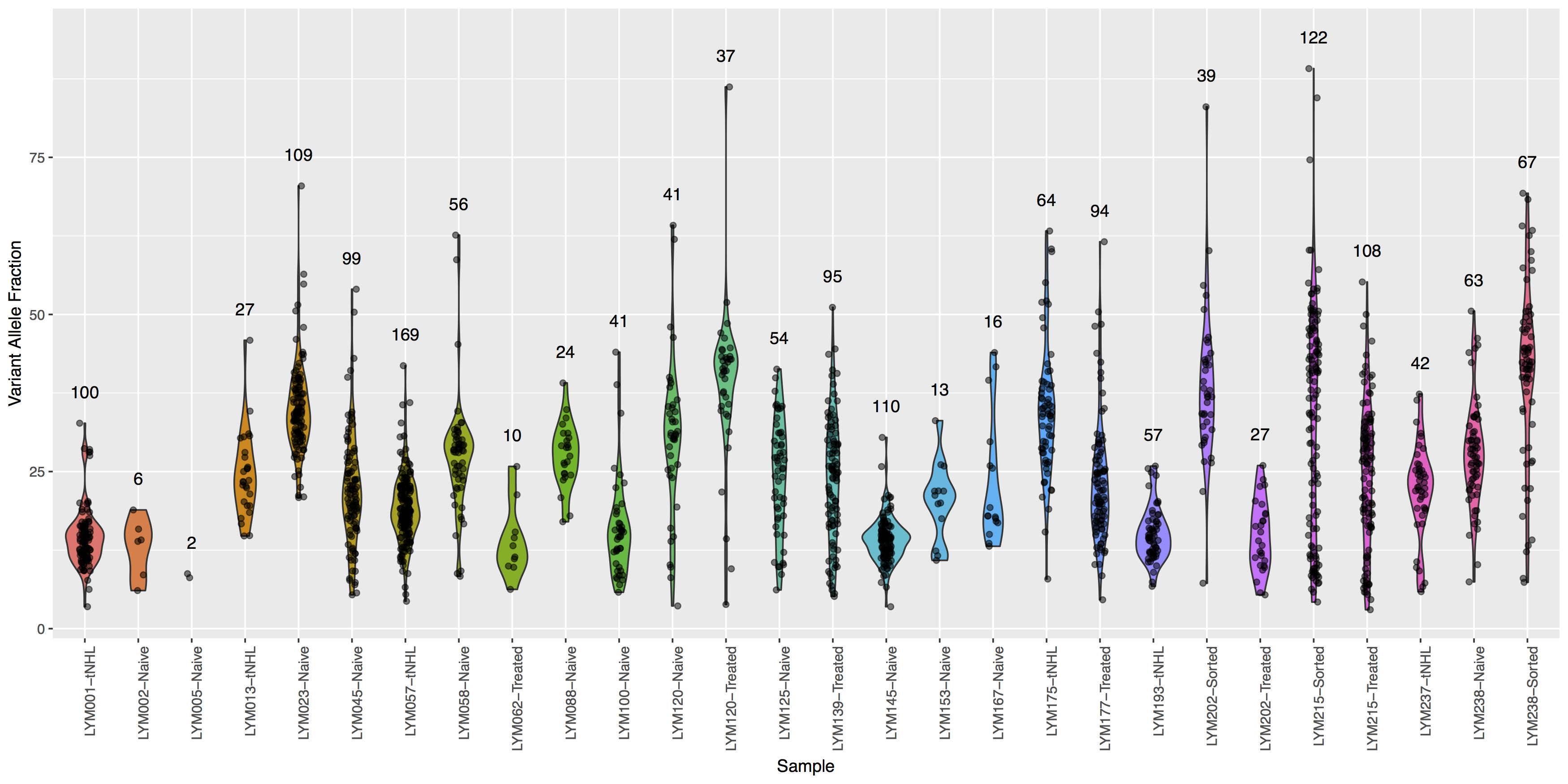
Get a hint!
You will need to pass variantDataMerge to geom_text()
What is the code to create the violin plot above?
ggplot() + geom_violin(data=variantData, aes(x=Simple_name, y=tumor_VAF, fill=Simple_name)) + geom_jitter(data=variantData, aes(x=Simple_name, y=tumor_VAF), width=.1, alpha=.5) + geom_text(data=variantDataMerge, aes(x=Simple_name, y=tumor_VAF + 5, label=freq)) + theme(axis.text.x=element_text(angle=90, hjust=1), legend.position="none") + xlab("Sample") + ylab("Variant Allele Fraction")