Posts
My thoughts and ideas
Welcome to the blog
My thoughts and ideas
There are at least three primary graphics programs available within the R environment. A package for base R graphics is installed by default and provides a simple mechanism to quickly create graphs. lattice is another graphics package that attempts to improve on base R graphics by providing better defaults and the ability to easily display multivariate relationships. In particular, the package supports the creation of trellis graphs - graphs that display a variable or the relationship between variables, conditioned on one or more other variables. Finally, ggplot2 is a graphics program based on the grammar of graphics ideology, and will be the primary focus of this course.
In this module, we will explore basic use of ggplot2 to plot genomic data. For illustration, we will use a set of mutation data from Supplemental Table S5 of the paper “Recurrent somatic mutations affecting B-cell receptor signaling pathway genes in follicular lymphoma”. You can download a cleaned up version of Supplemental Table S5 at http://genomedata.org/gen-viz-workshop/intro_to_ggplot2/ggplot2ExampleData.tsv. These data come in TSV format, and consist of ~5000 lines, each with a somatic tumor genome variant and various annotations describing the variant (e.g. affected individual, predicted consequence, read counts, etc.).
ggplot is based on a system of layering graphical objects to create a final plot. We will start by installing and loading the ggplot2 library. Next, it is important to know that ggplot expects the data passed to it to be of class data.frame. After importing our data (‘ggplot2ExampleData.tsv’), we will modify this data frame to include a ‘coverage’ (tumor_COV) variable. Then we can call the variantData data frame in our ggplot() function and compare the coverage variable to the variant allele frequency (tumor_VAF).
# install the ggplot2 library and load it
install.packages("ggplot2")
library(ggplot2)

# load Supplemental Table S5
# note that in the following example we are loading directly from a URL (instead of downloading it to the instance first)
variantData <- read.delim("http://genomedata.org/gen-viz-workshop/intro_to_ggplot2/ggplot2ExampleData.tsv", stringsAsFactors=TRUE)

# familiarize yourself with the data in this file by looking at the 'head' (top) of the file
head(variantData)

# look at a selection of columns
variantData[1:5, c(1:9,16,18)]

# make a coverage column since this doesn't exist yet
variantData$tumor_COV <- variantData$tumor_ref_count + variantData$tumor_var_count

# start making the plot to visualize the relationship between variant allele frequencies and read coverage
p1 <- ggplot(data=variantData, aes(x=tumor_VAF, y=tumor_COV))
p1
The object stored in variable p1 will generate a blank plot in the bottom right “Plots” window of Rstudio. We invoked ggplot with the function ggplot() and specified the data frame we are trying to plot. We then supplied aesthetic mappings with aes(). In essence this is specifying which columns ggplot should assign to the geometric objects aesthetics. In this specific case, we are telling ggplot that the data is in the data frame “variantData”, the column tumor_VAF should be plotted along the x-axis, and tumor_COV should be plotted along the y-axis. ggplot has determined the axis scales, given the ranges in the data supplied. However you will notice that nothing is actually plotted. At this point we have passed what data we want plotted however we have not specified how it should be plotted. This is what the various geometric objects in ggplot are used for (e.g. geom_point() for scatterplots, geom_bar() for bar charts, etc). These geometric objects are added as plot layers to the ggplot() base command using a +.
# add a point geom object to the plot (method 1)
p1 <- p1 + geom_point()
p1

# the following is equivalent to above (method 2)
p2 <- ggplot() + geom_point(data=variantData, aes(x=tumor_VAF, y=tumor_COV))
p2
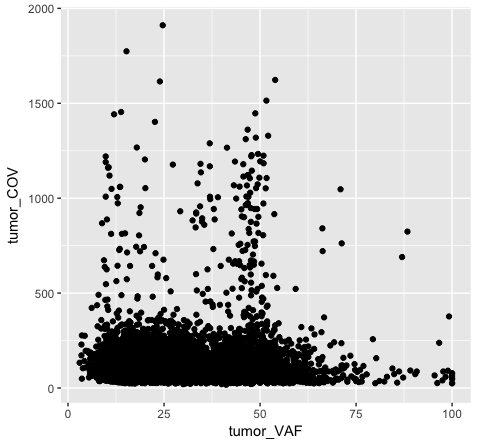
Both plot p1 and plot p2 generate a scatter plot, comparing the column tumor_COV on the y-axis to the column tumor_VAF on the x-axis. While the plots generated by the p1 and p2 variables may appear identical, we should briefly address their differences. In method 1 (plot p1), we invoke ggplot() with a data frame (variantData) and an aesthetic mapping of tumor_VAF and tumor_COV for x and y respectively. In this method the information is passed to all subsequent geometric objects and is used as appropriate in those objects. In this case, the only geometric object we include is geom_point(). The geom_point() layer is then added using the information passed from ggplot(). Conversely, in method 2 (plot p2), we invoke ggplot() without defining the data or aesthetic mapping. This information is specified directly in the geom_point() layer. If any additional geometric objects were added as layers to the plot, we would specifically have to define the data and aesthetics within each additional layer. This is especially useful when plotting multiple datasets on the same plot (we will explore this later on).
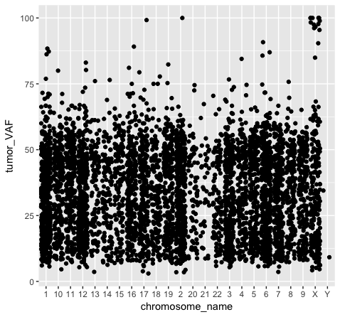
We should also note that geometric objects can behave differently, depending upon whether the plotted variables are continuous or discrete. In the example below (plot p3), we can see that the points have been binned by chromosome name on the x-axis, while the numeric values sorted in the column “tumor_VAF” are plotted along a continuous y-axis scale. The position of the points (specified by position=’jitter’ in the geom_point() object) shifts the points apart horizontally to provide better resolution. A complete list of available geoms within ggplot is available here.
# illustrating the difference between continous and discrete data
p3 <- ggplot() + geom_point(data=variantData, aes(x=chromosome_name, y=tumor_VAF), position="jitter")
p3
Going back to our original example (plot p1), the majority of points look like they have a coverage < 500x. However, there are outliers in this data set causing the majority of points to take up a relatively small portion of the plot. We can provide more resolution to this by the following methods:
Note that these transformations can be applied to the x axis as well (scale_x_continous(), xlim(), etc.), as long as the x-axis is mapped to data appropriate for a continuous scale.
# method 1, set y limits for the plot
p4 <- p1 + scale_y_continuous(limits=c(0, 500))
p4
# alternatively, the following is a shortcut method for the same
p4 <- p1 + ylim(c(0, 500))
p4
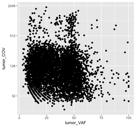
# method 2, transform the actual values in the data frame
p5 <- ggplot() + geom_point(data=variantData, aes(x=tumor_VAF, y=log2(tumor_COV)))
p5
# method 3, transform the axis using ggplot
p6 <- p1 + scale_y_continuous(trans="log2")
p6
Note that adjusting the scale_y_continuous() layer will plot only the points within the specified range by setting the limits. ylim() is a shortcut that achieves the same thing. You’ll see a warning when doing this, stating that rows are being removed from the data frame that contain values outside of the specified range. There is an “out of bounds” parameter within scale_y_continuous() to control what happens with these points, but this isn’t necessarily the best method for this particular plot. In method 2 (plot p5), we actually transform the data values themselves by applying a log2 transform. This method allows us to better visualize all of the points, but it is not intuitive to interpret the log2 of a value (tumor coverage). Alternatively, method 3 (plot p6) does not transform the values, but adjusts the scale the points are plotted on and does a better job of displaying all of our data without having to convert the log2 values.
Discussion: What are the pros and cons of the three approaches above? Are there other approaches we might consider?
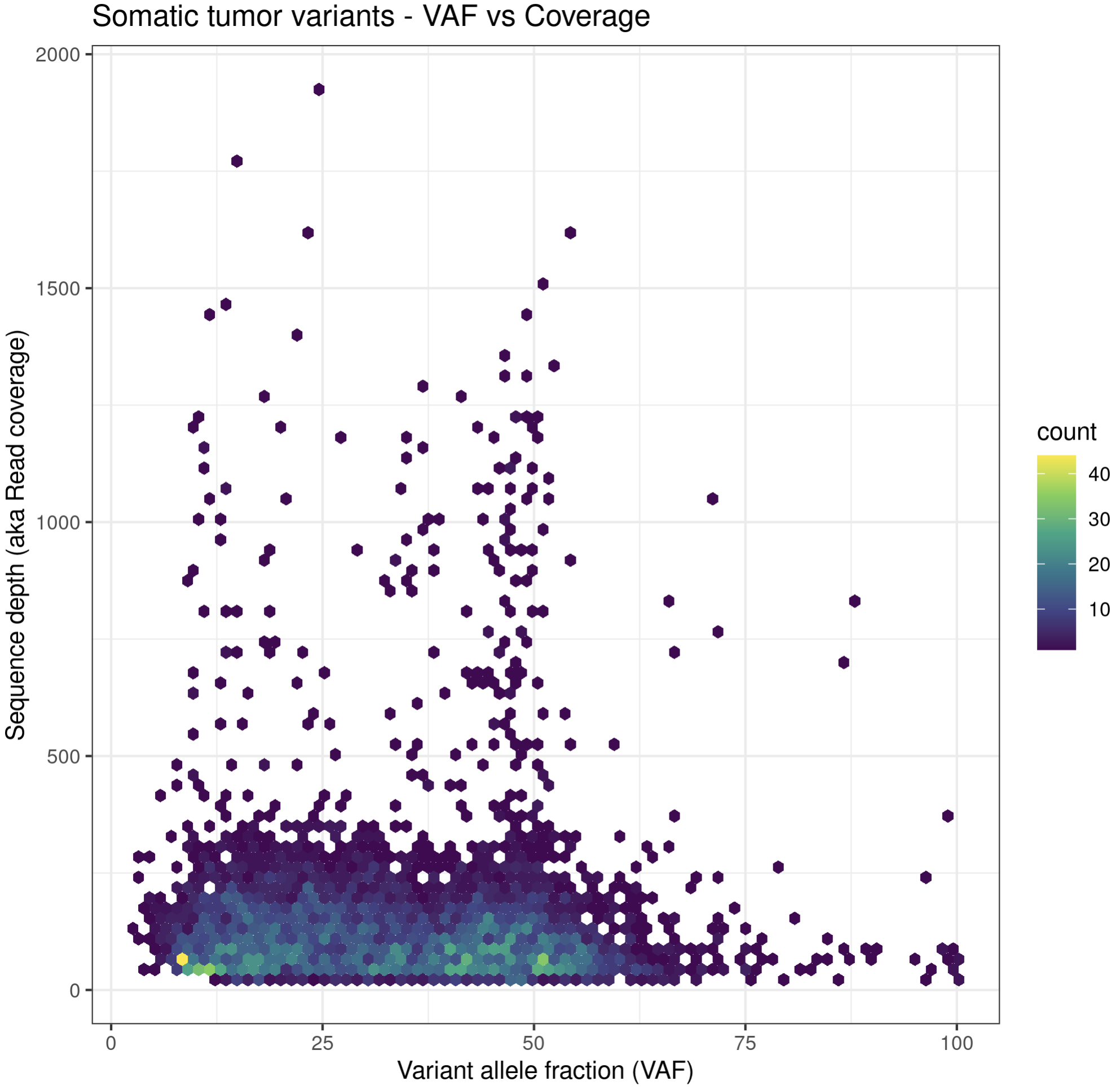
# method 4, show all the data on linear scale but use a density plotting function to better see where the bulk of data point are
# also add some additional annotations, customize color palette, etc.
install.package("hexbin")
p6a = ggplot(data=variantData, aes(x=tumor_VAF, y=tumor_COV)) + geom_hex(bins=75) + scale_fill_continuous(type = "viridis") + theme_bw() + xlab("Variant allele fraction (VAF)") + ylab("Sequence depth (aka Read coverage)") + ggtitle("Somatic tumor variants - VAF vs Coverage")
p6a
While these plots look pretty good, we can make them more aesthetically pleasing by defining the color of the points within the aesthetic. We can specify a color by either the hex code (hex codes explained) or by naming it from R’s internal color pallette, a full list of which is available here. Alternatively, you can list colors by typing colors() in the R terminal.
# list colors in R
colors()
# obtain hex code for a specific color called "dark orchid"
install.packages("gplots")
library(gplots)
col2hex("darkorchid")
# what happens when we try to add color within the aesthetic?
p7 <- ggplot() + geom_point(data=variantData, aes(x=tumor_VAF, y=tumor_COV, color="#9932CC")) + scale_y_continuous(trans="log2")
p7
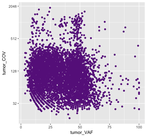
# and what happens when we try to add color within the geom?
p8 <- ggplot() + geom_point(data=variantData, aes(x=tumor_VAF, y=tumor_COV), color="#9932CC") + scale_y_continuous(trans="log2")
p8
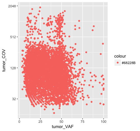
Above we chose “darkorchid4” which has a hex value of “#9932CC”. However the points in the first plot (p7) are red and not the expected purple color. Our points are appearing miscolored based upon how ggplot is interpreting the aesthetic mappings. When the color aesthetic is specified for geom_point it expects a factor variable by which to color points. If we wanted to, for example, color all missense variants with one color, nonsense variants with another color, and so on we could supply a factor for variant type to the color aesthetic in this way. But, when we specified a quoted hex code, ggplot assumed we wanted to create such a factor with all values equal to the provided text string. It did this for us and then used its internal color scheme to color that variable all according to the single category in the factor variable. By specifying the color outside the aesthetic mapping, geom_point knows to apply the color ‘darkorchid4’ to all of the points specified in the geom_point() layer (p8).
The syntax used in p8 makes sense if we want to display our points in a single color and we want to specify that color. The syntax used in p7 doesn’t make sense as used above but something similar could be used if we really did want to color each point according to a real factor in the data. For example, coloring points by the ‘dataset’, ‘type’, or ‘variant’ variables could be informative. Try one of these now.
# color each point according to the 'dataset' of the variant
p7a <- ggplot() + geom_point(data=variantData, aes(x=tumor_VAF, y=tumor_COV, color=dataset)) + scale_y_continuous(trans="log2")
p7a

# color each point according to the 'type' of the variant
p7b <- ggplot() + geom_point(data=variantData, aes(x=tumor_VAF, y=tumor_COV, color=type)) + scale_y_continuous(trans="log2")
p7b
Building on the above concepts, we could now try using the colour aesthetic to visualize our data as a density plot. For example, what if we wanted to know if the ‘discovery’ or ‘extension’ cohorts within our data (specified by the ‘dataset’ variable) had a higher tumor purity? We will use geom_density() to plot a density kernel of the tumor VAF values, but colour the cohort based upon the dataset subsets. As described above, we will supply a factor for the colour aesthetic.
# get a density curve of tumor vafs
p9 <- ggplot() + geom_density(data=variantData, aes(x=tumor_VAF, color=dataset))
p9

# let's add a bit more detail
p10 <- ggplot() + geom_density(data=variantData, aes(x=tumor_VAF, fill=dataset), alpha=.75, adjust=.5)
p10

# and let's change the colors some more
p11 <- p10 + scale_fill_manual(values=c("discovery"="#a13242", "extension"="#1a2930"))
p11
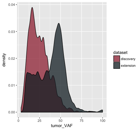
In the p9 plot, we told the geom_density() layer to differentiate the data based upon the ‘dataset’ column using the colour aesthetic. We see that our result contains two density curves that use two different colored lines to specify our datasets. In p10, we are telling our geom_density() layer to differentiate the datasets using the “fill” aesthetic instead. We globally assign the fill transparency (alpha=0.75). In addition, we utilize the adjust parameter to reduce the smoothing geom_density() uses when computing it’s estimate. Now, our datasets are specified by the fill (or filled in color) of each density curve. In p11 (shown above), we append the scale_fill_manual() layer to manually define the fill colours we would like to appear in the plot.
As an exercise, try manually changing the line colors in p9 using a similar method as that used in p11.
Get a hint!
look at scale_colour_manual()
Solution
ggplot() + geom_density(data=variantData, aes(x=tumor_VAF, color=dataset)) + scale_color_manual(values=c("discovery"="#a13242", "extension"="#1a2930"))
Note that when you use the “color” aesthetic you modify the choice of line colors with scale_color_manual. When you use the “fill” aesthetic you modify the choice of fill colors with scale_fill_manual. If you would like to customize both the line and fill colors, you will need to define both the “color” and “fill” aesthetic.
Try it. Use four different colors for the two line and two fill colors so that it is easy to see if it worked.
Depending on the geometric object used there are up to 9 ways to map an aesthetic to a variable. These are with the x-axis, y-axis, fill, colour, shape, alpha, size, labels, and facets.
Faceting in ggplot allows us to quickly create multiple related plots at once with a single command. There are two facet commands, facet_wrap() will create a 1 dimensional sequence of panels based on a one sided linear formula. Similarly facet_grid() will create a 2 dimensional grid of panels. Let’s try and answer a few quick questions about our data using facets.
# what is the most common mutation type among SNPs?
p12 <- ggplot(variantData[variantData$type == "SNP",]) + geom_bar(aes(x=trv_type))
p12
# use theme() rotate the labels for readability (more on themes below)
p12a <- ggplot(variantData[variantData$type == "SNP",]) + geom_bar(aes(x=trv_type)) + theme(axis.text.x = element_text(angle = 90))
p12a
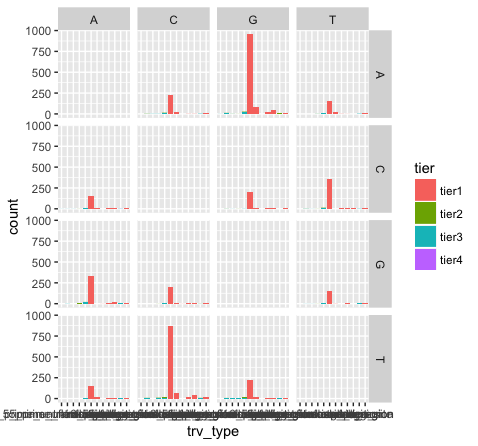
# what is the relation of tiers to mutation type?
p13 <- ggplot(variantData[variantData$type == "SNP",]) + geom_bar(aes(x=trv_type, fill=tier)) + theme(axis.text.x = element_text(angle = 90))
p13
# which reference base is most often mutated? compare p13 and p14 to understand what facet_wrap is doing here
p14 <- p13 + facet_wrap(~reference)
p14
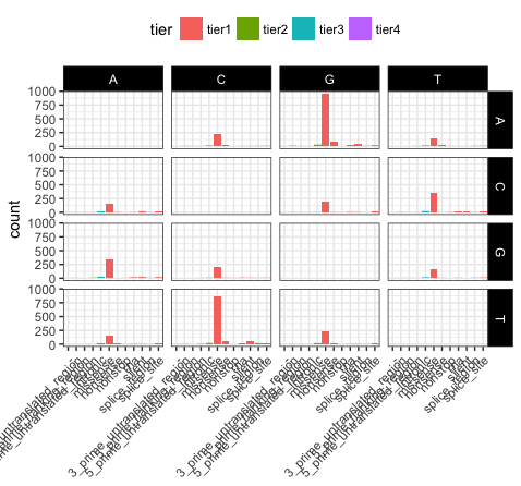
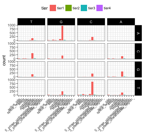
# which transitions and transversions occur most frequently?
p15 <- p13 + facet_grid(variant ~ reference)
p15
What do we see in this last plot? Which base changes are most common in this data set? Do we expect a random/uniform distribution of base changes?
Note that the variant bases in this plot are along the Y-axis, and the reference bases are along the X-axis. Thus the first row of panels is A->A, C->A, G->A, and T->A variants. Overall the most common mutations are G->A and C->T. In other words we are seeing more transitions than transversions: G->A (purine -> purine transition) and C->T (pyrimidine to pyrimidine transition). This is what we expect for various reasons.
Also note how we are selecting a subset of the “variantData” data above. Try the following commands to breakdown how this works:
variantData[1,]
variantData[,1]
variantData[,7]
variantData$type
variantData$type == "SNP"
x = variantData[variantData$type == "SNP",]
dim(x)
dim(variantData)
head(x)
Almost every aspect of a ggplot object can be altered. We’ve already gone over how to alter the display of data but what if we want to alter the display of the non data elements? Fortunately there is a function for that called theme(). You’ll notice in the previous plot some of the x-axis names are colliding with one another, let’s fix that and alter some of the theme parameters to make the plot more visually appealing.
# recreate plot p13 if it's not in your environment
p16 <- ggplot(variantData[variantData$type == "SNP",]) + geom_bar(aes(x=trv_type, fill=tier)) + facet_grid(variant ~ reference)
p16

# load in a theme with a few presets set
p17 <- p16 + theme_bw()
p17

# put the x-axis labels on a 45 degree angle
p18 <- p17 + theme(axis.text.x=element_text(angle=45, hjust=1))
p18

# altering a few more visual apects (put the legend at top and make the base change labels white on a black background)
p19 <- p18 + theme(legend.position="top", strip.text=element_text(colour="white"), strip.background=element_rect(fill="black"))
p19

# let's remove the main x-axis label as well
p20 <- p19 + theme(axis.title.x=element_blank())
p20
Let’s take a few minutes to discuss what is going on here. In p17, we’ve used theme_bw(), this function just changes a series of values from the basic default theme(). There are many such “complete themes” in ggplot and a few external packages as well containing additional “complete themes” such as ggtheme. In p18, we alter the axis.text.x parameter, we can see from the documentation that axis.text.x inherits from element_text() which is just saying that any parameters in element_text() also apply to axis.text.x. In this specific case we alter the angle of text to 45 degrees, and set the horizontal justification to the right. In p19 we change the position of the legend, change the colour of the strip.text, and change the strip background. Finally in p20 (shown above) we remove the x-axis label with element_blank(), which will draw nothing.
In ggplot the order in which a variable is plotted is determined by the levels of the factor for that variable. We can view the levels of a column within a dataframe with the levels() command and we can subsequently change the order of those levels with the factor() command. We can then use these to change the order in which aesthetic mappings such as plot facets and discrete axis variables are plotted. Lets look at an example using the previous faceted plots we made (p20).
# recreate plot p20 if it's not in your environment
p20 <- ggplot(variantData[variantData$type == "SNP",]) + geom_bar(aes(x=trv_type, fill=tier)) + facet_grid(variant ~ reference) + theme_bw() + theme(axis.text.x=element_text(angle=45, hjust=1), legend.position="top", strip.text=element_text(colour="white"), strip.background=element_rect(fill="black"), axis.title.x=element_blank())
p20

# view the order of levels in the reference and trv_type columns
levels(variantData$reference)
levels(variantData$trv_type)

# reverse the order of the levels
variantData$reference <- factor(variantData$reference, levels=rev(levels(variantData$reference)))
variantData$trv_type <- factor(variantData$trv_type, levels=rev(levels(variantData$trv_type)))

# view the updated order of levels for the try_type column
levels(variantData$trv_type)

# view the same plot as p20 but with the new order of variables
p21 <- ggplot(variantData[variantData$type == "SNP",]) + geom_bar(aes(x=trv_type, fill=tier)) + facet_grid(variant ~ reference) + theme_bw() + theme(axis.text.x=element_text(angle=45, hjust=1), legend.position="top", strip.text=element_text(colour="white"), strip.background=element_rect(fill="black"), axis.title.x=element_blank())
p21
We can see that reversing the order of levels in the reference column has subsequently reversed the reference facets (right side of plot). Similarily reversing the order of the trv_type column levels has reversed the labels on the x-axis.
# reverse the order of the trv_type levels back to original state
levels(variantData$trv_type)
variantData$trv_type <- factor(variantData$trv_type, levels=rev(levels(variantData$trv_type)))
levels(variantData$trv_type)
# if we want to modify the name of some of the levels manually (e.g. to make shorter versions of some really long names) we can do the following
levels(variantData$trv_type)[levels(variantData$trv_type)=="3_prime_untranslated_region"] <- "3p_utr"
levels(variantData$trv_type)[levels(variantData$trv_type)=="5_prime_untranslated_region"] <- "5p_utr"
levels(variantData$trv_type)[levels(variantData$trv_type)=="5_prime_flanking_region"] <- "5p_flank"
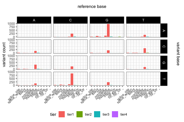
# update the plot yet again
p22 <- ggplot(variantData[variantData$type == "SNP",]) + geom_bar(aes(x=trv_type, fill=tier)) + facet_grid(variant ~ reference) + theme_bw() + theme(axis.text.x=element_text(angle=45, hjust=1), legend.position="bottom", strip.text=element_text(colour="white"), strip.background=element_rect(fill="black"), axis.title.x=element_blank()) + ylab("variant count")
# add some space around the margins of the plot
p22 <- p22 + theme(plot.margin = unit(c(1.5,1.5,0.2,0.2), "cm"))
p22
# add main x and y labels
library(grid)
grid.text(unit(0.5,"npc"), unit(0.95,"npc"), label = "reference base", rot = 0, gp=gpar(fontsize=11))
grid.text(unit(0.97,"npc"), 0.56, label = "variant base", rot = 270, gp=gpar(fontsize=11))
To save a plot or any graphical object in R, you first have to initalize a graphics device, this can be done with pdf(), png(), svg(), tiff(), and jpeg(). You can then print the plot as you normally would and close the graphics device using dev.off(). Alternatively ggplot2 has a function specifically for saving ggplot2 graphical objects called ggsave(). A helpfull tip to keep in mind when saving plots is to allow enough space for the plot to be plotted, if the plot titles for example look truncated try increasing the size of the graphics device. Changes in the aspect ratio between a graphics device height and width will also change the final appearance of plots.
# save the last plot we made.
pdf(file="p20.pdf", height=8, width=11)
p20
dev.off()

# alternatively ggsave will save the last plot made
ggsave("p20.pdf", device="pdf")

# note the current working directory where this file will have been saved
getwd()
In some cases, ggplot may expect data to be in ‘long’ instead of ‘wide’ format. This simply means that instead of each non-id variable having it’s own column there should be a column/columns designating key/value pairs. The long format is generally required when grouping variables, for example stacked bar charts. We can change between wide and long formats with the dcast() and melt() functions from the reshape2 package.
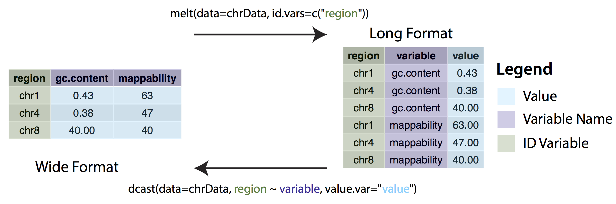
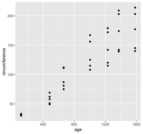
Consider the following example. The Orange dataset that is preloaded in your R install is in wide format and we can create a
scatterplot of the data with the code below.
ggplot(Orange, aes(x=age, y=circumference)) + geom_point()
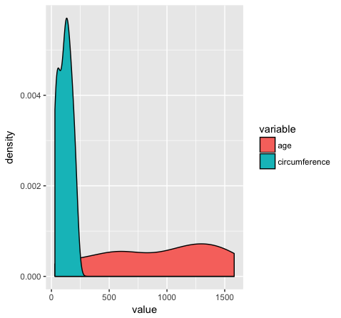
However if we want to group variables (stratify by some factor), such as when variables share a mapping aesthetic (i.e. using color to group variables age and circumference) we must convert the data to long format.
library(reshape2)
Orange2 <- melt(data=Orange, id.vars=c("Tree"))
head(Orange)
head(Orange2)
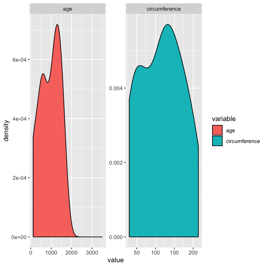
ggplot(Orange2, aes(x=value, fill=variable)) + geom_density()
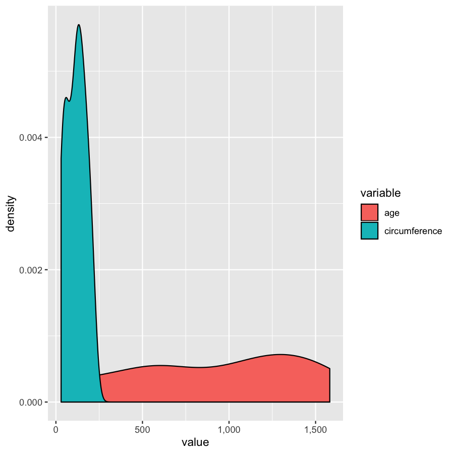
Almost done, in this last section, we will just mention a couple tips that you might find usefull. We’ll use the Orange2 dataset from above to illustrate. By default with large intergers such as genomic coordinates R will tend to display these in scientific notation. Many do not actually like this, you can commify axis values using the comma functions from the scales package as illustrated in the plot below. You will need to load the scales library for this to work.
library(scales)
ggplot(Orange2, aes(x=value, fill=variable)) + geom_density() + scale_x_continuous(labels=comma)
We’ve gone over how to set axis limits, but what if you have a faceted plot and you want very specific axis limits for each facet? Unfortunately applying an xlim() layer would apply to all facets. One way around this is to use “invisible data”. For the plot below we add an invisible layer to the alter the x-limits of the age facet.
ggplot(Orange2, aes(x=value, fill=variable)) + geom_density() + geom_point(data=data.frame(Tree=1, variable="age", value=3500), aes(x=value, y=0), alpha=0) + facet_wrap(~variable, scales="free")