Welcome to the blog

Posts

My thoughts and ideas

Introduction to gene coverage plots | Griffith Lab

Genomic Visualization and Interpretations

Introduction to gene coverage plots

Often is is usefull to view coverage of a specific region of the genome in the context of specific samples. During initial stages of analysis this can be done with a genome browser such as IGV however when preparing a publication more fine grain control is usefull. For example you may wish to change the coverage scale, reduce the size of introns, or visualize many samples at once. GenVisR provides a function for this aptly named genCov().

Introduction to datasets

In this section we will be using coverage data derived from two mouse samples from the study “Truncating Prolactin Receptor Mutations Promote Tumor Growth in Murine Estrogen Receptor-Alpha Mammary Carcinomas”. We will be showing that the knockout of the STAT1 gene described in the manuscript was successful. In order to obtain the preliminary data we used the command bedtools multicov -bams M_CA-TAC245-TAC245_MEC.prod-refalign.bam -bed stat1.bed to obtain coverage values for the wildtype TAC245 sample and the tumor free knockout TAC265 sample. Go ahead and load this data from the genomdata.org server.

# read the coverage data into R
covData <- read.delim("http://genomedata.org/gen-viz-workshop/GenVisR/STAT1_mm9_coverage.tsv")

Formating coverage data

Before we get started we need to do some preliminary data preparation to use genCov(). First off genCov() expects coverage data to be in the form of a named list of data frames with list names corresonding to sample id’s and column names “chromosome”, “end”, and “cov”. Further the chromosome column should be of the format “chr1” instead of “1”, we’ll explain why a bit later. Below we rename our data frame columns with colnames() and create an anonymous function, a, to go through and split the data frame up into a list of data frames by sample. We then use the function names() to assign samples names to our list.

# rename the columns
colnames(covData) <- c("chromosome", "start", "end", "TAC245", "TAC265")

# create a function to split the data frame into lists of data frames
samples <- c("TAC245", "TAC265")
a <- function(x, y){
    col_names <- c("chromosome", "end", x)
    y <- y[,col_names]
    colnames(y) <- c("chromosome", "end", "cov")
    return(y)
}
covData <- lapply(samples, a, covData)

names(covData) <- samples

loading a BSgenome and TxDb object

The next set of data we need is an object of class BSgenome, short for biostrings genome. These object are held in bioconductor annotation packages and store reference sequences in a way that is effecient for searching a reference. To view the available genomes maintained by bioconductor you can either install the BSgenome package and use the function available.genomes() or you can use biocViews on bioconductors website. We also need to load in some transcription meta data corresponding to our data. This type of data is also stored on bioconductor and is made available through annotation packages as TxDb objects. You can view the available TxDb annotation packages using biocViews. In our situation the coverage data for our experiment corresponds to the mm9 reference assembly, so we will load the BSgenome.Mmusculus.UCSC.mm9 and TxDb.Mmusculus.UCSC.mm9.knownGene libraries. It is important to note that the chromosomes between our data sets must match, UCSC appends “chr” to chromosome names and because we are using these libraries derived from UCSC data we must do the same to our coverage input data.

# install and load the BSgenome package and list available genomes
#if (!requireNamespace("BiocManager", quietly = TRUE))
#    install.packages("BiocManager")
#BiocManager::install("BSgenome", version = "3.8")
library("BSgenome")
available.genomes()

# install and load the mm9 BSgenome from UCSC
#if (!requireNamespace("BiocManager", quietly = TRUE))
#    install.packages("BiocManager")
#BiocManager::install("BSgenome.Mmusculus.UCSC.mm9", version = "3.8")
library("BSgenome.Mmusculus.UCSC.mm9")
genomeObject <- BSgenome.Mmusculus.UCSC.mm9

# Install and load a TxDb object for the mm9 genome
#if (!requireNamespace("BiocManager", quietly = TRUE))
#    install.packages("BiocManager")
#BiocManager::install("TxDb.Mmusculus.UCSC.mm9.knownGene", version = "3.8")
library("TxDb.Mmusculus.UCSC.mm9.knownGene")
TxDbObject <- TxDb.Mmusculus.UCSC.mm9.knownGene

Creating a Granges object

The final bit of required data we need is an object of class GRanges, short for “genomic ranges”. This class is a core class maintained by bioconductor and is the preferred way for storing information regarding genomic positions. In order to use this class we need to install the GenomicRanges package from bioconductor and use the GRanges() constructor function. Let’s go ahead and define a genomic location within this class corresponding to our coverage data.

# get the chromosome, and the start and end of our coverage data
chromosome <- as.character(unique(covData[[1]]$chromosome))
start <- as.numeric(min(covData[[1]]$end))
end <- as.numeric(max(covData[[1]]$end))

# define the genomic range
grObject <- GRanges(seqnames=c("chr1"), ranges=IRanges(start=start, end=end))

Creating an initial coverage plot

Now that we have all the basic inforamation we need let’s go ahead and pass all of this information to genCov() and get an initial coverage plot. We will also use the parameter cov_plotType so that the coverage is shown as a line graph, this is a matter of personal preference and may not be suitable is the coverage values vary widly from base to base. Other values cov_plotType accepts are “bar” and “point”.

# create an initial plot
genCov(x=covData, txdb=TxDbObject, gr=grObject, genome=genomeObject, cov_plotType="line")

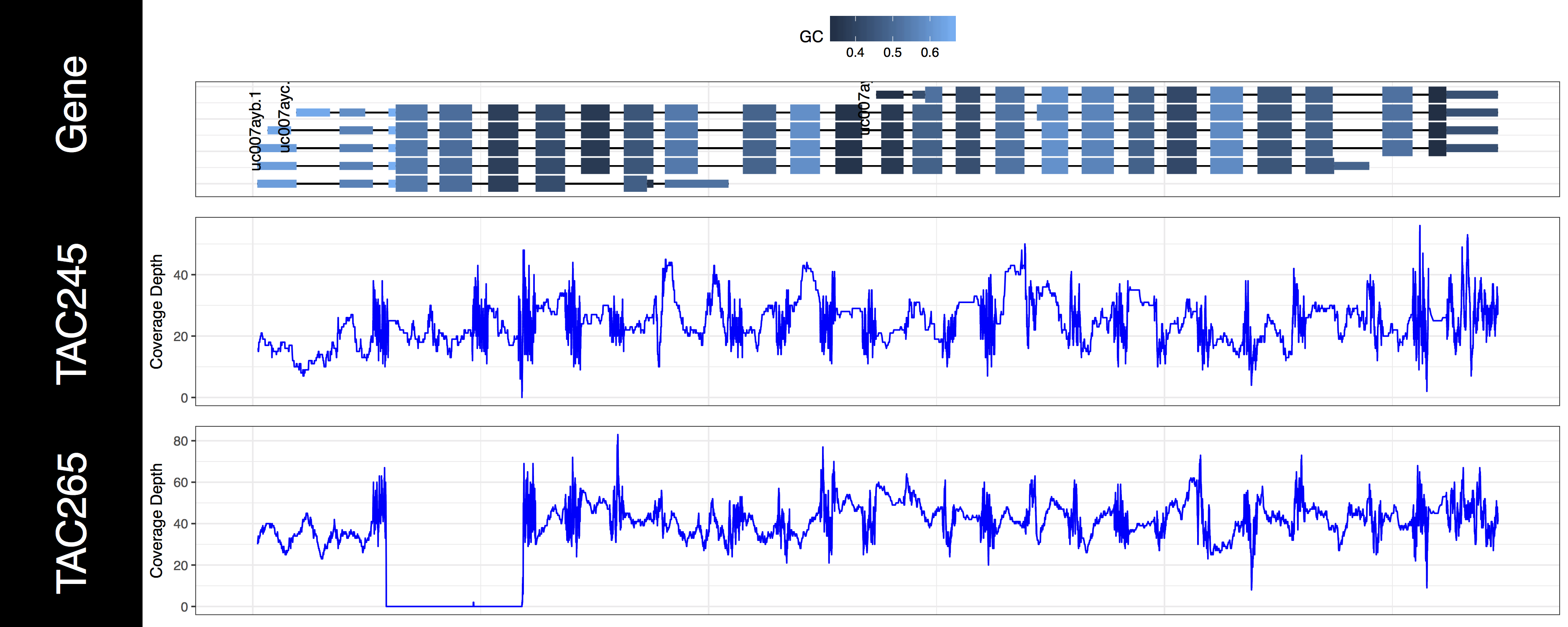
We now have an initial plot, let’s start talking about what is actually being displayed. The first thing you might have noticed is the gene track. Here we have representations for every genomic feature from the TxDb object encompassed by the genomic ranges we specified in grObject. We can see that there are 6 STAT1 isoforms, we can further view the gc content proportion for each feature in this region. You might have noticed a warning message as well, something along the lines of Removed 3 rows containing missing values (geom_text)., and we can see that not all of our isoforms are labled. If you’re wondering what’s going on we specified a genomic range right up to the gene boundaries for a few of these isoforms. Because genCov() is running out of plotting space to place these labels it, or rather ggplot2 removes them. Let’s go ahead and fix that by adding a flank to our genomic range, don’t worry about changing covData, genCov() will compensate and make sure everything still aligns. Let’s also only plot the canonical STAT1 isoform using the gene_isoformSel parameter, looking at the genome browser from UCSC we can see that this is “uc007aya.1”.

# add a flank and create another plot
grObject <- GRanges(seqnames=c("chr1"), ranges=IRanges(start=start-500, end=end+500))
genCov(x=covData, txdb=TxDbObject, gr=grObject, genome=genomeObject, cov_plotType="line", gene_isoformSel="uc007aya.1")

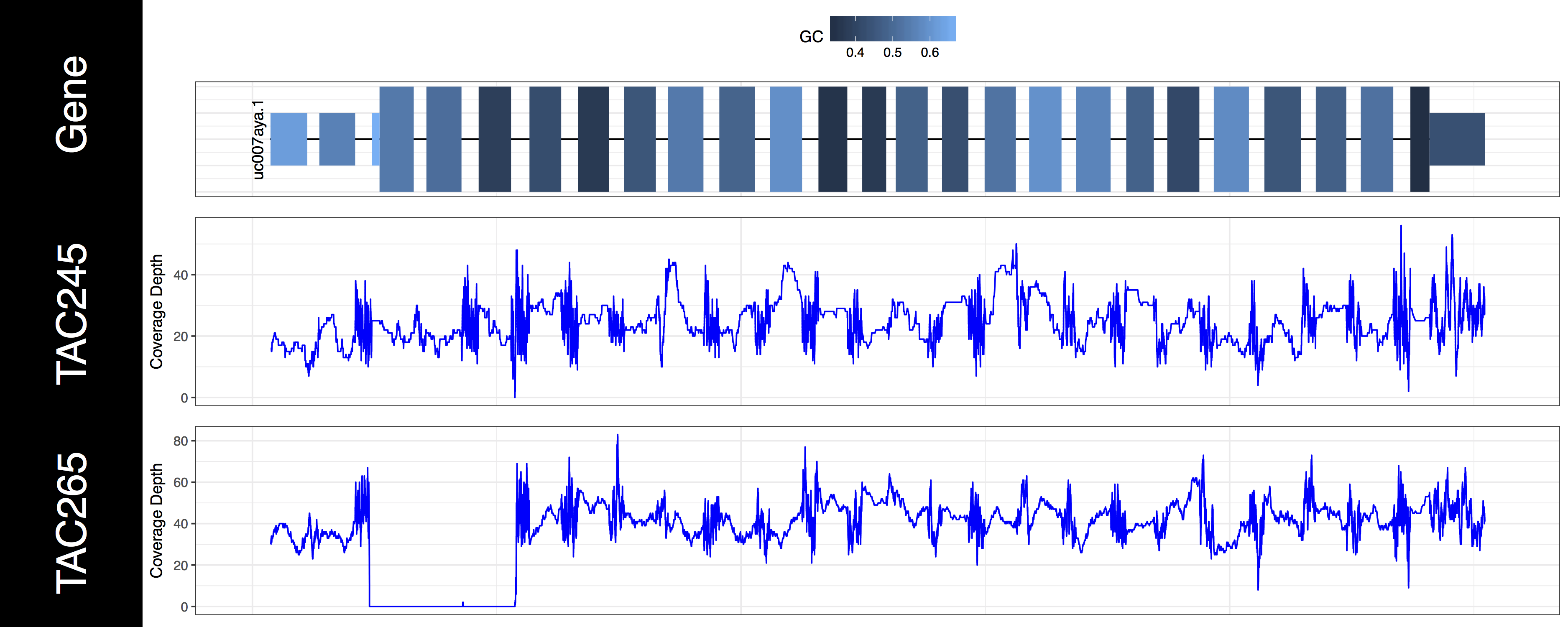
The second thing you may have noticed regarding these plots is that the space between types of genomic features (“cds”, “utr”, “introns”) seems off. In order to plot what is likely the most relevant data genCov() is scaling the space of each of these feature types. By default “Intron”, “CDS”, and “UTR” are scaled by a log factor of 10, 2, and 2 respectively. This can be changed by altering the base and transform parameters which correspond to each other. Alternatively setting these parameters to NA will remove the scaling entirely. Let’s go ahead and do that now just to get a sense of how things look without scaling.

# adjust compression of genomic features
genCov(x=covData, txdb=TxDbObject, gr=grObject, genome=genomeObject, cov_plotType="line", gene_isoformSel="uc007aya.1", base=NA, transform=NA)

Exercises

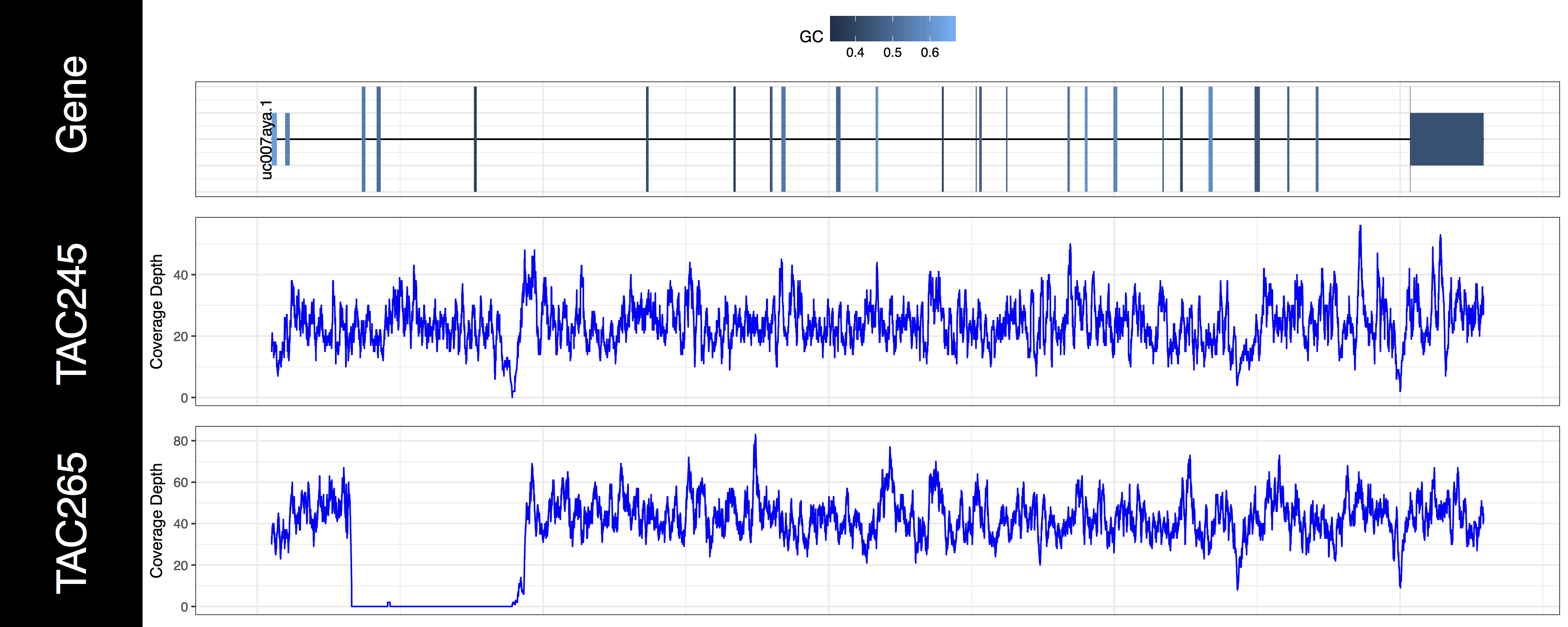
From the plots we produced above we can clearly see the first 3 exons of this isoform have been knocked out successfully in the “TAC265” sample and the “TAC245 Wild Type” sample is unchanged. The genCov() function also has many parameters to customize how the plot looks. Try viewing the documentation for genCov() and use these parameters to produce the plot below, remember documentation can change between version so type ?genCov in your R terminal for documentation specific to the version you have installed.
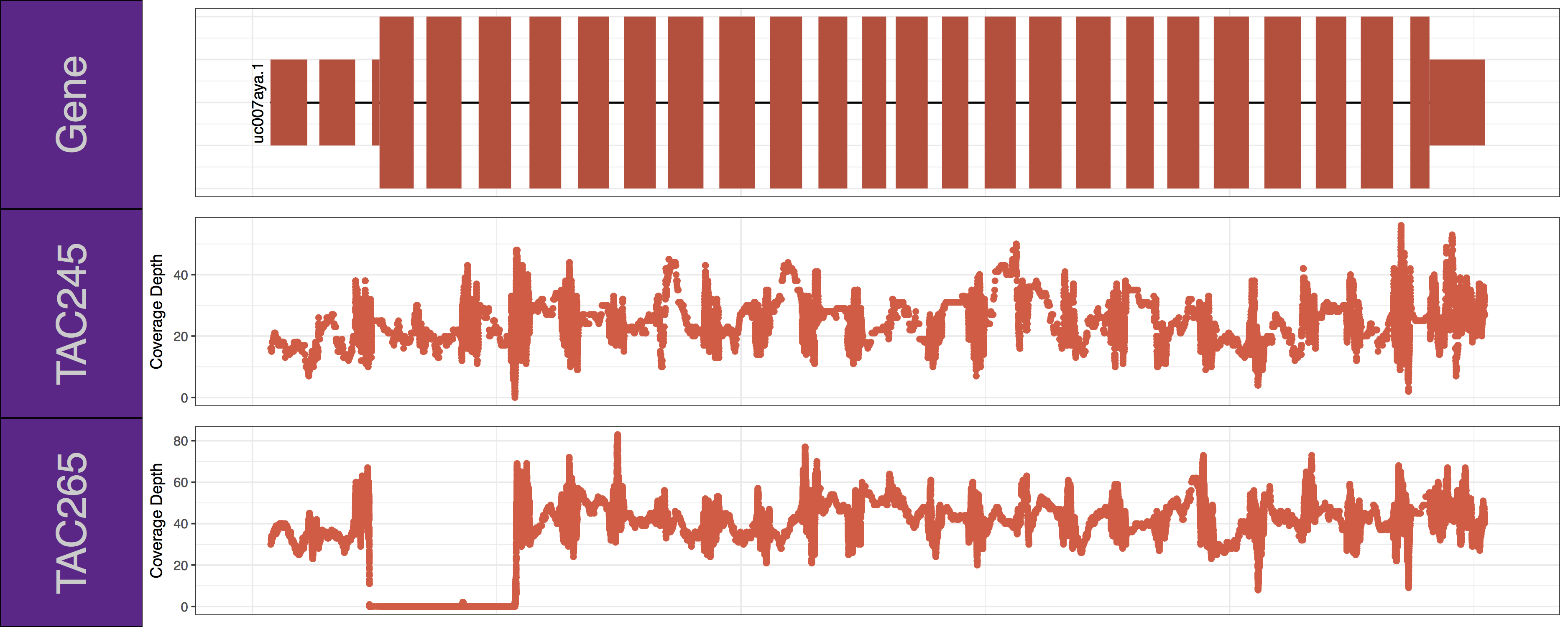
Get a hint!

Have a look at the following parameters: label_bgFill, label_txtFill, cov_colour, gene_colour

Answer

genCov(x=covData, txdb=TxDbObject, gr=grObject, genome=genomeObject, cov_plotType="point", gene_isoformSel="uc007aya.1", label_bgFill="darkorchid4", label_txtFill="grey80", cov_colour="tomato2", gene_colour="tomato3")

Introduction to transition/transverion plots | Griffith Lab

Genomic Visualization and Interpretations

Introduction to transition/transverion plots

Transitions and transversions describe the mutation of a nucleotide from one base to another. Specifically transitions describe the mutation of nucleotides between purines or between pyrimidines and transversions from purines to pyrimidines or pyrimidines to purines. Often such events can give clues as to the origin of mutations within a sample. For example transverions are associated with ionizing radiation.

Transitions and Transversions by Krishnavedala with permission under CC BY-SA 4.0

Loading Data

Figure 1 of the manuscript “Recurrent somatic mutations affecting B-cell receptor signaling pathway genes in follicular lymphoma” plots the rate of each type of transition and transversion observed in a cohort of samples. In this section we will use the GenVisR function TvTi to create a version of this figure, shown below. The underlying data for this figure can be found in supplemental table S5 and is the same data used in the “Introduction to ggplot2” section. We’ll just load the data directly from the url on genomedata.org.

This research was originally published in Blood. Krysiak et al. Blood 2017 129:473-483 by Krysiak et al. with permission under © the American Society of Hematology

Data Preparation

The GenVisR function TvTi() will calculate the rate of individual transitions and transversions within a cohort and plot this information as a stacked barchart. As with the waterfall() function TvTi() can accept multiple file types as specified by the parameter fileType. Here we will use the most flexible, an “MGI” file type which expects a data frame with column names “sample”, “reference”, and “variant”. Further we will re-assign the sample column to use the same sample names as in the manuscript figure. In order to match the manuscript figure we will also limit the data to just the discovery cohort and re-factor the data frame with the function factor() so samples without any data are not plotted.

# load the data into R
mutationData <- read.delim("http://genomedata.org/gen-viz-workshop/intro_to_ggplot2/ggplot2ExampleData.tsv")

# change the "Simple_name" column to "sample"
colnames(mutationData)[colnames(mutationData) %in% "sample"] <- "sample_1"
colnames(mutationData)[colnames(mutationData) %in% "Simple_name"] <- "sample"

# subset the data to just the discovery cohort
mutationData <- mutationData[mutationData$dataset == "discovery",]
mutationData$sample <- factor(mutationData$sample, levels=unique(mutationData$sample))

# run TvTi
TvTi(mutationData, fileType="MGI")

Plotting Frequencies with Proportions

You might notice from the previous plot that two samples look a bit off. Specifically the samples “LYM002-Naive” and “LYM005-Naive” are missing transitions and transversions. By default TvTi() plots only the proportion of transitions and transversions which can be deceiving if the frequency of mutation events is not high enough to get an accurate calculation of the relative proportion. We can use the parameter type which expects a string specifying either “proportion” or “frequency”, to instead plot the frequency of each mutation event. Let’s use this parameter two create two plots, one of frequency the other of proportion and combine them. To do this we will need to output our plots as grobs using out="grob", and use the function arrangeGrob() from the gridExtra package to combine the two plots into one. Finally we will need to call grid.draw() on the grob to output it to the current graphical device. We can see from the resulting plot that quite a few samples have low mutation frequencies and we should interpret these samples with caution.

# install and load gridExtra
install.packages("gridExtra")
library(gridExtra)
library(grid)

# make a frequency and proportion plot
tvtiFreqGrob <- TvTi(mutationData, fileType="MGI", out="grob", type="frequency")
tvtiPropGrob <- TvTi(mutationData, fileType="MGI", out="grob", type="proportion")

# combine the two plots
finalGrob <- arrangeGrob(tvtiFreqGrob, tvtiPropGrob, ncol=1)

# draw the plot
grid.draw(finalGrob)

Changing the order of samples

By default the order of the samples on the x-axis uses the levels of the sample column in the input data frame to determine an order, if that column is not of type factor it is coerced to one using the existing order of samples to define the levels within that factor. This behavior can be altered using parameter sort which will take a character vector specifying either “sample” or “tvti”. Specifying “sample” will order the x-axis alpha-numerically based on the sample names, conversely “tvti” will attempt to order the x-axis samples by decreasing proportions of each transition/transversion type. In the manuscript figure we can see that a custom sort order is being used. Let’s take advantage of the default ordering behavior in TvTi() and change the levels of the sample column to match the order in the manuscript figure.

# determine the exisitng order of samples
levels(mutationData$sample)

# create a custom sample order to match the manuscript
sampleOrder <- c("LYM145-Naive", "LYM023-Naive", "LYM045-Naive", "LYM238-Sorted", "LYM238-Naive", "LYM058-Naive", "LYM125-Naive", "LYM100-Naive", "LYM088-Naive", "LYM167-Naive", "LYM153-Naive", "LYM002-Naive", "LYM005-Naive", "LYM120-Naive", "LYM120-Treated", "LYM215-Sorted", "LYM215-Treated", "LYM139-Treated", "LYM177-Treated", "LYM202-Sorted", "LYM202-Treated", "LYM062-Treated", "LYM057-tNHL", "LYM001-tNHL", "LYM175-tNHL", "LYM193-tNHL", "LYM237-tNHL", "LYM013-tNHL")

# make sure all samples have been specified
all(mutationData$sample %in% sampleOrder)

# alter the sample levels of the input data
mutationData$sample <- factor(mutationData$sample, levels=sampleOrder)

# recreate the plot
tvtiFreqGrob <- TvTi(mutationData, fileType="MGI", out="grob", type="frequency")
tvtiPropGrob <- TvTi(mutationData, fileType="MGI", out="grob", type="proportion")
finalGrob <- arrangeGrob(tvtiFreqGrob, tvtiPropGrob, ncol=1)
grid.draw(finalGrob)

adding clinical data

As with many other GenVisR functions we can add a heatmap of clinical data via the parameter clinData which expects a data frame with column names “sample”, “variable”, and “value”. A subset of the clinical data is available available on genomedata.org which we will load into R directly. The clinical data contains information for all samples in the experiment however we are only interested in the discovery cohort, the next step then is to subset our clinical data to only those samples in our main plot. From there we can use melt() to coerce the data frame into the required “long” format and add the clinical data to the proportions plot with the clinData parameter. In order to more closely match the manuscript figure we will also define a custom color pallette and set the number of columns in the legend with the parameters clinVarCol and clinLegCol respectively.

# read in the clinical data
clinicalData <- read.delim("http://genomedata.org/gen-viz-workshop/GenVisR/FL_ClinicalData.tsv")

# subset just the discovery cohort
clinicalData <- clinicalData[clinicalData$Simple_name %in% mutationData$sample,]
all(sort(unique(as.character(clinicalData$Simple_name))) == sort(unique(as.character(mutationData$sample))))

# convert to long format
library(reshape2)
clinicalData <- melt(data=clinicalData, id.vars="Simple_name")
colnames(clinicalData) <- c("sample", "variable", "value")

# define a few clinical parameter inputs
clin_colors <- c('0'="lightblue",'1'='dodgerblue2','2'='blue1','3'='darkblue','4'='black','FL'='green3','t-NHL'='darkgreen','Treated'='darkred','TreatmentNaive'='red','NA'='lightgrey')

# add the clinical data to the plots
tvtiFreqGrob <- TvTi(mutationData, fileType="MGI", out="grob", type="frequency")
tvtiPropGrob <- TvTi(mutationData, fileType="MGI", out="grob", type="proportion", clinData=clinicalData, clinLegCol = 2, clinVarCol = clin_colors)
finalGrob <- arrangeGrob(tvtiFreqGrob, tvtiPropGrob, ncol=1, heights=c(2, 5))
grid.draw(finalGrob)

re-aligning plots

Up til this point we have glossed over what arrangeGrob() is actually doing however this is no longer a luxury we can afford. In the previous figure we can see that adding the clinical data to our plot has caused our proportion and frequency plots to go out of alignment. This has occurred because the y-axis text in the clinical plot takes up more space than in the frequency plot. Because we added clinical data with GenVisR to the proportion plot those graphics are aligned with each other however TvTi() has no idea the frequency plot exists, it’s added to our graphic after the fact with arrangeGrob(). In order to fix this issue we will need a basic understanding of “grobs”, “TableGrobs”, and “viewports”. First off a grob is just short for “grid graphical object” from the low-level graphics package grid; Think of it as a set of instructions for create a graphical object (i.e. a plot). The graphics library underneath all of ggplot2’s graphical elements are really composed of grob’s because ggplot2 uses grid underneath. A TableGrob is a class from the gtable package and provides an easier way to view and manipulate groups of grobs, it is actually the intermediary between ggplot2 and grid. A “viewport” is a graphics region for which a grob is assigned. We have already been telling GenVisR to output grobs instead of drawing a graphic because we have been using the arrangeGrob() function in gridExtra to arrange and display extra viewports in order to create a final plot. Let’s briefly look at what this actually means, we can show the layout of viewports with the function gtable_show_layout(). In the figure below we have overlayed this layout on to our plot and have shown the table grob to the right. In the table grob we can see that at the top level our grobs are compsed of 2 vertical elements and 1 horizontal elements. The column z corresponds to the order of plot layers, and cells corresponds to the viewport coordinates. So we can see that the grob listed in row 1 is plotted first and is located on the viewport spanning vertical elemnents 1-1 and horizontal elements 1-1 and thus on our layout is in the viewport (1, 1).

# load the gtable library
library(gtable)

# visualize the viewports of our plot
gtable_show_layout(finalGrob)

Pretty simple right? But not so fast the table grob in finalGrob is a little over simplified on the surface. It is true that our plot is composed of two final grobs however each grob is made up of lists of grobs in the table grob all the way down to the individual base elements which make up the plot. In the figure below we illustrate the second layer of these lists. To re-align the plots we’ll need to peel back the layers until we can acess the original grobs from ggplot2. We will then need to obtain the widths of each of these elements, find the max width with unit.pmax(), and re-assign the width of each as these grobs using the max width.

# find the layer of grobs widths we care about
proportionPlotWidth <- finalGrob$grobs[[2]]$grobs[[1]]$widths
clinicalPlotWidth <- finalGrob$grobs[[2]]$grobs[[2]]$widths
transitionPlotWidth <- finalGrob$grobs[[1]]$grobs[[1]]$widths

# find the max width of each of these
maxWidth <- unit.pmax(proportionPlotWidth, clinicalPlotWidth, transitionPlotWidth)

# re-assign the max widths
finalGrob$grobs[[2]]$grobs[[1]]$widths <- as.list(maxWidth)
finalGrob$grobs[[2]]$grobs[[2]]$widths <- as.list(maxWidth)
finalGrob$grobs[[1]]$grobs[[1]]$widths <- as.list(maxWidth)

# plot the plot
grid.draw(finalGrob)

adding additional layers

Our plot is getting getting close to looking like the one in the manuscript, there are a few final touches we should add however. Specifically let’s add in some vertical lines separating samples by “treatment-naive”, “treated”, and “t-NHL”. Let’s also remove the redundant x-axis text, we can do all this by adding additional ggplot2 layers to the various plots with the parameter layers and clinLayer.

# load ggplot2
library(ggplot2)

# create a layer for vertical lines
layer1 <- geom_vline(xintercept=c(14.5, 22.5))

# create a layer to remove redundant x-axis labels
layer2 <- theme(axis.text.x=element_blank(), axis.title.x=element_blank())

# create the plot
tvtiFreqGrob <- TvTi(mutationData, fileType="MGI", out="grob", type="frequency", layers=list(layer1, layer2))
tvtiPropGrob <- TvTi(mutationData, fileType="MGI", out="grob", type="proportion", clinData=clinicalData, clinLegCol = 2, clinVarCol = clin_colors, layers=layer1, clinLayer=layer1)
finalGrob <- arrangeGrob(tvtiFreqGrob, tvtiPropGrob, ncol=1, heights=c(2, 5))
grid.draw(finalGrob)

Exercises

The plot above has been finished, however we recreated all the plots without taking the time to realign them. Try and aswer the questions below regarding our finalGrob, then try to fix the alignment. If you get stuck go over the “realigning plots” section again.

How many grob layers are in finalGrob?

Get a hint!

try and use finalgrobs$grobs to dig into layers until you reach an endpoint, remember finalgrobs$grobs returns lists.

Answer

There are six separate layers of grobs, here they are: finalGrob$grobs[[1]]$grobs[[1]]$grobs[[15]]$grobs[[1]]$grobs

Let’s practice extracting individual grob element from finalGrob, use grid.draw() to try and draw one of the legend titles.

Get a hint!

The grob names should give a hint regarding which element they correspond to, also remember that $grobs returns a list not the actual table grob.

Answer

Here is one solution, there are two others! grid.draw(finalGrob$grobs[[1]]$grobs[[1]]$grobs[[15]]$grobs[[1]]$grobs[[2]])

Finally let’s go ahead and fix the final version of our plot by realigning the grobs in finalGrob.

Get a hint!

You will have to go three layers deep to access the proper viewports!

Answer

The answer is actually the same code used in the realign plots section of the tutorial.